
There’s a unique pleasure in admiring beautiful homes – an inspiring pastime I affectionately call ‘weekend house gazing.’ It’s not about intrusive peeking, but rather a delightful drive through charming neighborhoods, soaking in the architectural grandeur and exquisite curb appeal of gorgeous exteriors. For many of us, the dream of building a custom home remains a cherished aspiration. If that day ever arrives for me, my mind is already brimming with exterior home design concepts and color palettes, all inspired by these delightful weekend excursions.
My personal style leans towards the traditional, yet I always seek opportunities to incorporate fresh, unexpected twists. Today, I’m thrilled to partner with James Hardie to share some of my top exterior home design and color ideas. More excitingly, I’ll introduce an incredible online tool that can transform those abstract ideas into a tangible vision, allowing you to see exactly how different designs would look on your own home.
Elevating Exteriors: The Enduring Quality of James Hardie Siding
You’ve likely encountered James Hardie® fiber cement products before – and for good reason. They stand as the #1 brand of siding in North America, a testament to their unparalleled quality and versatility. James Hardie offers an extensive range of styles, from classic planks and charming shingled siding to essential trim pieces and much more. Each product is meticulously engineered to offer superior protection against the elements, specifically designed to withstand damage from moisture, rot, and even pests. For homeowners like myself, who’ve battled the relentless pecking of woodpeckers on traditional wood siding, the durability of James Hardie provides immense peace of mind. This robust material ensures that your home’s exterior remains intact and beautiful, year after year, without the constant threat of wear and tear.
Beyond its incredible resilience, James Hardie understands that aesthetics are just as crucial as durability. That’s why their siding comes in an impressive array of gorgeous, long-lasting color options. These hues are not merely painted on; they are enhanced with their exclusive ColorPlus® Technology, a revolutionary process that bakes multiple coats of paint onto the siding. This creates a vibrant, fade-resistant finish that outlasts a typical paint job, keeping your home looking pristine with minimal maintenance. Having seen its performance firsthand on a home my parents built over two decades ago, I can confidently say that James Hardie fiber cement siding would be my absolute first choice for any future new build or if my current home ever requires residing. Its proven track record for beauty and longevity makes it an investment that truly stands the test of time, ensuring exceptional curb appeal and structural integrity for generations.
Inspiring Exterior Home Design & Color Ideas for Your Next Project
With an understanding of the superior foundation that James Hardie products provide, let’s dive into some inspiring exterior home design and color ideas. These concepts are designed to spark your imagination, whether you’re embarking on a dream new build or planning a significant exterior remodel.
1. Harmonizing Textures: Single Color, Diverse Profiles
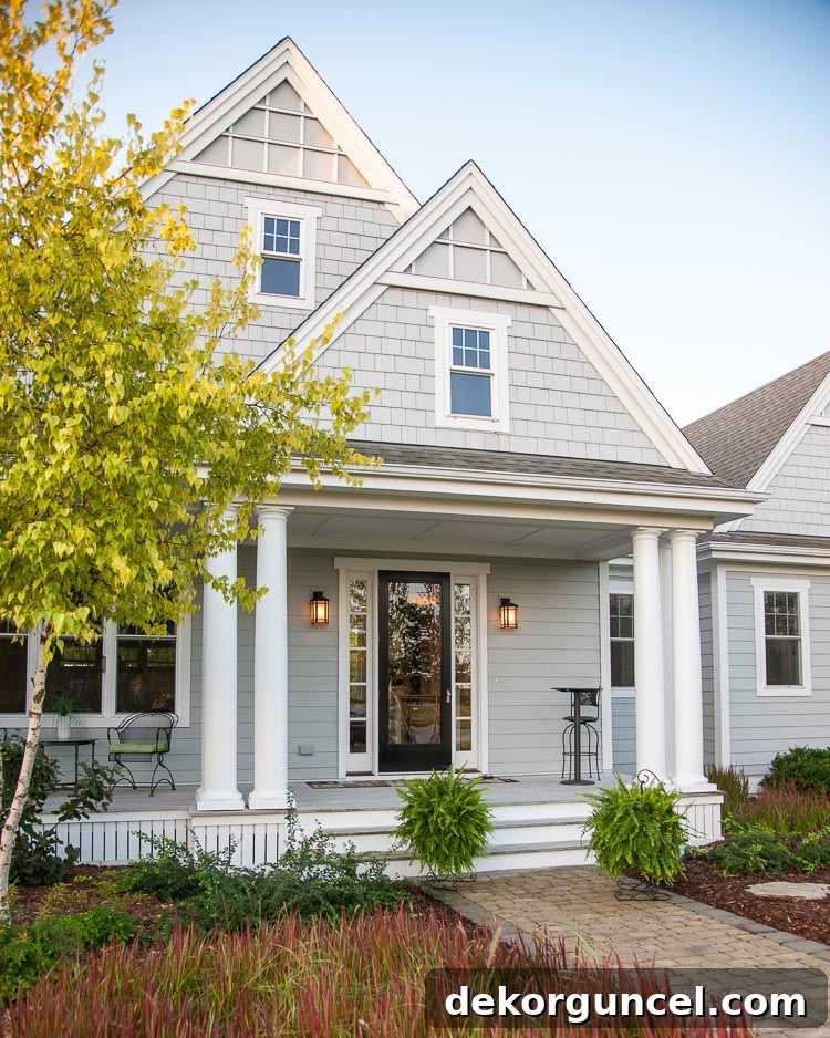
A sophisticated way to add depth and visual interest to your home’s exterior is by utilizing a single, cohesive color while incorporating different siding profiles. This gray home perfectly embodies this elegant approach, captivating me with its thoughtful design and the timeless combination of a soft gray hue – specifically James Hardie’s Light Mist – paired with crisp white trim. What truly elevates this design is the clever use of two distinct siding styles: HardiePlank® lap siding on the first story, lending a classic horizontal line, seamlessly transitioning to HardieShingle® siding on the second story, which adds a charming, rustic texture. This interplay of textures within a single color family creates a subtle yet powerful architectural statement.
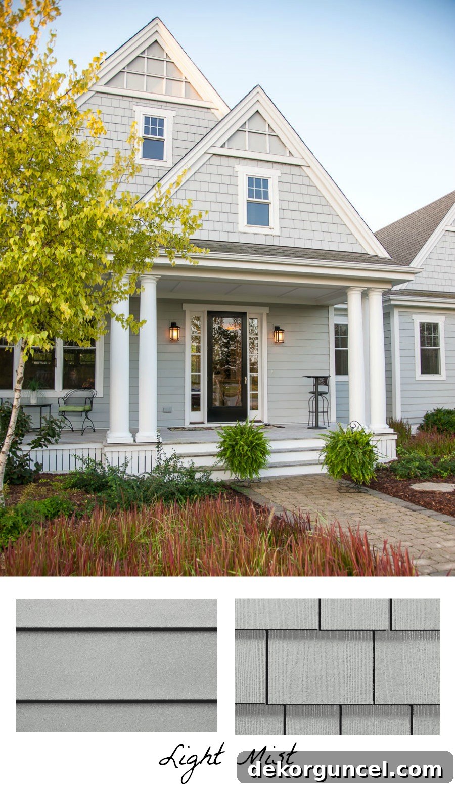
The strategic combination of these two different siding styles and textures infuses the home with significantly more character and visual appeal than if a single profile had been used throughout. It’s a masterclass in how subtle variations can create a dynamic facade. Furthermore, the triangular trim details at the exterior peaks serve as a beautiful accent, framing the architectural elements and adding another layer of bespoke charm. This approach proves that you don’t need multiple colors to achieve a rich, multifaceted exterior; sometimes, varying textures within a unified palette is all it takes to make a house truly stand out.
2. Subtle Sophistication: Two Shades from the Same Color Family
While some homes embrace a multi-colored exterior, often with three or more distinct hues, a more cohesive and sophisticated approach can be found in utilizing two different shades from the same color family. Personally, I find this strategy to be incredibly beautiful and visually harmonious, as perfectly demonstrated by this stunning mountain home. Instead of disparate color schemes, imagine the depth created by subtle variations of a single base color.
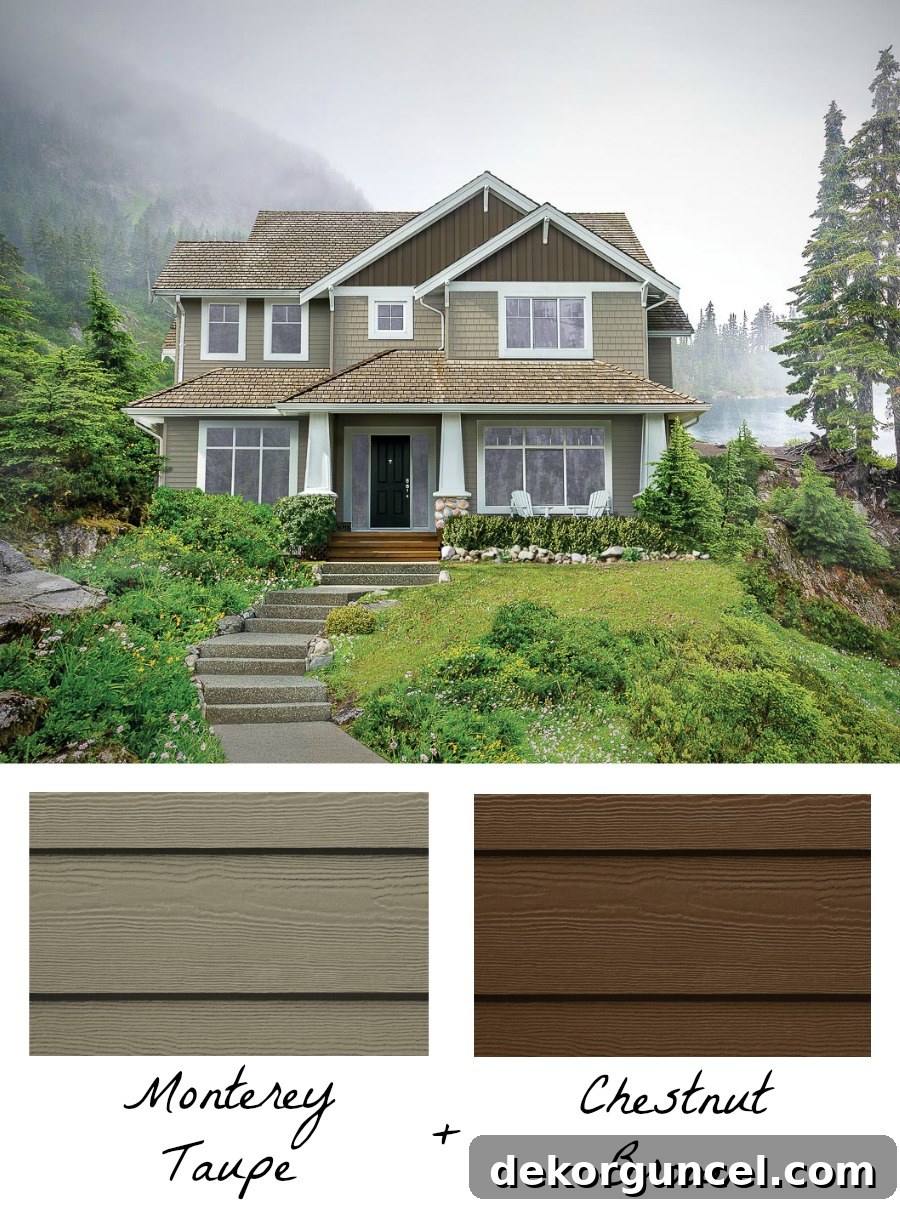
On this particular home, HardiePlank lap siding and HardieShingle siding were predominantly used in the inviting shade of Monterey Taupe across most of the exterior. To introduce a gentle contrast and highlight architectural features, a darker hue from the same brown family, Chestnut Brown, was meticulously applied to the HardiePanel® vertical siding and HardieTrim® batten boards within the triangular peaks. This thoughtful combination provides a layered effect, drawing the eye to the architectural lines without overwhelming the senses. Although the precise door color isn’t clear from the image, extending that same rich Chestnut Brown to the front door would serve as a fantastic finishing touch, elegantly tying the entire exterior color palette together and enhancing the home’s warm, inviting appeal. This method is ideal for homeowners seeking a nuanced, elegant look that offers visual interest without sacrificing harmony.
3. Timeless Appeal: Integrating Brick or Stone Accents
For those seeking to infuse their home’s exterior with classic warmth, texture, and undeniable character, incorporating brick or stone accents is an exemplary choice. One of my local dream homes, a true architectural marvel (thankfully out of my price range, or I’d be relocating!), perfectly blends siding with exquisite stone elements, achieving a look that is simply beyond gorgeous. You can integrate stone or brick in various ways: as a foundational element, across entire exterior walls, or as a more subtle accent to highlight specific architectural features, much like the charming application seen in this super cute row house.
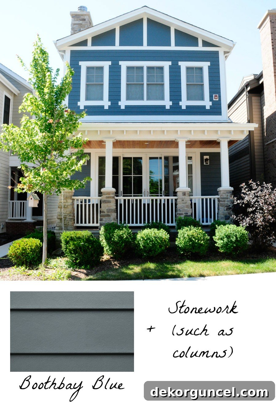
Here, HardiePlank siding in the inviting shade of Boothbay Blue serves as the primary exterior color. The addition of natural stone on the front columns and the chimney instantly transforms the facade, adding a grounding, organic feel. Doesn’t it do wonders for warming up a home’s exterior, creating an inviting and robust presence? Brick can achieve a similar effect, offering a slightly different aesthetic. Consider the charming red brick foundation, porch, and stairs on this delightful home, which pairs exquisitely with the Sail Cloth HardiePlank lap siding.
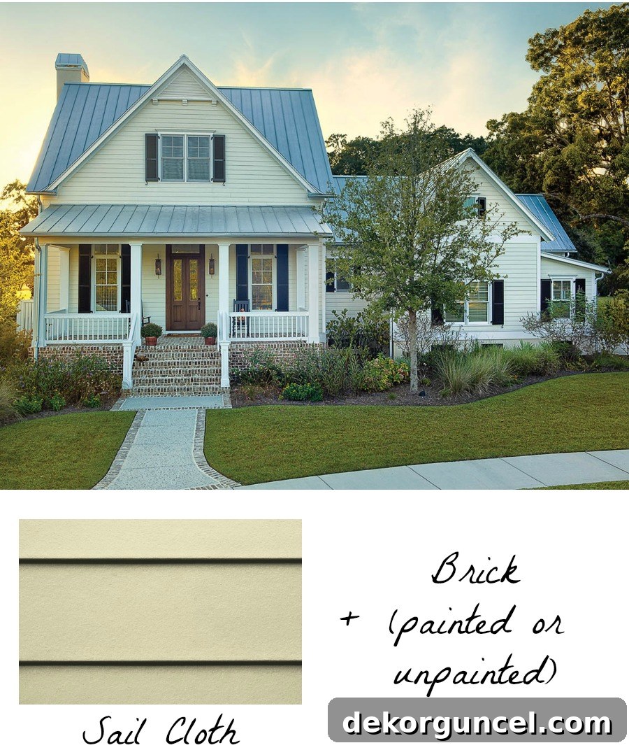
This combination not only provides excellent textural contrast but also grounds the home, giving it a sense of history and permanence. Whether you opt for the rugged charm of stone or the timeless appeal of brick, these natural materials beautifully complement the crisp lines and vibrant colors of James Hardie siding, resulting in an exterior that is both visually rich and incredibly durable.
4. Strategic Contrast: Extending Trim Colors for Architectural Impact
I have an undeniable affection for anything painted in a deep, sophisticated gray – a preference so strong it inspired the color choice for our kitchen island. This affinity naturally extends to exterior design, making me absolutely adore the dramatic dark gray and crisp white exterior of this home. However, what truly makes this facade stand out isn’t just the color palette, but a clever, subtle design technique that elevates its architectural interest: extending the color of the trim into a larger, more prominent portion of the home’s exterior.
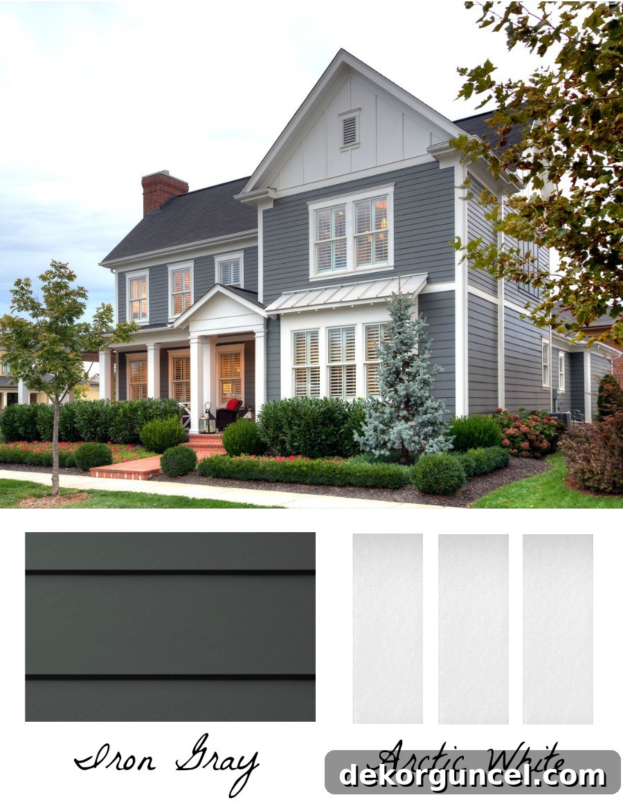
While Iron Gray HardiePlank lap siding covers most of the exterior, the designers went beyond conventional trim application. Instead of solely using Arctic White HardieTrim® around the windows and edges, they masterfully incorporated Arctic White HardiePanel vertical siding and HardieTrim Batten Boards across a significant section of the home’s second-story peak and over the portico leading to the front door. This strategic expansion of the trim color transforms a typically secondary element into a focal point, emphasizing the home’s verticality and architectural features. The result is a much more dynamic and intentional exterior, where the trim doesn’t just frame but actively participates in shaping the home’s overall aesthetic. This technique is perfect for homeowners looking to add a contemporary, architectural flair to their design, using color and material placement to create striking visual impact.
5. Playful Accents: A Surprise Pop of Color in Unexpected Places
While my preference steers clear of disparate color combinations on a home’s main facade, I’m absolutely captivated by the idea of injecting a delightful ‘pop of color’ in a less obvious, unexpected location. This ingenious approach adds a layer of personality and charm without disrupting the overall color harmony of the exterior. A perfect example of this creative design thinking is showcased on the ceiling of this long, inviting porch, where a vibrant hue provides a wonderful visual surprise.
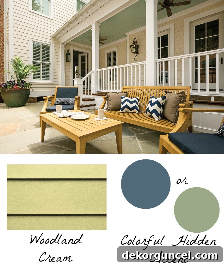
Isn’t it simply enchanting? The primary exterior color, a beautiful Woodland Cream HardiePlank lap siding, serves as an ideal canvas for this kind of playful color application. Its neutral and versatile nature allows it to coordinate effortlessly with a wide spectrum of other color families, including lush greens, serene blues, and warm reds. This adaptability makes Woodland Cream an excellent base for homeowners who wish to experiment with subtle yet impactful accents. Imagine a sky blue porch ceiling for a coastal vibe, a soft green for a natural retreat, or even a deep terra cotta for a Mediterranean feel. This design strategy encourages creativity, inviting homeowners to express their unique style in a delightful and memorable way, adding a touch of whimsy and unexpected beauty to their outdoor living spaces.
6. Modern Edge: Embracing Two Contrasting Trim Colors
A burgeoning design trend that has recently captured my attention, and one I’m seeing more and more of, involves the use of two contrasting trim colors – most often a sophisticated combination of black and white. This striking dual-trim approach is something I would absolutely love to incorporate into a future home design. It offers a contemporary edge and a powerful visual statement that truly enhances a home’s architectural lines. This beautiful home exemplifies the trend perfectly, showcasing crisp Arctic White HardieTrim paired with sleek black windows and gutters. The stark yet harmonious contrast between these two elements is incredibly striking and modern, creating a bold, defined aesthetic.
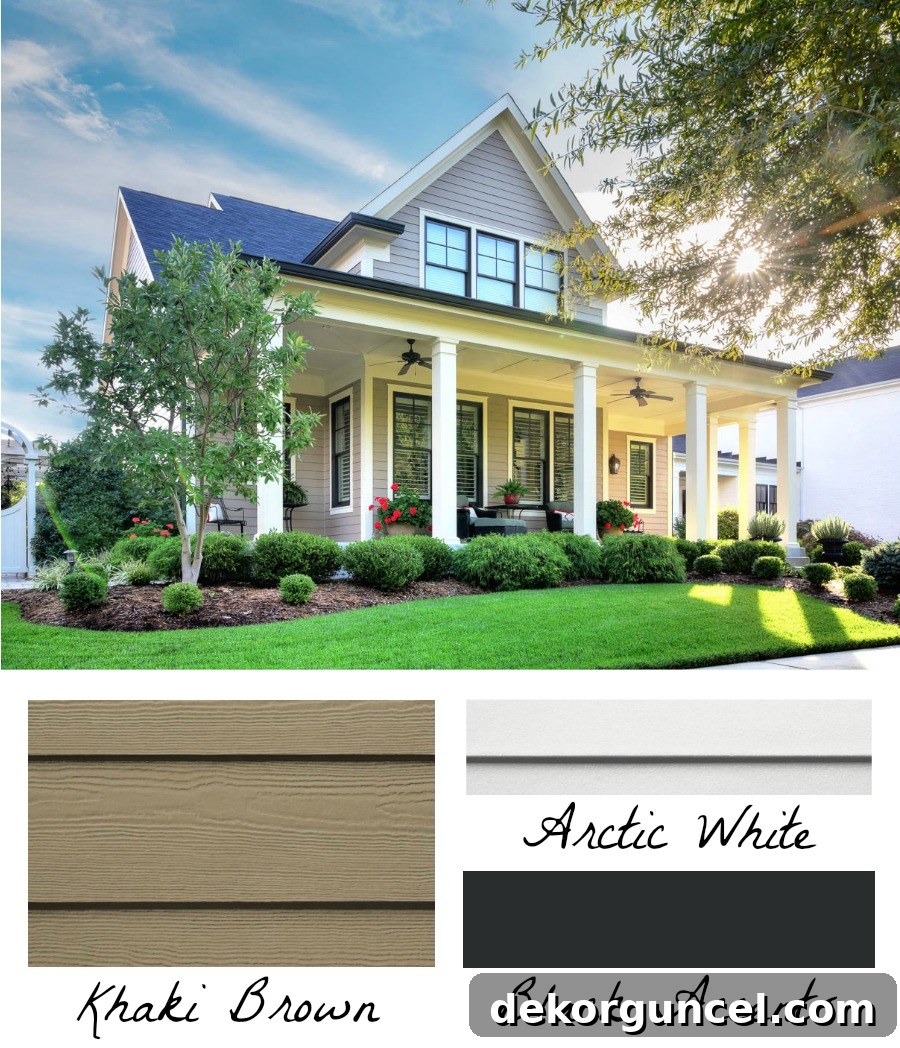
The key to successfully implementing a black and white trim combination lies in pairing it with a single, neutral color for the rest of your home’s body. This allows the contrasting trim to truly pop and define the structure without overwhelming the facade. On this particular home, the Khaki Brown HardiePlank provides an ideal neutral backdrop, allowing the black and white trim to create a captivating frame. Other excellent neutral body color choices could include a warm tan, a versatile gray, or even a pure white. This design strategy offers a fresh, contemporary take on exterior aesthetics, providing a bold yet balanced look that homeowners are increasingly drawn to for its sophisticated and enduring appeal.
Beyond Inspiration: Visualizing Your Dream Home with James Hardie’s Color Tool
After exploring these inspiring exterior design concepts, the next logical question often arises: “How do I know what colors will truly work together, and what won’t, on *my* home?” This is where James Hardie provides an invaluable resource that takes all the guesswork out of the equation: their exceptional online visualizer tool, which you can access {here}. This interactive platform is a game-changer for homeowners, allowing you to confidently experiment with different color combinations and see them come to life.
The first step in using this fantastic tool is selecting your main exterior color. It’s probably no surprise that I’d be drawn to one of their classic grays or serene blues, given their timeless appeal and versatility.
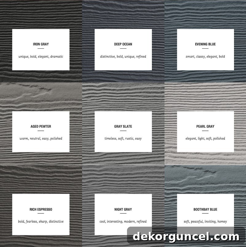
While James Hardie siding and trim products are also available primed, allowing for custom paint colors of your choice, I honestly believe their extensive palette of beautiful, pre-finished options is often the best route. Their advanced ColorPlus® Technology delivers a factory-applied finish that is significantly more durable and long-lasting than a typical on-site paint job. Choosing ColorPlus Technology means you could be saving yourself the headaches and expense of repainting for many years to come, offering exceptional value and sustained curb appeal.
Once you’ve selected your primary exterior color in the visualizer, the tool prompts you to choose an image that best represents your home’s architectural style (for me, the Farmhouse style is always a dream!). This step helps you realistically envision your chosen color palette. From there, you effortlessly move on to customizing the colors of your trim and accents, along with additional crucial elements like your roof, windows, front door, and shutters. This comprehensive approach ensures that every detail contributes to a harmonious and stunning exterior design.
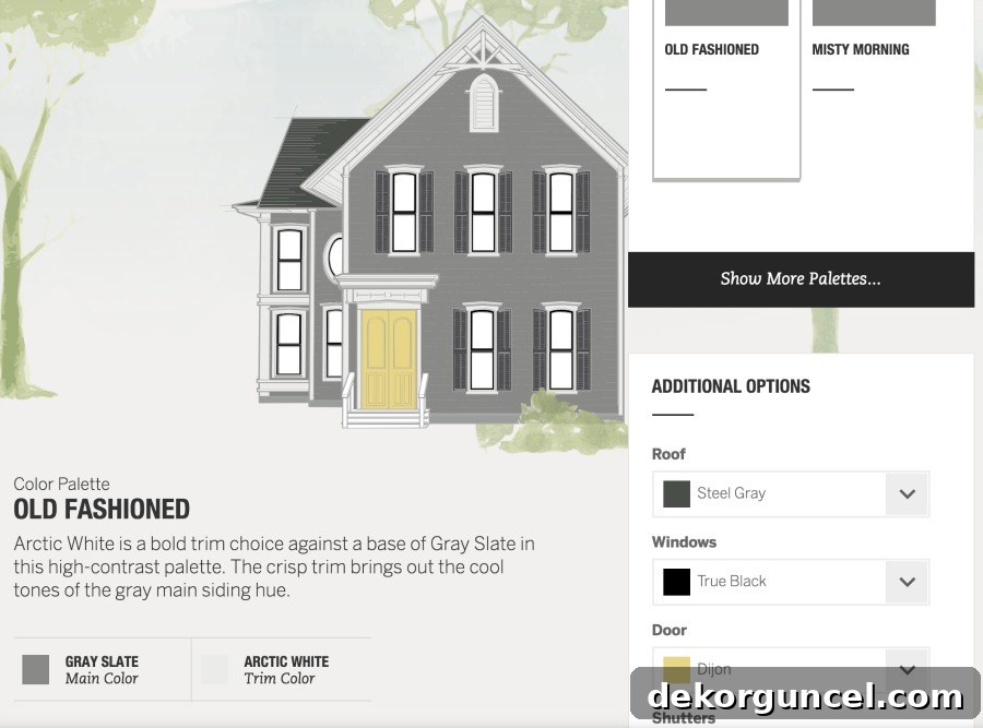
It’s incredibly enjoyable and insightful to play around with different combinations, discovering how various hues interact to create distinct moods and styles. Once you’re satisfied with your selections, the visualizer even offers a fun ‘color personality’ assessment based on your choices. Mine perfectly captured my aesthetic, stating, “You surround yourself with cool, calm-inducing hues. You’re laid back but are drawn to classic style.” Spot on! The tool also allows you to save your finalized palette, making it easy to share with family and friends for feedback, or to present to your contractor. This invaluable resource truly empowers homeowners to make confident, informed design decisions, ensuring their home’s exterior is not just beautiful, but perfectly tailored to their vision.
I’d genuinely love to hear about some of your favorite exterior color combinations. And, given the choice among the featured homes today, which one would you pick? For me, it’s a delightful toss-up between the Khaki Brown house with its striking black and Arctic White trim, and the serene Light Mist house – both are absolutely dreamy! For even more captivating exterior home inspiration and expert advice, make sure to download the comprehensive James Hardie Inspiration Guide {here}!
And before I bid you farewell, I have some exciting personal news: my kitchen remodel is FINALLY 100% complete! As in, all the touch-up paint is put away, ladders stored, and drop cloths neatly folded – it is DONE! I captured a crazy number of photos over the weekend and will be sharing a massive “before” and “after” reveal post either this weekend or early next week, so please stay tuned – I absolutely cannot wait to show it to you!
