
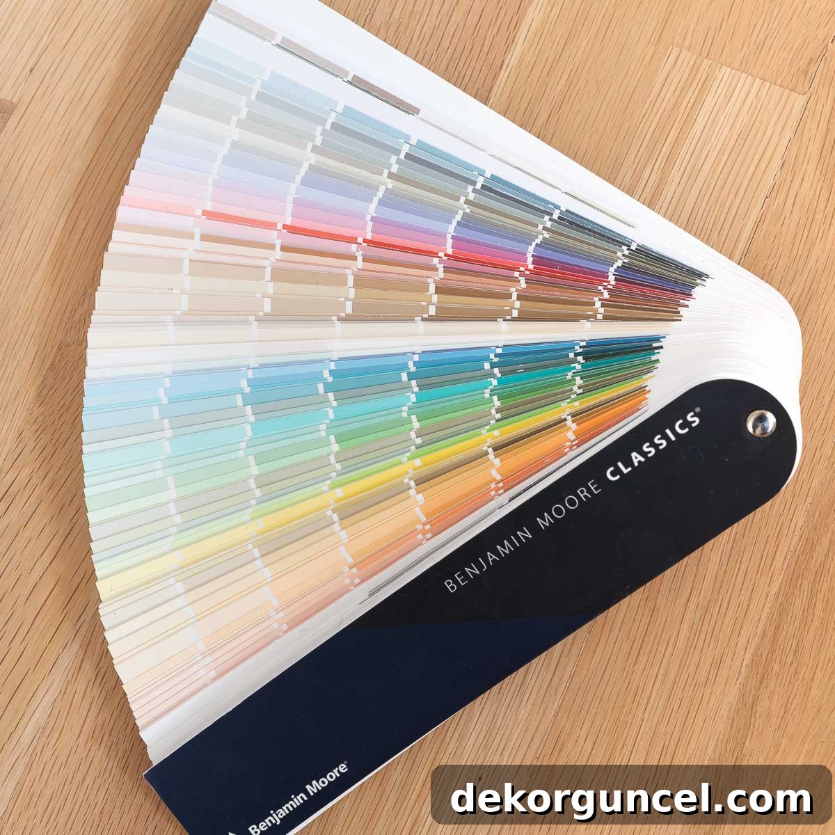
Embarking on a painting project for your home is an exciting venture, yet selecting the perfect paint color can often feel like navigating a complex maze. What appears captivating on a small swatch might transform dramatically once applied to your walls, influenced by countless variables. Fear not, for today we unveil eight invaluable strategies designed to demystify the paint selection process, ensuring you discover the ideal hue that brings your vision to life. Get ready to transform your space with confidence and style! (This post contains affiliate links; for our full disclosure statement, please click here.)
1. Don’t Expect a Paint Color to Look the Same in Different Homes
One of the most common misconceptions in paint selection is the expectation that a color seen in a friend’s home or a glossy magazine will replicate precisely in your own space. This simply isn’t the case. Paint colors are incredibly dynamic, appearing vastly different from one house to another, and even from room to room within the same dwelling. The unique characteristics of your home – including the volume of natural light, the direction your windows face, and your existing furnishings – all play a pivotal role in how a paint color truly manifests.
Consider the interplay of natural light: a north-facing room receives cooler, bluer light, which can make colors appear more subdued or even reveal unexpected grey or purple undertones. Conversely, south-facing rooms are bathed in warm, intense light throughout the day, often making colors appear brighter and more saturated. East-facing rooms enjoy bright, warm morning light that transitions to cooler tones in the afternoon, while west-facing rooms receive warm, golden light in the late afternoon and evening. This variability means a vibrant green in one room could appear muted in another, purely due to the direction of light.
Even within a single room, a paint color can exhibit remarkable variations across different walls or even distinct sections of the same wall. Our living room in a previous home serves as a perfect illustration. We adorned the walls with Sherwin Williams Anew Gray, a color we absolutely adored. Yet, I was consistently astonished by the dramatic shifts in its appearance on our fireplace wall:
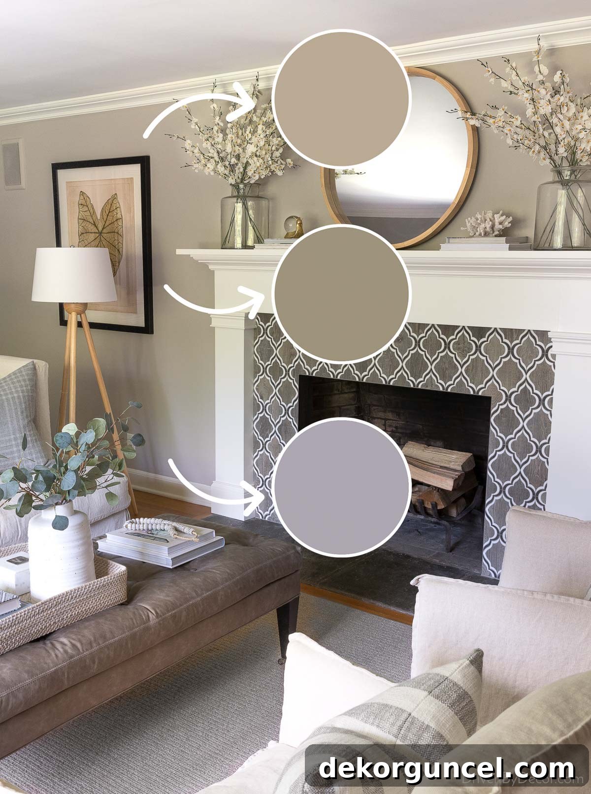
The subtle purple hue at the base of the wall was directly attributable to the cool, blue-tinted northern light streaming through the window during specific hours. While approximately 90% of the room received light that mirrored the top paint sample – precisely the color effect I desired – this nuanced understanding only came from diligently observing paint samples positioned strategically across the room. This invaluable lesson underscores the critical importance of evaluating your paint samples under diverse conditions.
Beyond natural light, artificial lighting (warm vs. cool bulbs), surrounding furniture, flooring, and even decorative accents contribute to the overall perception of your wall color. A vibrant red sofa, for instance, can reflect its warmth onto an adjacent wall, subtly altering the paint’s undertones. Therefore, to gain an accurate understanding of how a color will truly look in your specific environment, it’s essential to conduct thorough sampling. This leads us seamlessly to our next crucial tip…
2. Always Sample Your Paint Colors Thoroughly
Making an informed paint color decision based solely on minuscule, digitally printed color strips is akin to judging a book by its cover – it rarely tells the full story. The miniature scale and digital rendition of these strips often fail to accurately represent the true depth, undertones, and reflectance of a paint color once it’s applied to a large surface. To truly gauge a color’s potential, it is imperative to view generously sized samples of the actual paint within your unique space.
In the past, my method involved purchasing small sample pots of paint and meticulously brushing two coats onto foam boards. These portable boards could then be moved from wall to wall and room to room, allowing me to observe the color under various lighting conditions. While effective, this process was often messy and time-consuming. Fortunately, advancements in paint sampling technology have made this step considerably easier and more efficient.
Today, I wholeheartedly recommend using Samplize peel-and-stick paint samples. These innovative samples (available here) offer several distinct advantages over traditional methods:
- **Larger Size:** Samplize samples are substantially larger than the typical paint chips found in stores, providing a much better visual representation of the color spread across a wall.
- **Actual Paint Application:** Crucially, these samples are crafted using genuine paint rolled onto the sample material, rather than being digitally printed. This ensures an unparalleled color accuracy that digital representations simply cannot match.
- **Repositionable and Mess-Free:** The peel-and-stick design is a game-changer. You can effortlessly stick and re-stick the samples on different walls, at varying heights, and in multiple rooms without leaving any residue or causing damage. This flexibility allows for comprehensive testing without the mess or commitment of painting directly onto your walls.

When using samples, be sure to place them directly on the walls you intend to paint, not against a white background or another paint color, as this can skew your perception. Observe them throughout the day – morning, afternoon, and evening – to see how the color interacts with changing natural light. Also, consider viewing them under your artificial lighting sources. This diligent approach to sampling will significantly increase your chances of selecting a paint color that you will love for years to come.
3. Understand Light Reflectance Value (LRV)
Beyond aesthetics, the scientific properties of paint play a vital role in its appearance. Every paint color possesses an LRV, or Light Reflectance Value, which is a standardized metric indicating the percentage of visible and usable light that a paint color reflects from its surface. This scale spans from 0 to 100, where 0 represents pure black, absorbing all light, and 100 signifies pure white, reflecting all light. In practical terms, a lower LRV indicates a darker paint color that will absorb more light, making a room feel cozier or more intimate. Conversely, a higher LRV suggests a lighter color that will reflect more light, contributing to a brighter, more expansive feel.
Grasping LRV empowers you to make highly informed decisions about brightness and mood. For instance, if you currently have Sherwin Williams Alpaca, a popular greige, on your bedroom walls and find its brightness level just right, but are now contemplating a shift to a blue palette, comparing LRVs is an excellent strategy. Alpaca has an LRV of 57. If you’re exploring blue paint colors, Benjamin Moore Smoke, with an LRV of 56, would be an excellent contender. This numerical proximity suggests that Smoke will offer a similar “not-too-dark, not-too-light” visual weight, ensuring the desired brightness is maintained even with a completely different hue.
Utilizing LRV is especially beneficial when aiming for specific atmospheric effects. In smaller rooms or those with limited natural light, opting for a color with a higher LRV can help maximize the available light, making the space feel more open and airy. Conversely, in expansive, brightly lit rooms, a lower LRV can create a sense of depth, warmth, and intimacy. It’s a powerful tool for balancing light and shadow, influencing how spacious or cozy a room feels.
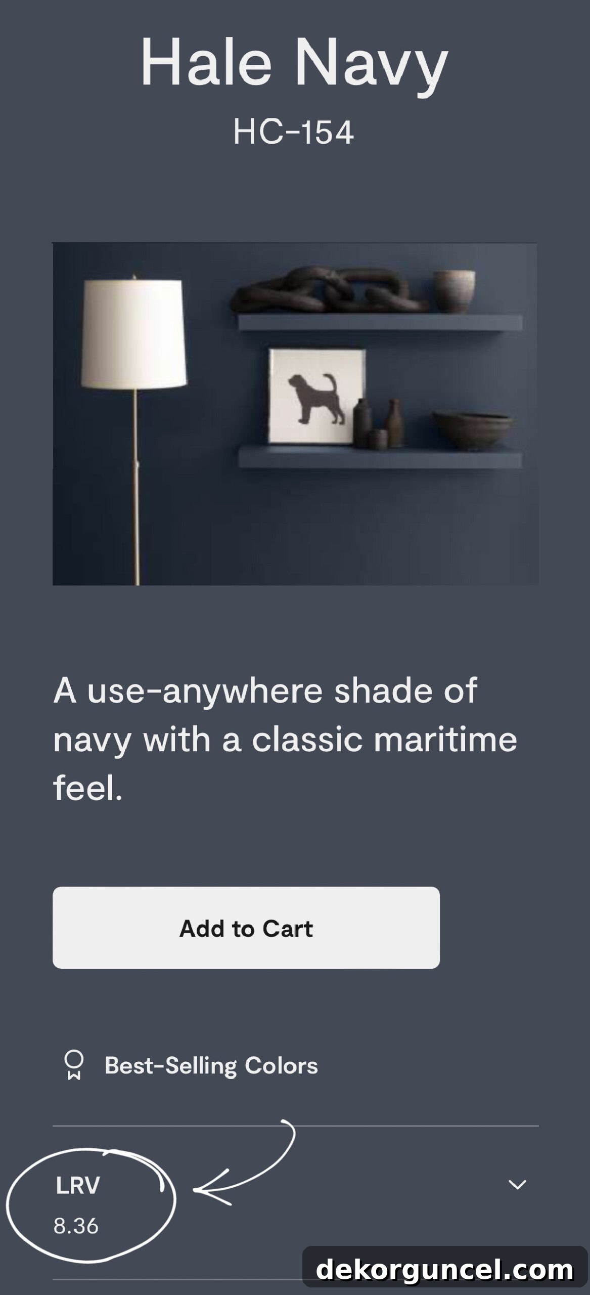
While LRV is typically not printed directly on the small paint chip, it is readily available on the paint company’s official website for each specific color. For Benjamin Moore colors, you can generally locate the LRV by navigating to the individual color page:
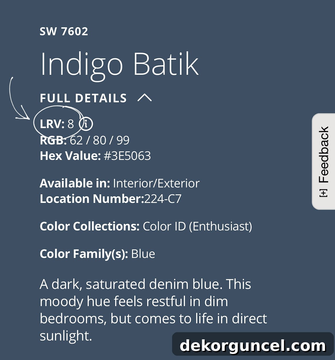
For Sherwin Williams, you’ll find this information by selecting the desired color and then clicking on the “full details” option, which usually expands to reveal comprehensive data, including the LRV:
Incorporating LRV into your decision-making process provides a quantifiable measure that complements your visual observations, helping you achieve a balanced and harmonious environment tailored to your preferences.
4. Avoid the Temptation of Color Matching
The allure of replicating a premium paint brand’s exquisite color using a more budget-friendly alternative is undeniable. It’s often tempting to take a beloved shade from a brand like Benjamin Moore and request it be mixed into a less expensive base from Behr or another similar company. However, this seemingly clever cost-saving measure frequently leads to disappointment, as true color matching across different brands is an elusive ideal.
The fundamental issue lies in the proprietary nature of paint formulations. Each paint manufacturer uses unique base paints and distinct colorant systems. These colorants are composed of different pigments, in varying concentrations, and interact differently with the specific base formula. Consequently, when a paint store attempts to “color match” by analyzing a chip from one brand and mixing it into another’s base, they are essentially trying to replicate a complex chemical composition with an entirely different set of ingredients. The result is rarely, if ever, an exact match. Instead, you often end up with a color that is “close enough” but lacks the precise depth, vibrancy, or subtle undertones of the original.
This discrepancy is particularly pronounced with white paint colors. Whites are deceptively complex, often containing subtle undertones of yellow, blue, red, or green that become apparent only once applied to a large surface. When clients express surprise that their chosen white paint color exhibits completely different undertones than anticipated, my first inquiry is almost always about whether they attempted to color match it with a different brand. In approximately 95% of these instances, the answer is yes, underscoring why the final color deviates significantly from their expectation.
While there might be rare instances where you achieve a reasonably good color match for a very specific, simple hue, it is far from guaranteed. The risk of investing time and money into a paint job only to be dissatisfied with the outcome makes it a gamble I generally advise against. Unless you are painting a low-stakes area, such as a child’s playroom or a utility closet, where a precise color match is not critical, it’s typically not worth rolling the dice. For rooms where color precision and aesthetic impact are important, stick with the original brand’s formula to ensure you get the exact color you envision.
5. Choose Your Paint Sheen Carefully
The sheen, or finish, of your paint is more than just a surface detail; it’s a critical factor that profoundly influences both the aesthetic appeal and the long-term durability of your painted walls. A shinier finish, such as satin or gloss, will inherently make your chosen paint color appear brighter and more reflective due to its higher light-reflecting properties. Conversely, a flatter or matte finish will absorb more light, resulting in a softer, more muted appearance of the same color.
To illustrate this effect, consider our “circus room,” where Benjamin Moore Simply White was used on both the walls and the shiplap ceiling. Despite being the exact same color, they present as two distinctly different whites. The satin finish on the ceiling amplifies its brightness, making it appear significantly whiter than the flat finish applied to the walls:
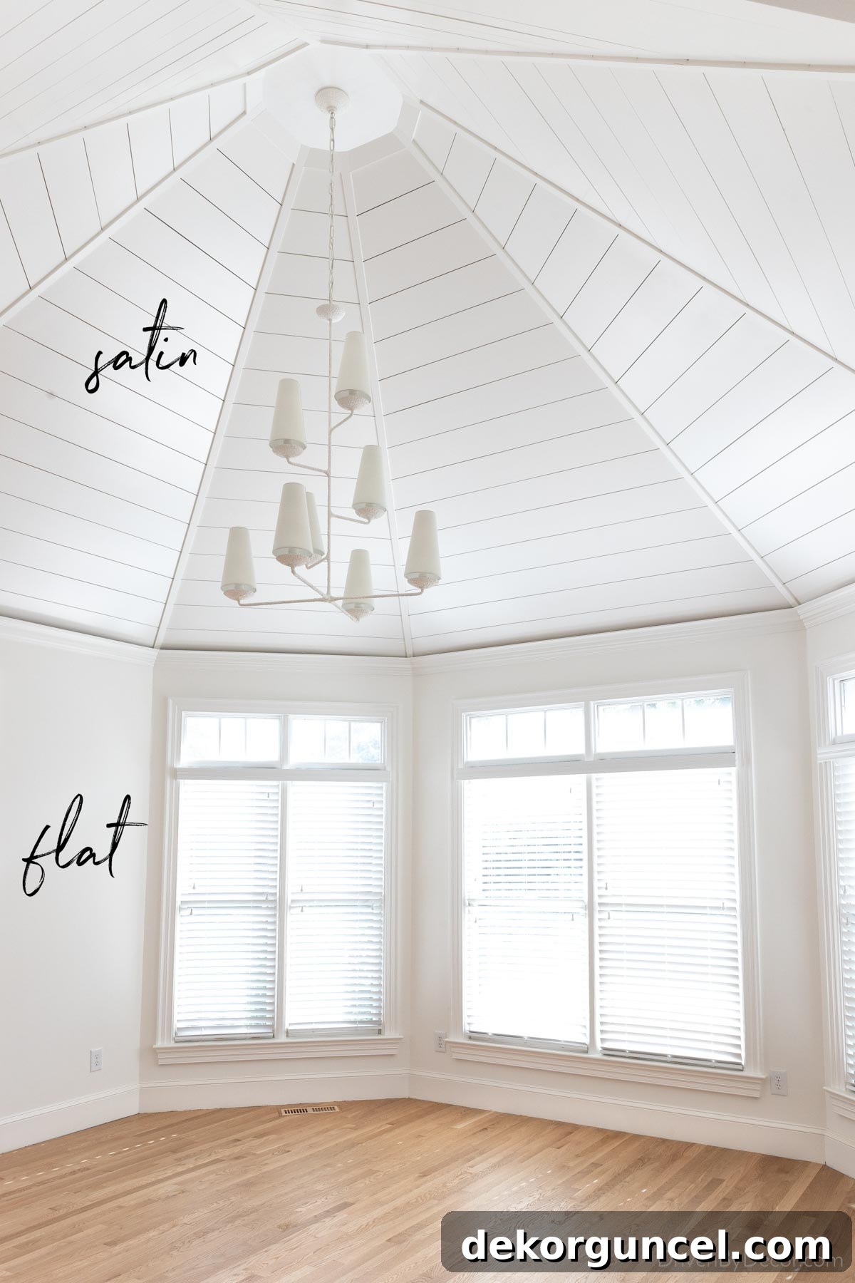
Beyond visual impact, your lifestyle and the specific function of the room should heavily weigh into your sheen decision. Generally, the glossier the sheen, the more resilient it becomes. Higher gloss paints are more scrubbable, resistant to moisture, and easier to clean, making them ideal for high-traffic or high-humidity environments. Conversely, flatter sheens excel at hiding wall imperfections – such as minor bumps, dings, or uneven textures – and are typically easier to touch up seamlessly without revealing sheen differences. Here’s a breakdown of typical uses for various paint sheens:
- Gloss & Semigloss: These durable, highly reflective finishes are primarily reserved for trim work such as baseboards, window casings, and doors, as well as cabinetry. Their robust nature makes them resistant to frequent handling and cleaning. Semigloss is also a practical choice for bathrooms or laundry rooms where high moisture levels are common, as it creates a barrier that prevents water absorption.
- Satin: Offering a soft, subtle sheen, satin paint is a popular and versatile choice for rooms that experience moderate to high traffic or moisture. This includes kitchens, children’s bedrooms, hallways, and bathrooms. It balances durability with a pleasing aesthetic.
- Eggshell: Often considered the most common sheen for interior walls, eggshell provides a low-luster finish that resembles an eggshell, hence the name. It’s highly suitable for living rooms, dining rooms, and adult bedrooms where moderate use is expected, offering good durability and a warm, inviting appearance.
- Flat & Matte: These are the least reflective finishes. Flat paint offers a completely non-reflective, velvety appearance, making it exceptional at concealing surface imperfections. Matte paint has a barely perceptible touch more sheen than flat, offering slightly improved scrubbability while retaining the ability to hide flaws. Both are ideal for low-traffic areas like formal dining rooms, master bedrooms, and especially ceilings, where their light-absorbing qualities create a smooth, consistent look.
While these are general guidelines, personal preference and specific paint technologies can allow for deviations. For instance, I personally prefer to paint all the walls in our home with flat or matte finishes. My rationale is threefold: (1) I aesthetically favor the understated elegance and visual softness of a lower sheen; (2) I appreciate how effortlessly low sheens can be touched up without noticeable sheen variations, a common issue with higher gloss paints; and (3) I no longer contend with young children leaving handprints all over the walls. Even for our recent master bathroom remodel, I opted for a matte finish using Benjamin Moore’s Aura Bath & Spa paint (color: Benjamin Moore Chantilly Lace), a specialized formulation designed for moisture-prone environments, proving that modern paint technology can offer both desired aesthetics and necessary performance.
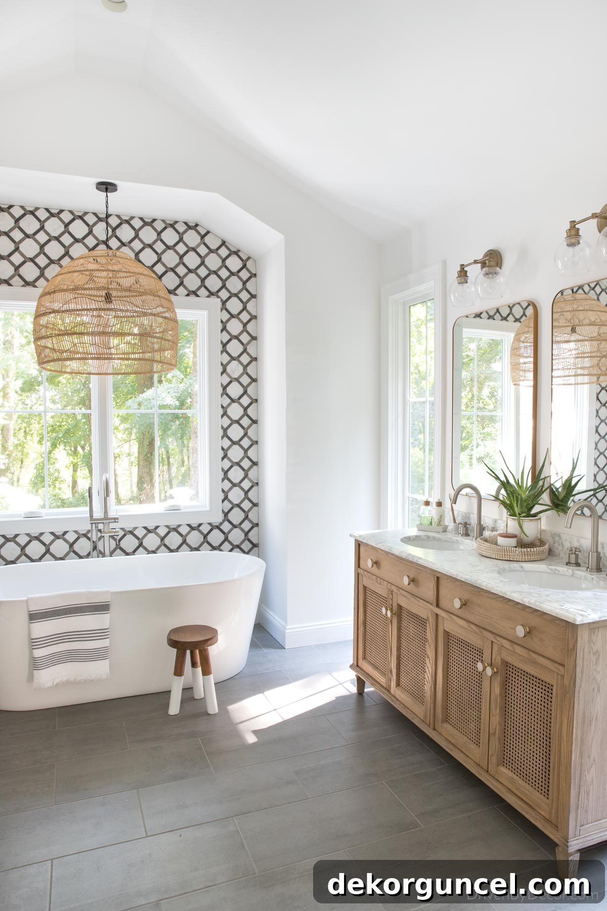
Sources: Double vanity | Vanity knobs | Bathroom faucets (brushed nickel) | Vanity lights | Vanity mirrors (gold) | Soap & lotion sink set with tray | Woven pendant | Freestanding bathtub | Tub filler | Dipped leg stool | Striped towel
6. Design Your Room First, Then Choose Paint
A common pitfall in interior design is selecting a paint color as the very first step in decorating a room, then attempting to build the entire design around it. This approach often leads to frustration and limited creative options. Instead, adopt a more flexible and strategic philosophy: finalize the core design elements of your space – including furniture pieces, fabrics, artwork, and rugs – *before* you choose your paint color. This ensures a harmonious and cohesive outcome.
Think of paint as the ultimate chameleon in your design toolkit. There are literally thousands of paint colors available, offering an almost infinite spectrum of shades, tints, and undertones. This vast selection means that once your primary decor elements are in place, you will invariably find a paint color that perfectly complements and enhances them. The reverse, however, is significantly more challenging. Trying to source furniture, textiles, and accessories that perfectly match a very specific, pre-selected paint color can be an exhausting and often fruitless endeavor, frequently resulting in compromises that detract from your overall vision.
My preferred method for designing any room begins with identifying one or two “star” pieces that truly excite me and serve as the foundational inspiration for the space. This could be a striking pillow fabric, a captivating piece of art, a luxurious rug, or even a cherished heirloom piece of furniture. These elements often carry a richer, more complex color palette or texture that is harder to replicate, making them ideal starting points. For instance, our dining room’s design was built entirely around {this rug}, which I instantly fell in love with:

Every subsequent design choice for the room – from the artwork adorning the walls to the elegant sideboard lamp – was carefully selected to complement and harmonize with the statement-making rug, creating a truly unified and visually pleasing environment:
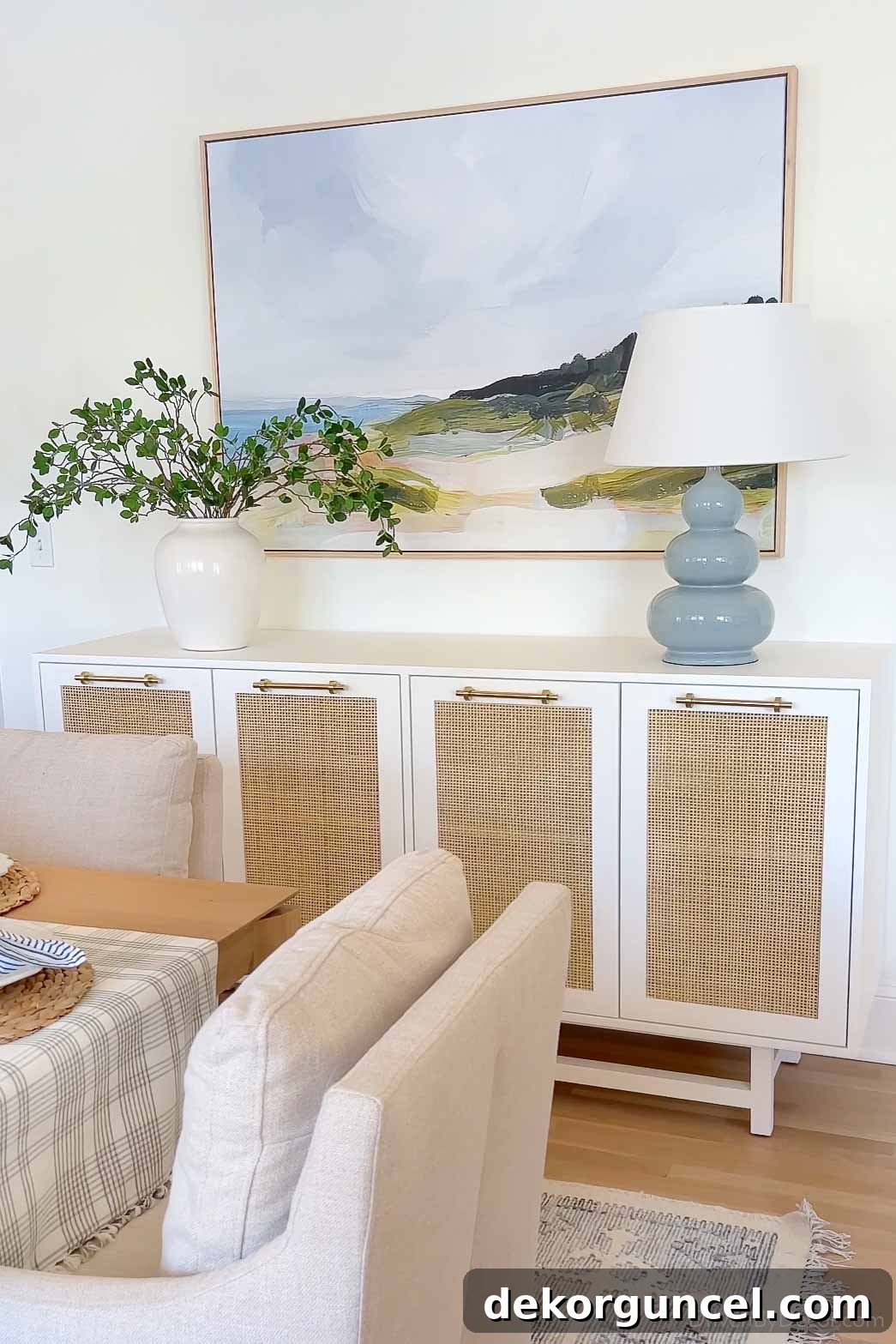
Room sources: End chair | Side chair | Table | Sideboard | Lamp | Vase (similar) | Greenery | Art
By prioritizing your decor, you grant yourself the flexibility to explore a vast array of paint options, ensuring the chosen color truly acts as the perfect backdrop, unifying all elements and enhancing the overall ambiance of your meticulously designed space.
7. The Transformative Power of Lightbulbs
Even with meticulous planning and careful sampling, selecting the perfect paint color isn’t always foolproof. Sometimes, despite all efforts, the finished walls might not quite capture the envisioned hue, revealing unexpected undertones or a general disharmony. Before you resign yourself to repainting, consider a powerful yet often overlooked secret weapon in a designer’s arsenal: a simple lightbulb swap can sometimes make all the difference, subtly yet significantly altering the perceived color of your walls.
Lightbulbs are not all created equal; they emit light across a wide spectrum of “color temperatures,” which dictates how warm (more yellow-toned) or cool (more blue-toned) the light appears. This characteristic is measured in Kelvin (K) and is usually clearly indicated on the lightbulb packaging. Understanding this spectrum allows you to manipulate the visual impact of your paint color.
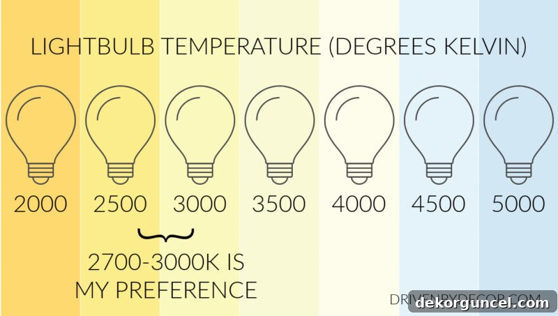
- Lower Kelvin (2700K – 3000K): These bulbs emit a warmer, softer, more yellowish light, similar to traditional incandescent bulbs or candlelight. If your paint color appears too cool or sterile, switching to a lower Kelvin bulb can introduce warmth, making the color feel cozier and more inviting. This is often desirable in living rooms and bedrooms.
- Mid-Range Kelvin (3500K – 4000K): Often referred to as “neutral white” or “cool white,” these bulbs offer a balanced light that is neither overly warm nor excessively cool. They are excellent for general task lighting and can help colors appear truer to their original shade without strong yellow or blue casts.
- Higher Kelvin (5000K – 6500K): These bulbs produce a cooler, brighter, and bluer light, akin to daylight or overcast skies. If your paint color seems too warm, yellow, or muddy, a higher Kelvin bulb can help to neutralize these tones, making the color appear crisper and cleaner. This is often beneficial in bathrooms, kitchens, and home offices where natural light is valued.
For example, if your chosen beige paint appears unexpectedly yellow, swapping your existing warm-toned lightbulbs (e.g., 2700K) for ones with a higher Kelvin rating (e.g., 4000K or 5000K) can effectively reduce the perceived yellowness, pushing the color closer to its intended neutral. Conversely, if a cool grey or blue paint feels too stark or cold, introducing warmer lightbulbs can soften its appearance and make the room feel more welcoming. This strategy is particularly effective and crucial in rooms with minimal to no natural light, such as internal bathrooms, laundry rooms, or basements, where artificial lighting is the sole determinant of how a paint color is perceived. Don’t underestimate the subtle yet powerful influence of your lightbulbs; they are an integral component in defining your room’s ambiance and color accuracy.
8. Create Seamless Color Flow Throughout Your Home
When selecting a paint color for a specific room, it’s essential to consider it not in isolation, but as part of a larger, cohesive narrative that flows throughout your entire home. While painting every room the exact same color is certainly not a requirement, creating a thoughtful and intentional color palette that connects spaces elevates your home’s aesthetic from disjointed to harmonious. A well-executed color flow imparts a sense of calm, sophistication, and a feeling that every design choice has been carefully considered.
Achieving color flow doesn’t mean monotony. It involves choosing a primary neutral backdrop (whites, greys, beiges) that extends through hallways and main living areas, then introducing complementary or analogous colors in adjacent rooms. This creates a visual connection, guiding the eye smoothly from one space to the next. You might use varying shades and tints of the same core color or select colors that share common undertones, ensuring they feel related even if they are distinct hues. For example, if your living room has a warm greige, an adjacent dining room could feature a muted green with warm undertones, maintaining a harmonious feel.
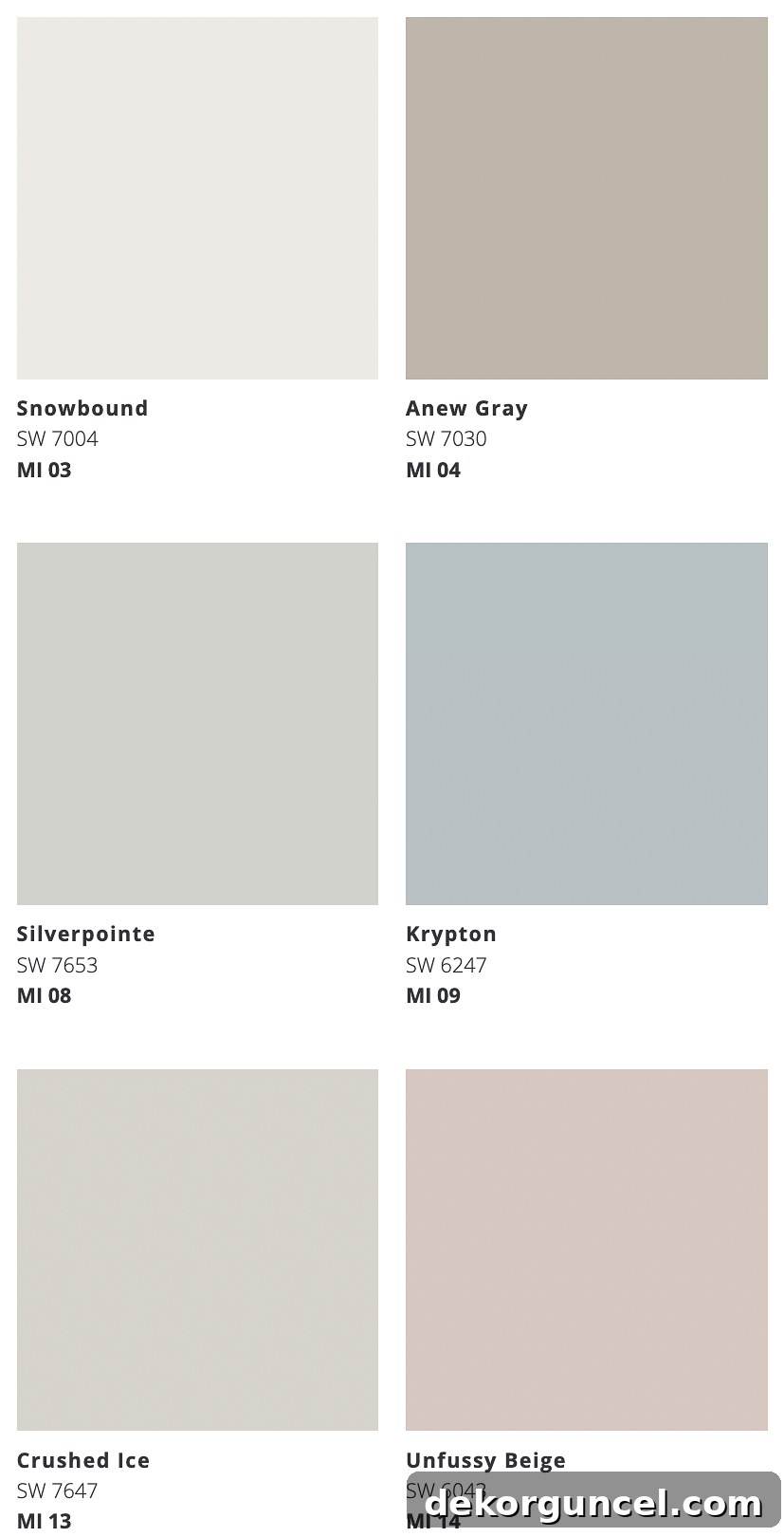
Resources like Sherwin Williams’ Color ID palettes are excellent starting points for understanding how different colors can beautifully mix and match. These curated palettes are designed by experts to provide a collection of colors that inherently work well together, making it easier for homeowners to build a whole-home scheme with confidence. I particularly appreciate their “minimalist palette,” which, along with several other complementary shades, features these six foundational colors:
Having a whole-home color palette doesn’t preclude you from venturing into bolder, more distinct choices in certain areas. In fact, these controlled bursts of color can add personality and intrigue without disrupting the overall flow. As far as I’m concerned, anything goes in children’s rooms – they are perfect canvases for vibrant and imaginative hues. Similarly, smaller, more contained spaces like powder rooms and laundry rooms offer fantastic opportunities to get creative with daring colors or patterns, as their impact is limited to that specific zone, allowing you to experiment freely.
Armed with these insightful tips, you’re now equipped to approach your next painting project like a seasoned color-picking professional. Make painting a room or two a priority on your to-do list, and witness firsthand how a simple change in paint color can utterly revitalize and transform a space! For detailed guidance on executing your painting project, explore our posts on how to paint a room like a pro and how to paint an interior door with precision. And if you’re seeking recommendations for tried-and-true favorite paint colors, delve into our curated selections on:
Best Blue Paint Colors
Greige Paint Colors
Best White Paint Colors
My Home’s Paint Colors
XO,
