
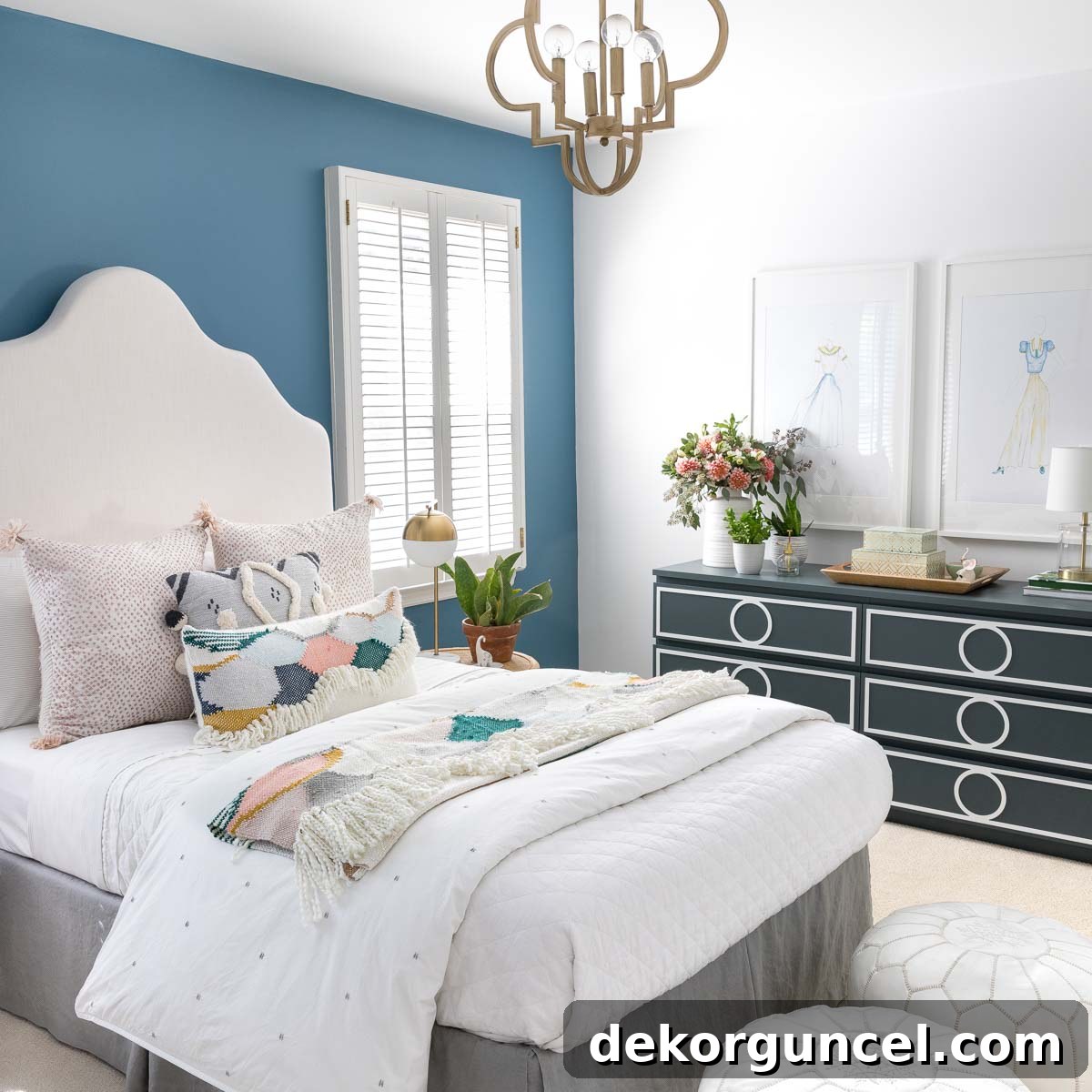
Get ready to be inspired! We’re thrilled to unveil the captivating transformation of my daughter’s bedroom into a dreamy boho sanctuary. Without investing in a single new piece of major furniture, we managed to completely revolutionize the room’s aesthetic and vibe, all thanks to the incredible power of paint and a thoughtfully curated palette of boho bedroom colors. This makeover proves that with a little creativity and strategic planning, you can achieve a stunning, personalized space that reflects unique style. My daughter and I absolutely adore the serene yet vibrant atmosphere we’ve created. Ready to explore how we did it? (This post contains affiliate links, meaning I may earn a small commission at no extra cost to you if you purchase through them. For full disclosure details, please click here.)
Crafting the Perfect Boho Bedroom Color Palette
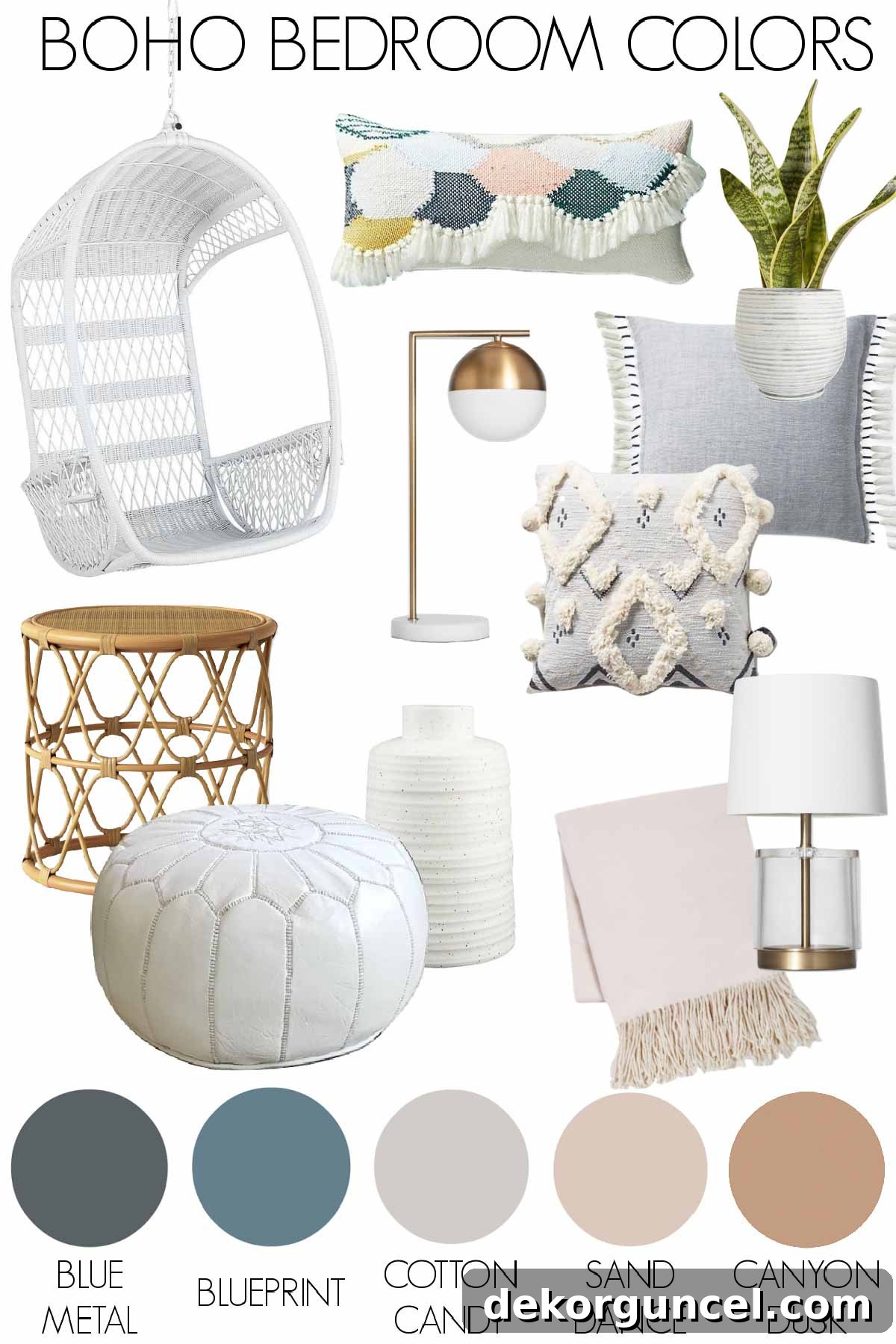
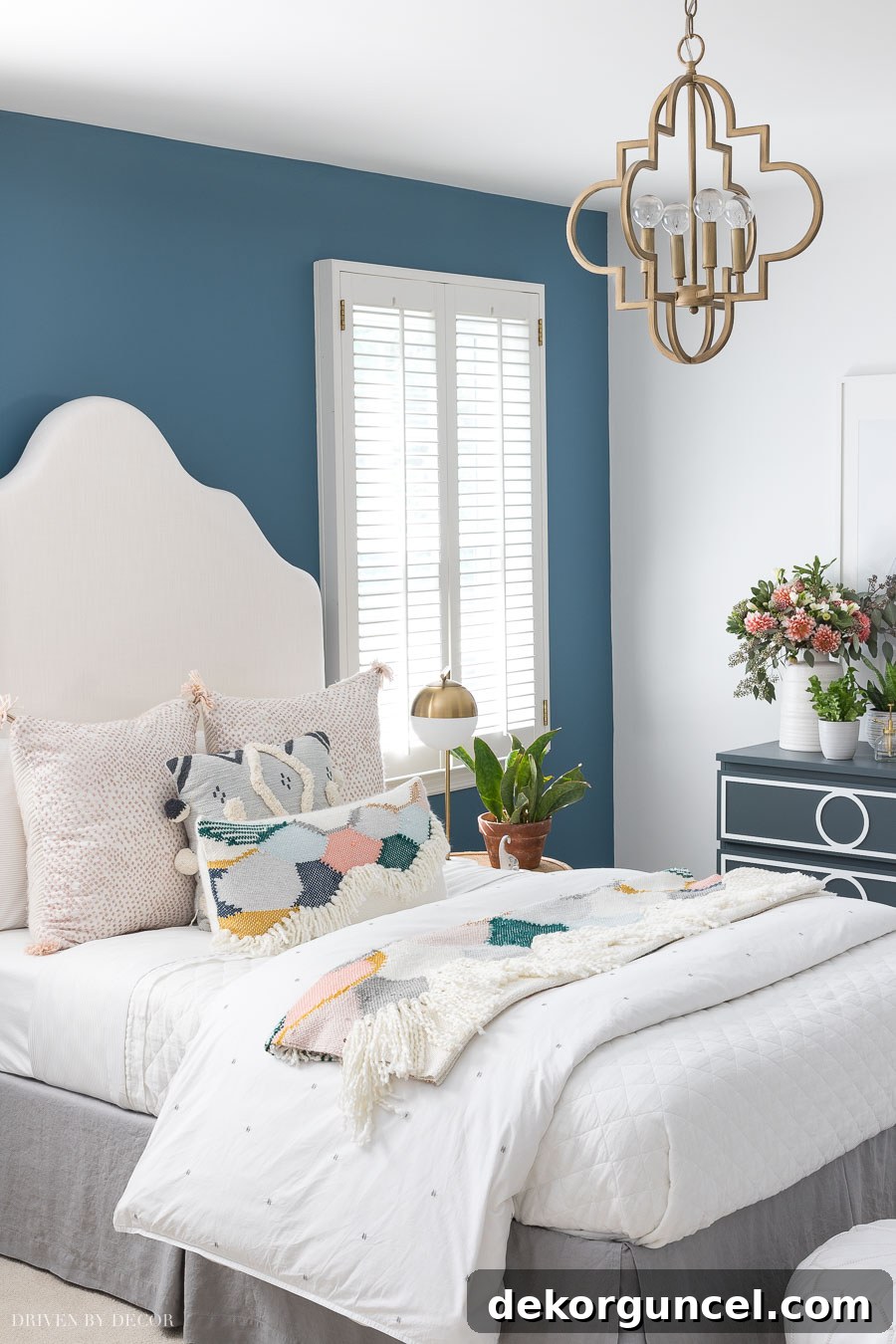
The foundation of any successful room transformation lies in its color scheme. For this boho bedroom makeover, we embarked on a journey to find the ideal balance of calming blues and soft pastels, ensuring the space felt both lively and tranquil. Our starting point was Behr’s Blueprint, a beautifully saturated yet soft blue that immediately set the tone for the room. This gorgeous shade served as our anchor, from which we built a cohesive and harmonious palette.
To complement Blueprint, we introduced Behr’s Blue Metal, a sophisticated dark blue-gray that adds depth and a touch of moody elegance without overwhelming the space. To prevent the room from feeling too cool, we carefully integrated softer pastels. Behr’s Cotton Grey provided a subtle, airy neutral, while Sand Dance brought in a delicate, dusty rose hue, infusing warmth and a gentle pop of color. To further enrich the bohemian feel, we incorporated natural woven neutrals, mirroring the earthy tones found in shades like Canyon Dusk, which seamlessly blend with the painted surfaces. The result is a vibrant yet serene boho bedroom color palette that feels both cohesive and inviting.
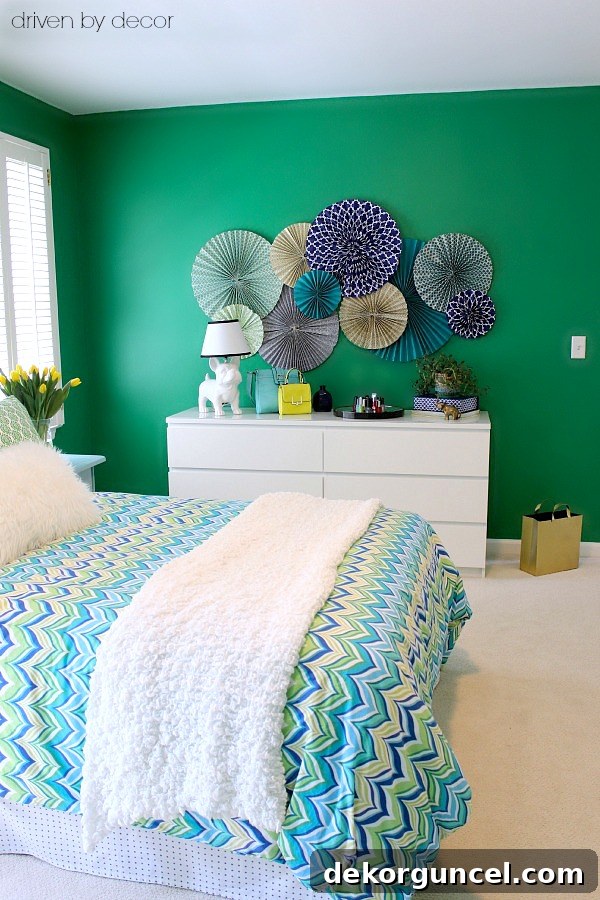
Witnessing the dramatic change as we said “bye-bye” to the room’s previous bright green walls and welcomed the calming embrace of Behr Blueprint was truly exhilarating. This specific shade provides the perfect balance – it’s colorful enough to be engaging, yet possesses a soft, sophisticated quality that prevents it from being overpowering, making it an ideal choice for a teen’s retreat.
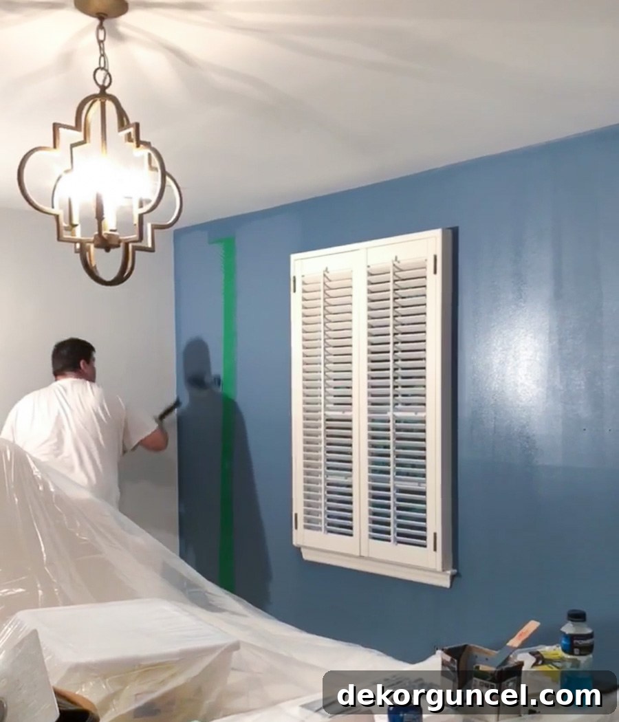
Once the initial coats were dry, we knew we had made the perfect choice for the accent wall. Blueprint radiates a sophisticated charm that truly grounds the space. For the remaining three walls, we opted for White 52 in a matte finish. This is a truly versatile white, striking the perfect balance between warm and cool, ensuring it complements the Blueprint beautifully without clashing. We extended this crisp white to the trim and doors, utilizing a satin finish to provide a subtle contrast in sheen and enhance durability. This thoughtful combination creates a bright, expansive feel while allowing the accent wall to shine as a focal point.
After the professional painters completed the wall work, it was my turn to tackle some smaller, yet impactful, DIY projects. This included transforming her dresser and closet. With the major painting complete, we moved on to finalizing the bedding and accessories, carefully selecting pieces that would further enhance our boho vision. The culmination of these efforts brought the entire room together, and both my daughter and I couldn’t be more delighted with the stunning results. It truly feels like a brand-new space, filled with warmth and personal touches.
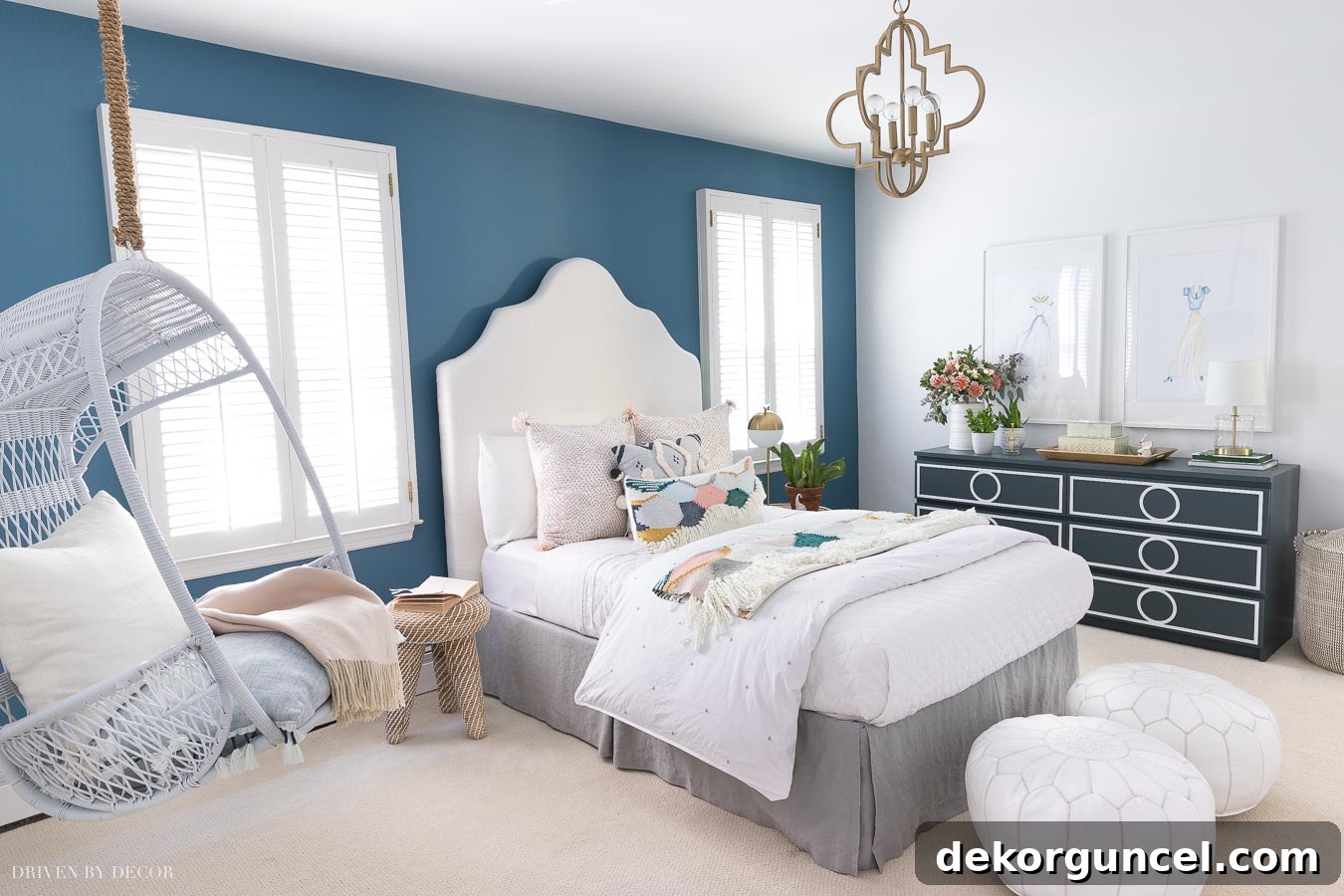
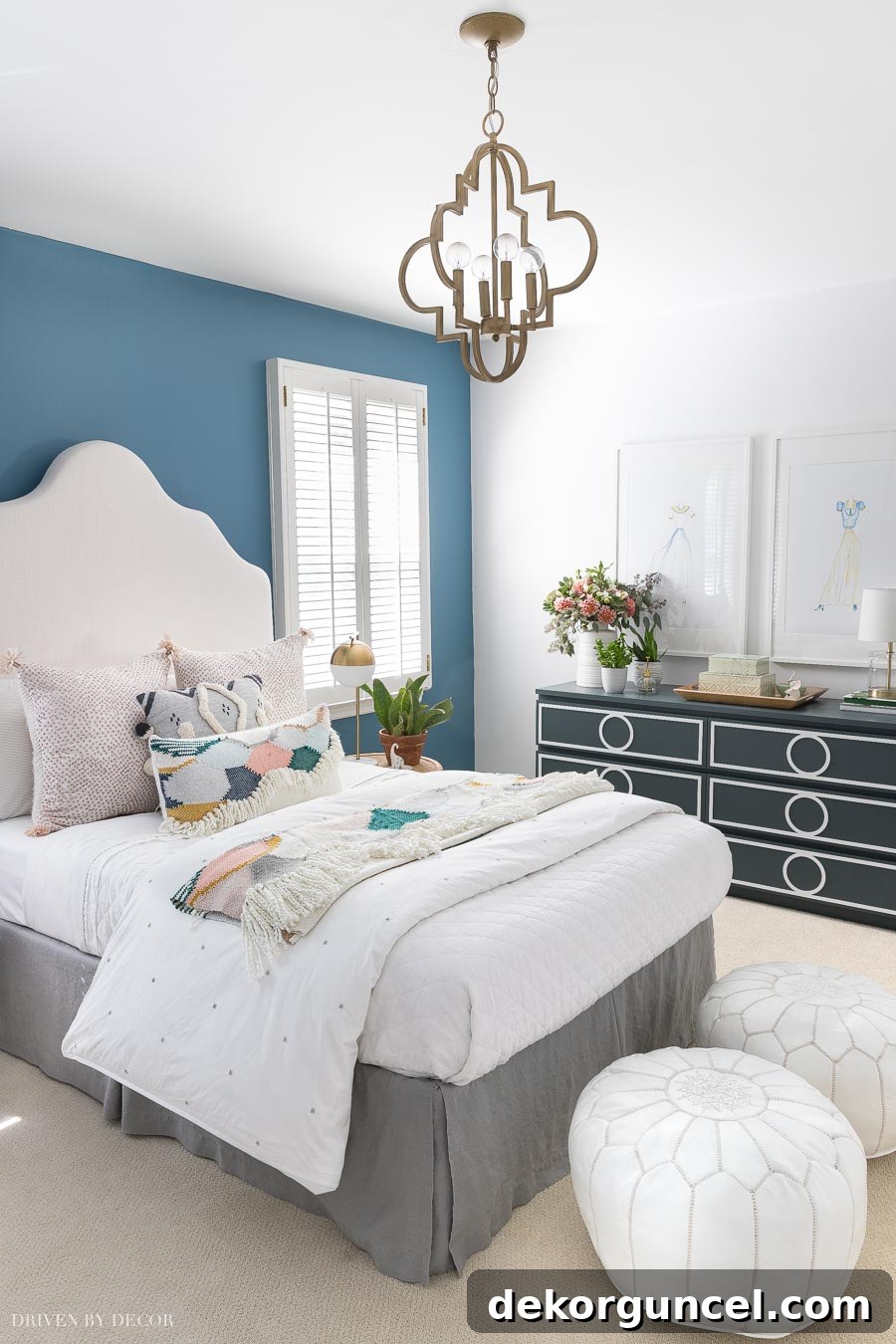
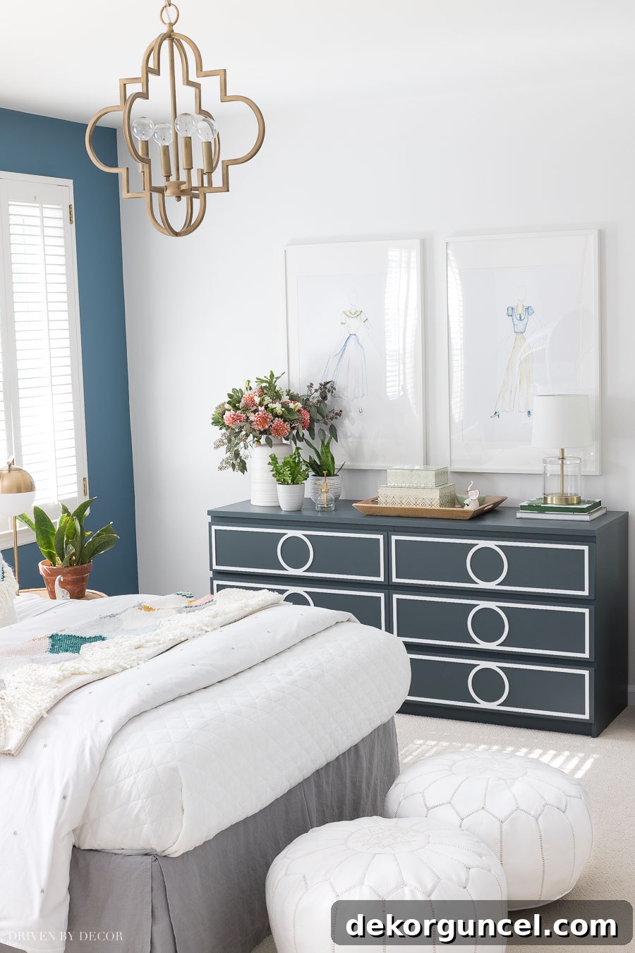
Bedroom Sources & Key Elements: DIY upholstered headboard | Elegant Quatrefoil pendant light | Crisp white quilt for versatile bedding | Stylish white leather poufs for flexible seating | Modern acrylic lamp for dresser illumination | Other bedding & accessories are no longer available but inspired similar looks.
To infuse a playful yet sophisticated energy, we carefully selected a colorful array of pillows for the bed. This included two charming blush mini polka dot pillows, a beautifully patterned blue pillow that echoed the accent wall, and a unique scalloped lumbar pillow (unfortunately, no longer available). This mix created a dynamic focal point, adding layers of texture and color that are essential for a true boho aesthetic.
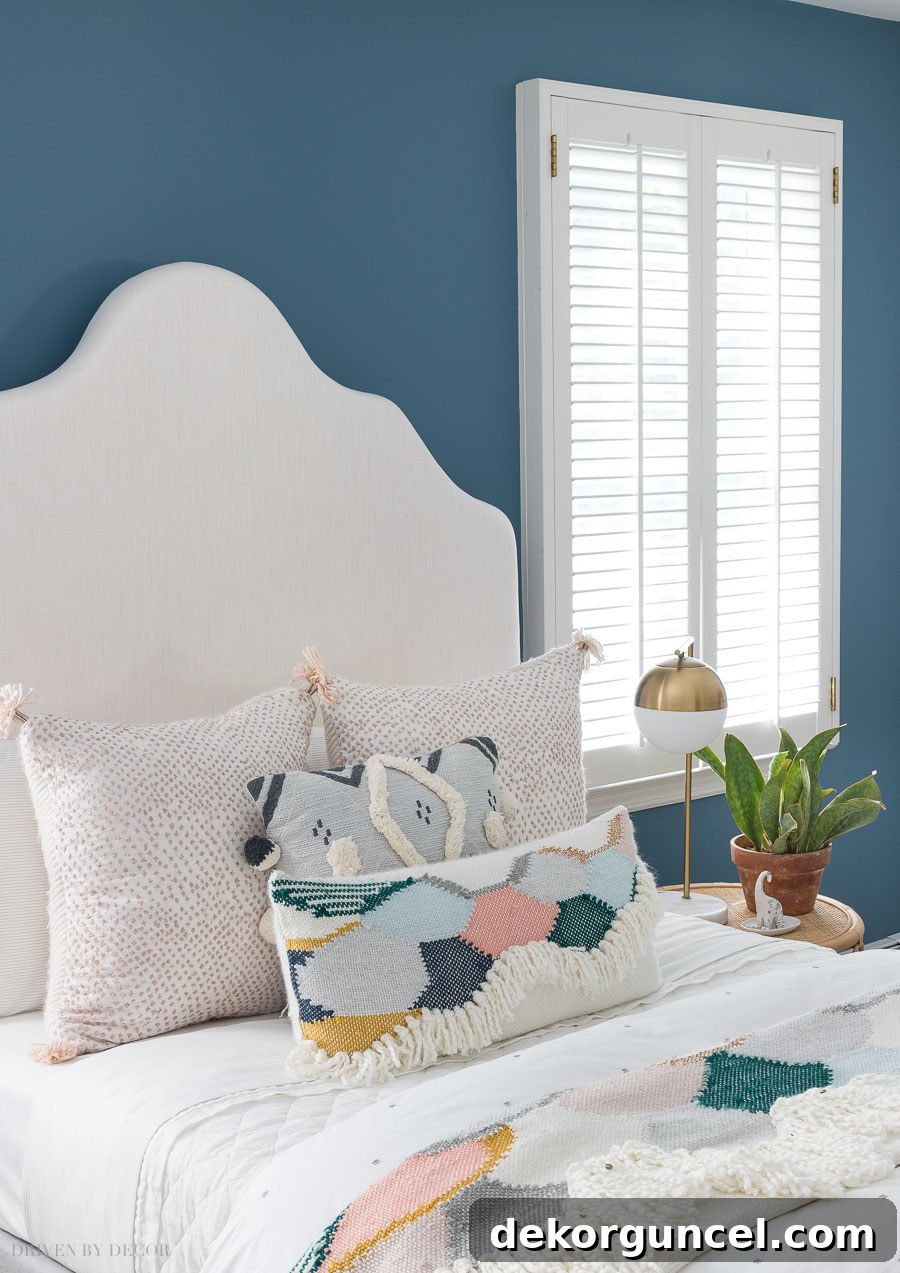
While the vibrant throw blanket adds a unique and personalized touch that truly reflects my daughter’s taste, we made a conscious decision to keep the major bedding pieces wonderfully neutral. This strategic choice offers incredible longevity and versatility. Should my daughter’s style evolve in the future, we won’t need to purchase entirely new foundational bedding. The white quilt we selected, a beloved piece I now own in three of our bedrooms due to its fantastic washability and comfort, along with a simple white duvet adorned with subtle gray dots, provides a timeless base that will effortlessly complement any future decor changes. This approach allows for easy updates with smaller, more affordable accessories like pillows and throws.
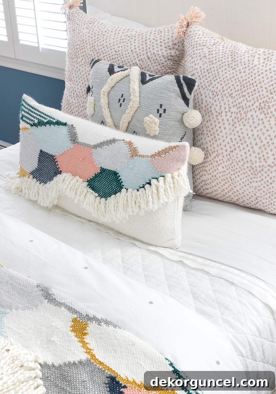
The upholstered headboard, a DIY project I completed several years ago, proved to be a perfect fit for this newly re-imagined space. Its classic design seamlessly integrated into the bohemian aesthetic, demonstrating the power of reusing existing pieces. Beyond incorporating our curated palette of boho bedroom colors through fresh bedding, we discovered several other ingenious ways to inject personality and color into this enchanting room.
Revitalizing Furniture: The Power of a Painted Piece
Before the exciting makeover, my daughter’s bedroom housed this standard white IKEA Malm 6-drawer dresser. While it offered ample storage and was perfectly sized for her room, its utilitarian design left much to be desired in terms of aesthetic appeal. It was, quite frankly, a blank canvas crying out for a creative intervention to align with our burgeoning boho theme.
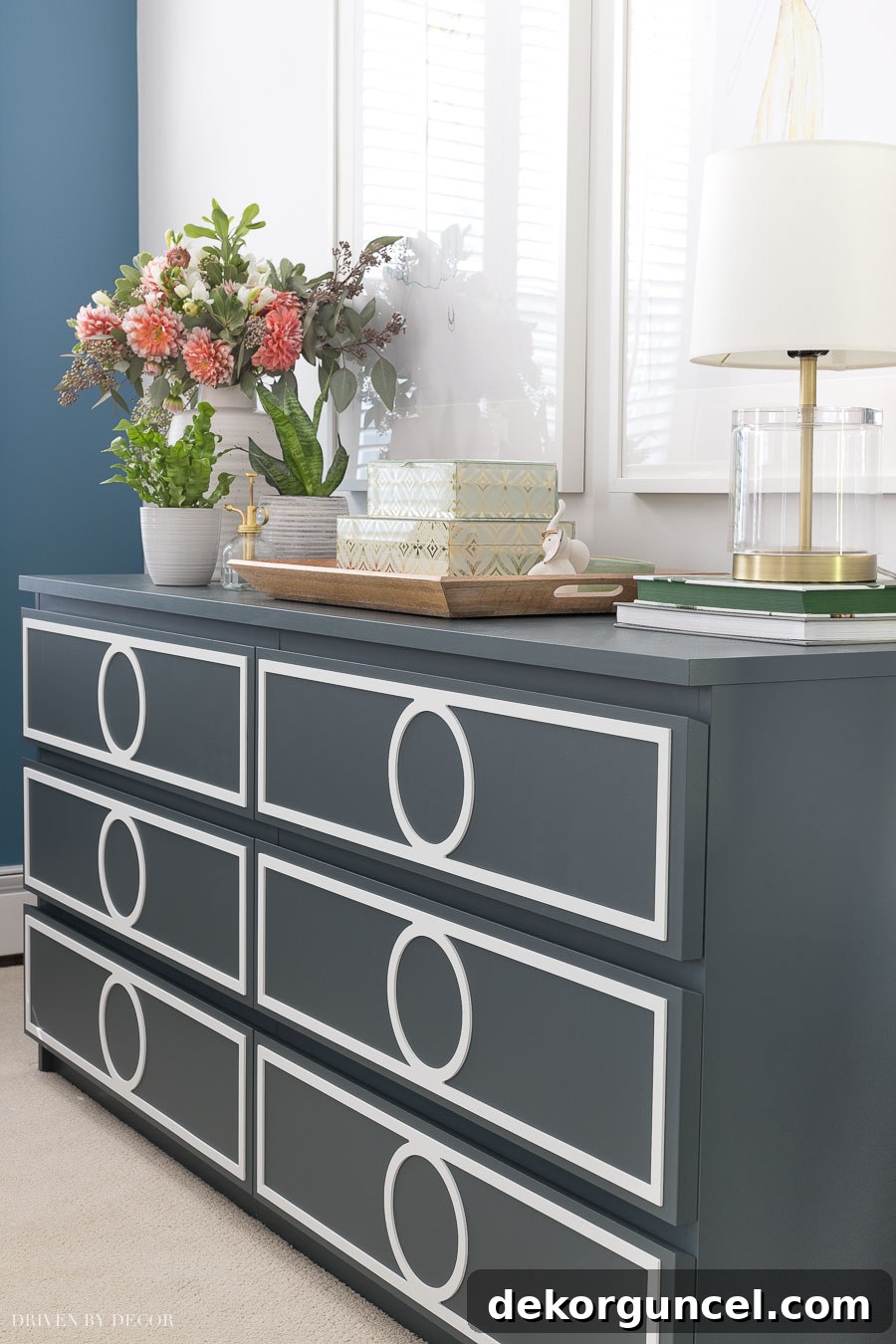
With a fresh coat of paint and some ingenious overlays, this ordinary piece was utterly transformed, now looking like a bespoke, high-end dresser perfectly suited for a chic boho bedroom!
The process I followed to transform this everyday IKEA Malm dresser into a stunning statement piece was surprisingly straightforward and achievable for any DIY enthusiast:
- Preparation is Key: I began by giving the entire dresser a light sanding. To ensure maximum adhesion for the primer, especially on the glossy IKEA surface, I followed up with a liquid sander/deglosser, such as this highly effective product. While either method alone might suffice, using both provided extra assurance for a durable finish.
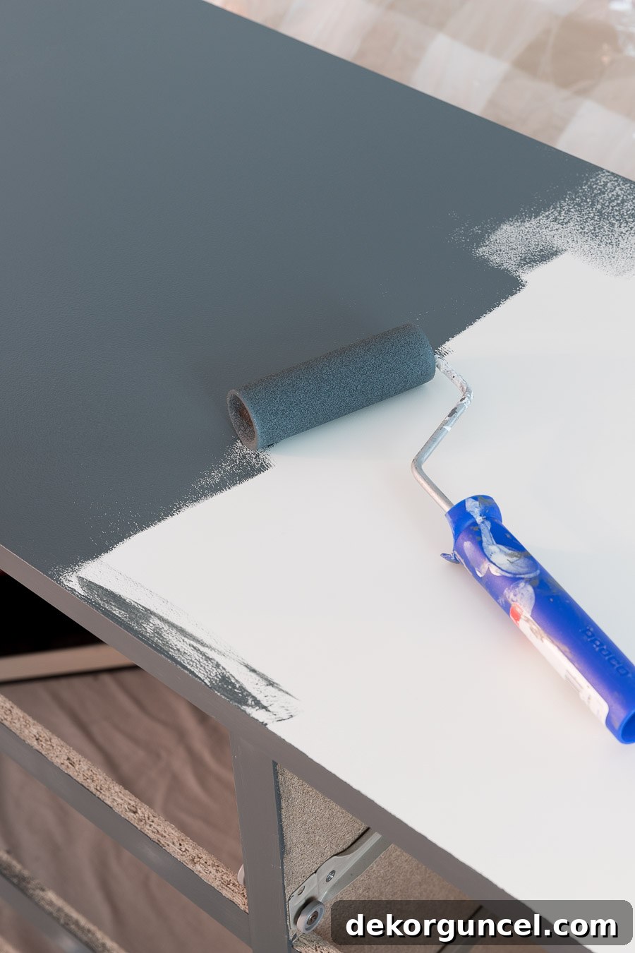
- Priming for Perfection: Next, I removed all the drawers and meticulously primed both the dresser body and the drawer fronts. For smooth surfaces like this, a small roller with a ¼″ nap, similar to this recommended type, works wonders to achieve a flawless, streak-free base.
- Painting with Precision: The painting process mirrored the priming steps. The secret to avoiding roller marks is speed – apply the paint quickly and evenly, as these thin coats dry rapidly. I chose Behr’s Blue Metal, a truly gorgeous deep blue-gray that beautifully complements the room’s bohemian color scheme. Although one coat often provides impressive coverage, particularly over primer, I always recommend applying 2-3 thin coats for furniture pieces. Allowing ample drying time between each coat is crucial for achieving maximum durability and a professional-looking finish that will stand the test of time.
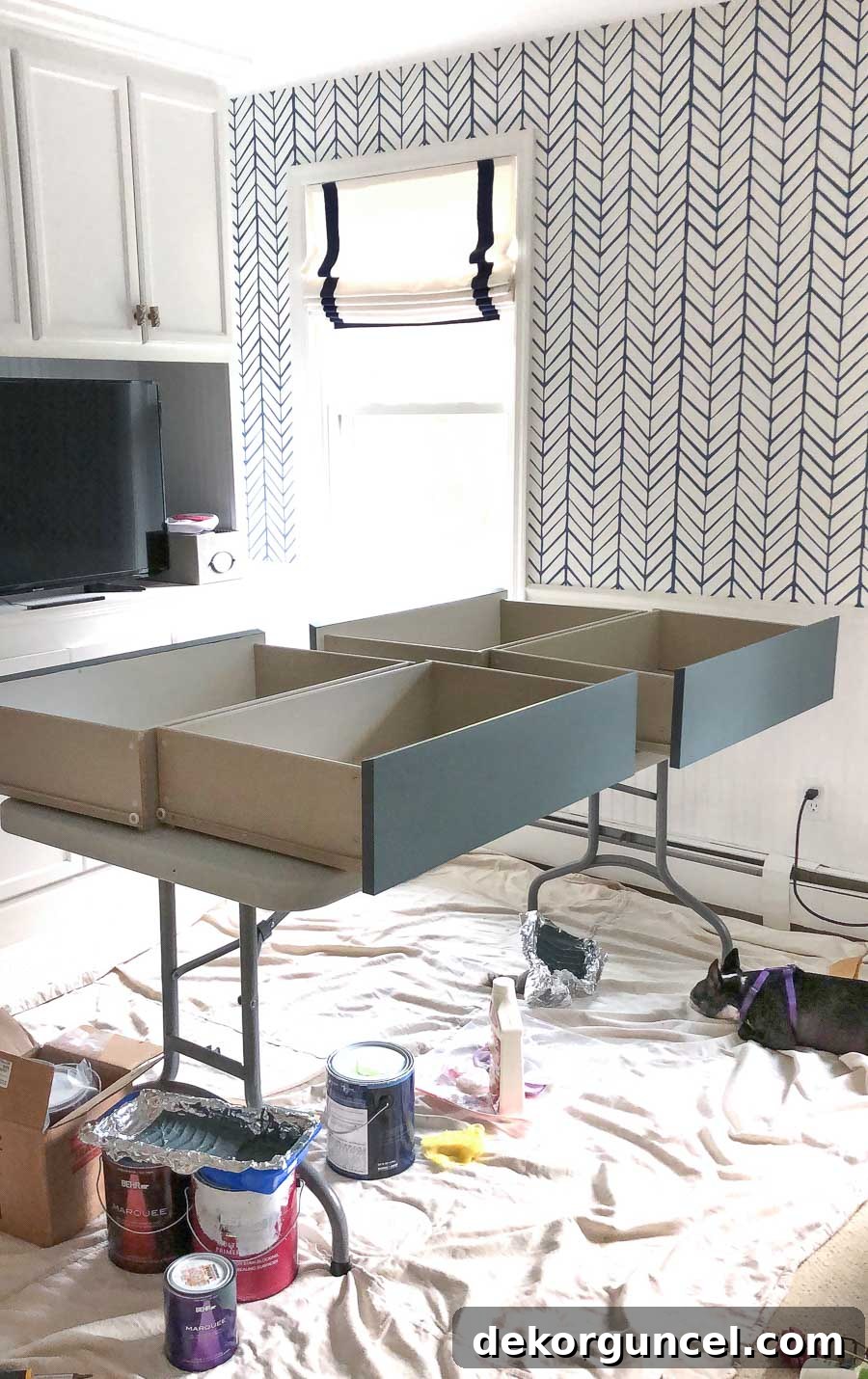
To efficiently paint the dresser drawers, I strategically arranged them on an old folding table, ensuring the front ends faced outwards for easy access and consistent application. As you can see, I even had a dedicated “furry project supervisor” diligently monitoring my progress, ensuring I stayed focused on the task at hand!
4. Protective Finish for Longevity: As a crucial final step, especially for furniture that will endure frequent use, applying a protective coating is highly recommended. A water-based polyurethane, particularly on the top surface, will significantly enhance durability and protect your beautiful paint job. Once applied, it’s vital to allow your freshly painted furniture piece to dry and fully cure for at least a week before regular use. This ensures the paint hardens completely, preventing nicks and scratches.
Typically, once the painting is complete, my furniture projects are finished. However, for this dresser, I took it a step further to truly elevate its appearance. I added these elegant overlays to the front of each drawer. These decorative panels are custom-designed to fit popular IKEA dressers and are easily attached with a strong adhesive, such as Liquid Nails. This simple addition makes an astonishing difference, transforming a basic piece into something truly unique and stylish!
Personalized Wall Art: Art that Complements Your Color Palette
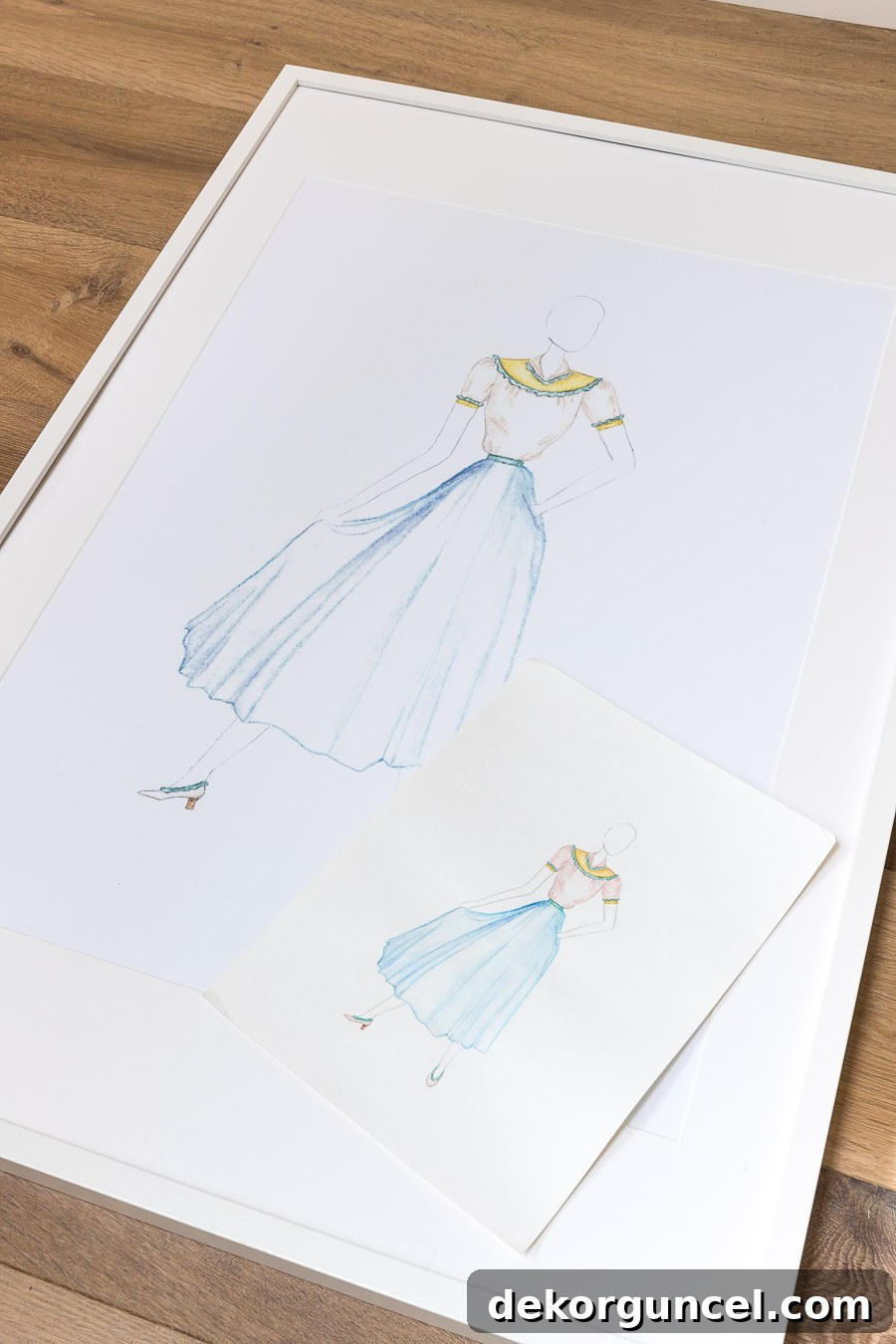
Above the beautifully revamped dresser, we installed two large framed prints that are incredibly special and unique. These aren’t just any store-bought art; they are actual enlargements of two of my daughter’s very own fashion design sketches. This personal touch perfectly encapsulates the bohemian spirit of individuality and creativity, making the room truly hers.

I absolutely adore framing my girls’ artwork! Not only is it an incredibly budget-friendly way to decorate (especially when utilizing simple, affordable frames like these versatile IKEA frames), but it also infuses the space with a deeply personal and meaningful touch that mass-produced art simply cannot replicate. The process was wonderfully simple: I took two of my daughter’s cherished sketches to our local copy shop and had them professionally enlarged to the precise dimensions needed to perfectly fill the frames. This DIY art project adds immense character and a unique narrative to the room, tying into the bespoke feel of the boho design.
Bringing Life and Vibrancy with Greenery
In addition to the personalized art prints, we strategically placed several vibrant plants atop her dresser. These natural elements instantly breathed life and an undeniable sense of beauty into the room. Unlike my own less-than-stellar track record with houseplants (I possess a notorious “black thumb”), my daughter has a natural affinity for plants and absolutely thrives on having them around. Incorporating greenery was therefore an effortless decision and a perfect complement to the organic, fresh feel of the bohemian aesthetic. The various textures and shades of green add depth and a soothing natural touch, enhancing the overall tranquility and visual appeal of the space.
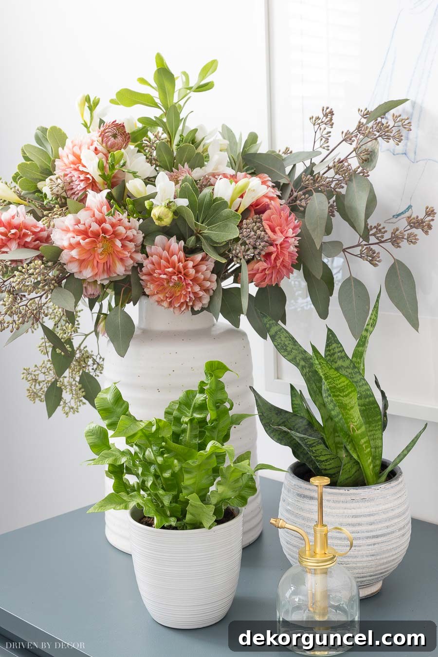
Greenery & Planter Sources: Elegant tall vase for displaying flowers | Stylish gray stripe planter for houseplants | Functional plant mister for nurturing greenery
Enhancing Interest with Woven Neutrals and Textured Elements
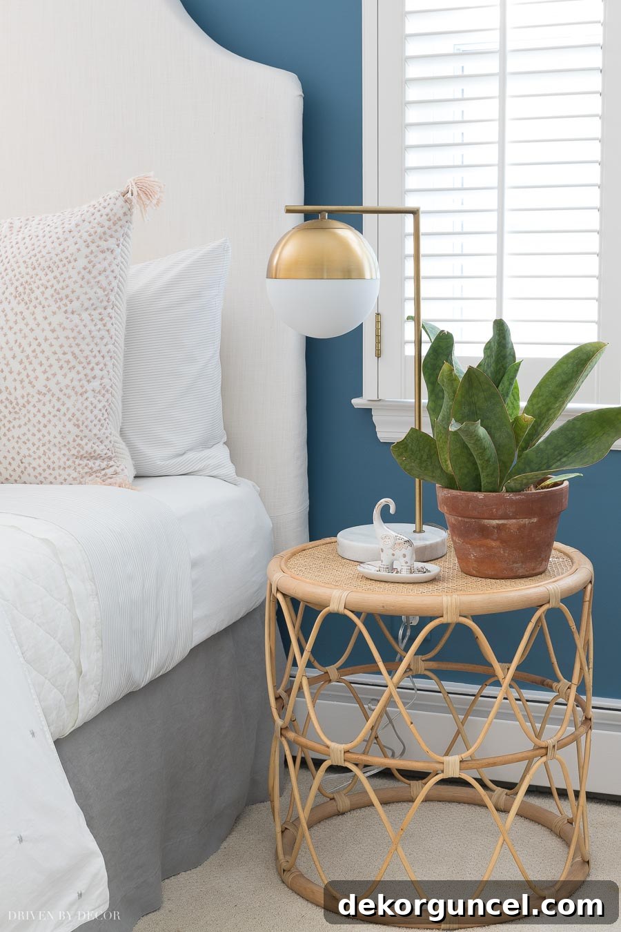
To further enrich the sensory experience of the room and truly capture the essence of bohemian design, we introduced various textures through woven neutrals. A prime example is this beautiful rattan nightstand, which immediately brings an organic, earthy feel and tactile warmth to the bedside. Its intricate weave adds an artisanal touch that perfectly complements the overall aesthetic.
Another clever way we incorporated texture was by wrapping a length of natural rope around the chain supporting my daughter’s charming swing chair. This incredibly simple DIY trick instantly elevated its appearance, transforming a basic chain into a visually appealing detail that adds to the room’s cohesive, relaxed vibe. It’s a small change with a big impact, enhancing the cozy, inviting feel of the space.
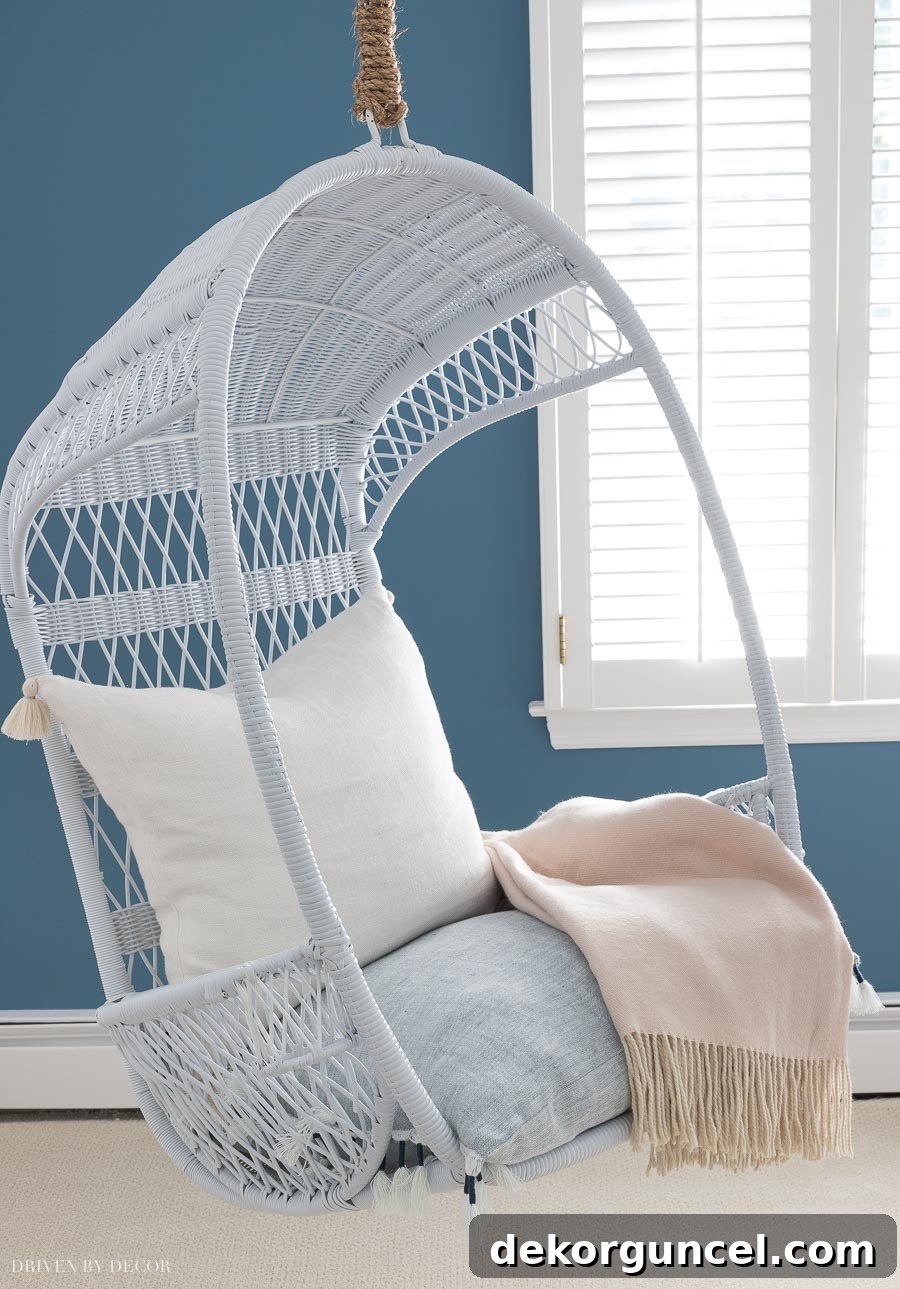
The addition of a plush blue tasseled pillow, serving as a comfortable cushion for the swing chair, further enhances its inviting appeal, while a soft blush throw draped nearby adds another layer of color and luxurious texture, beautifully completing its new, refreshed look.
Smart Organization: Closet Makeover with Complementary Colors
Our makeover journey even extended to my daughter’s closet! We were fortunate to inherit robust closet organization systems in both of my girls’ rooms, which provided excellent storage and functionality. However, aesthetically, they were far from inspiring, sporting that rather dull, dated beige color reminiscent of the 1980s. This uninviting backdrop felt out of place with the vibrant, fresh energy we were cultivating in the main bedroom space.
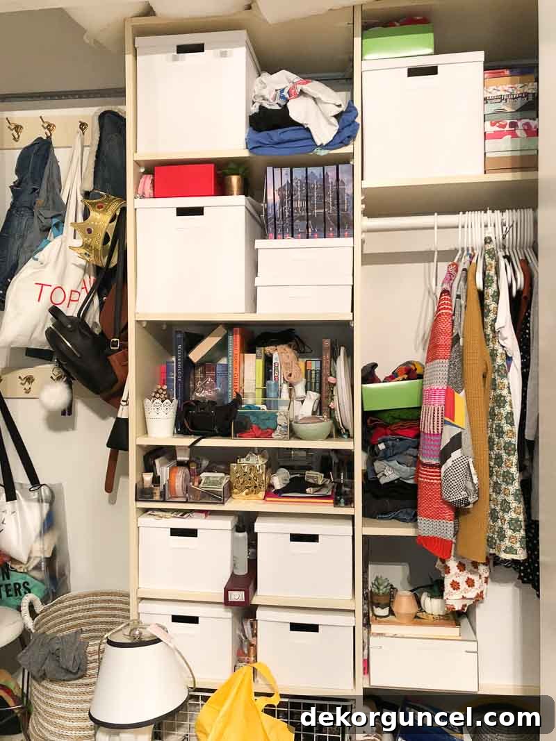
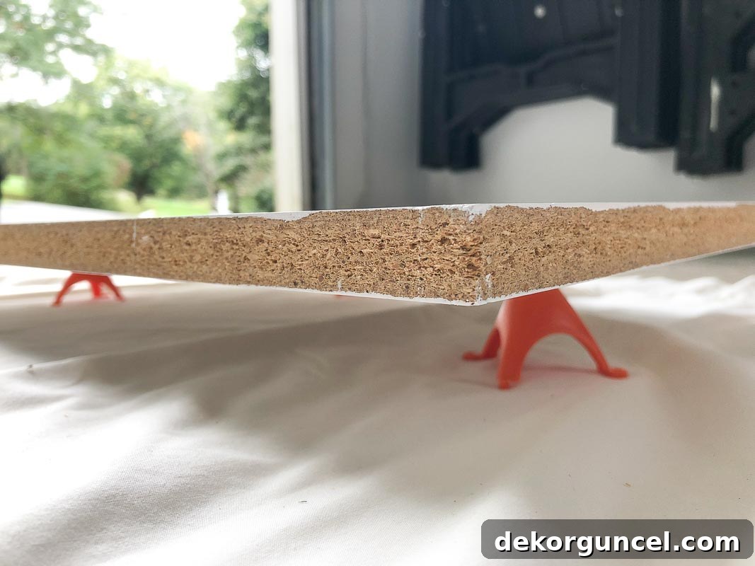
Just as we revitalized the dresser, I harnessed the transformative power of paint to give her closet a completely refreshed and contemporary look. I followed the exact same meticulous steps: thorough preparation, expert priming, and painting with Behr’s White 52 in a durable satin finish. Everything within the closet system was painted in place, with the exception of the shelves. These I carefully removed and painted individually on my trusty folding table. A clever trick for painting shelves efficiently is to paint one side, allow it to dry completely for a day, and then flip them over onto these invaluable painter’s tripods. This allows you to easily paint the second side without marring your freshly painted surface, saving time and ensuring a flawless finish.
With a fresh, clean coat of paint, my daughter’s formerly drab closet was transformed into a bright, organized, and inviting space, perfectly aligning with the room’s new aesthetic. The difference is truly remarkable, proving that even functional areas can be beautiful.
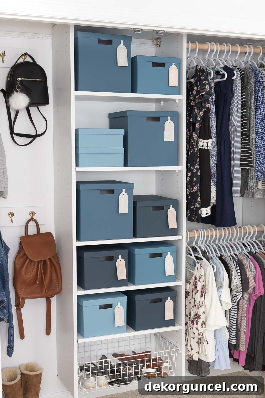
The transformation was utterly astonishing! The previously uninspiring beige closet now radiates freshness and functionality. To further enhance its utility and aesthetic appeal, I installed a second closet rod, creating two rows for hanging clothes and maximizing storage capacity. For an added touch of fun and personalization, I embarked on a creative project with her storage boxes. She already owned several of these inexpensive IKEA Tjena boxes, which I decided to paint in four harmonious shades of blue, all derived from the same color strip as Behr’s Blueprint. The best part? No special prep or priming was needed for these! I simply rolled on a single coat of paint, which covered amazingly well, and they were ready to add a cheerful burst of color to her newly organized space.
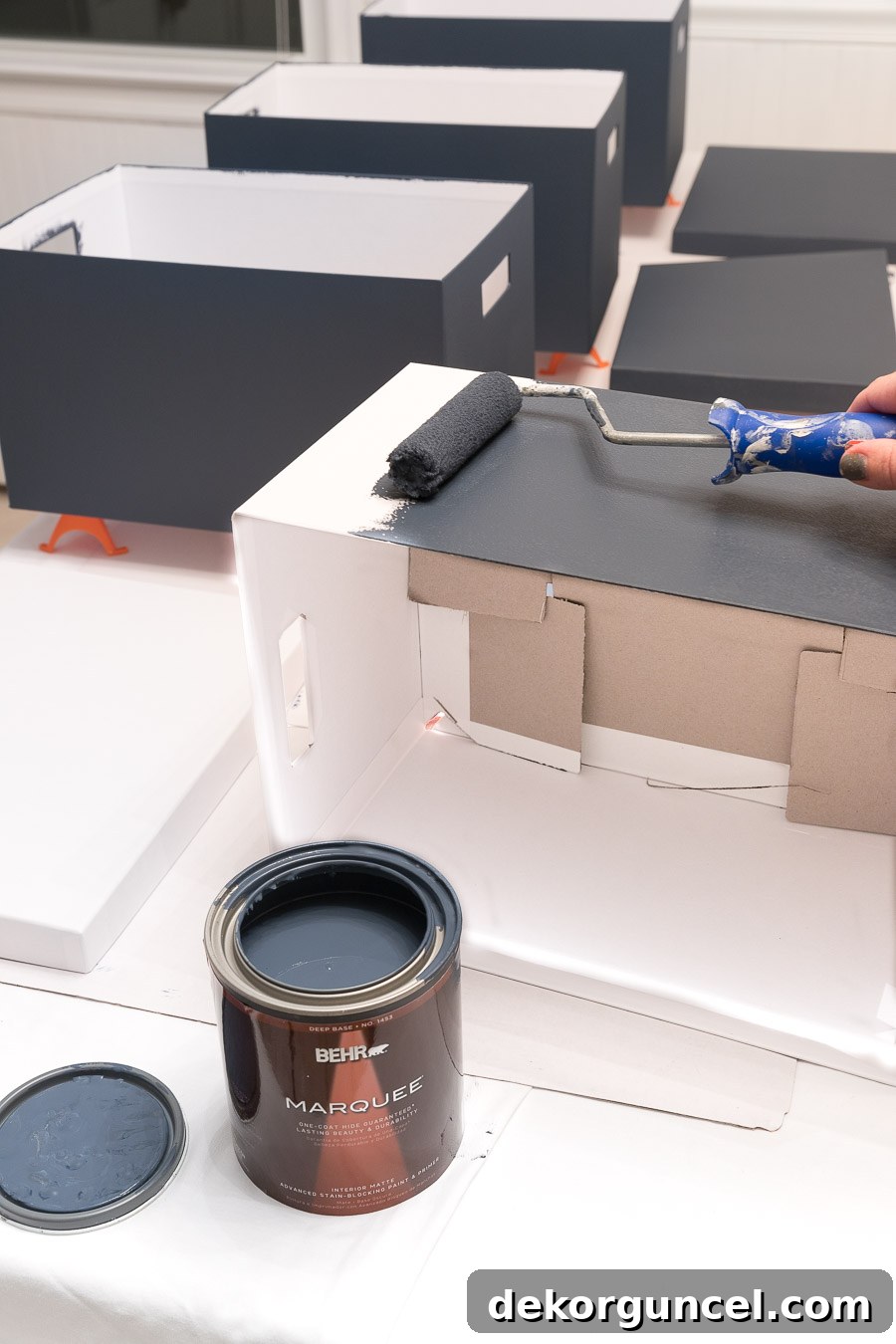
The carefully chosen quartet of blue hues, ranging from deepest to lightest, included Behr’s Undersea, Shipwreck, Blueprint, and Dolphin Blue. This gradient effect adds visual interest and a subtle sophistication to the storage, perfectly complementing the room’s overarching color scheme.
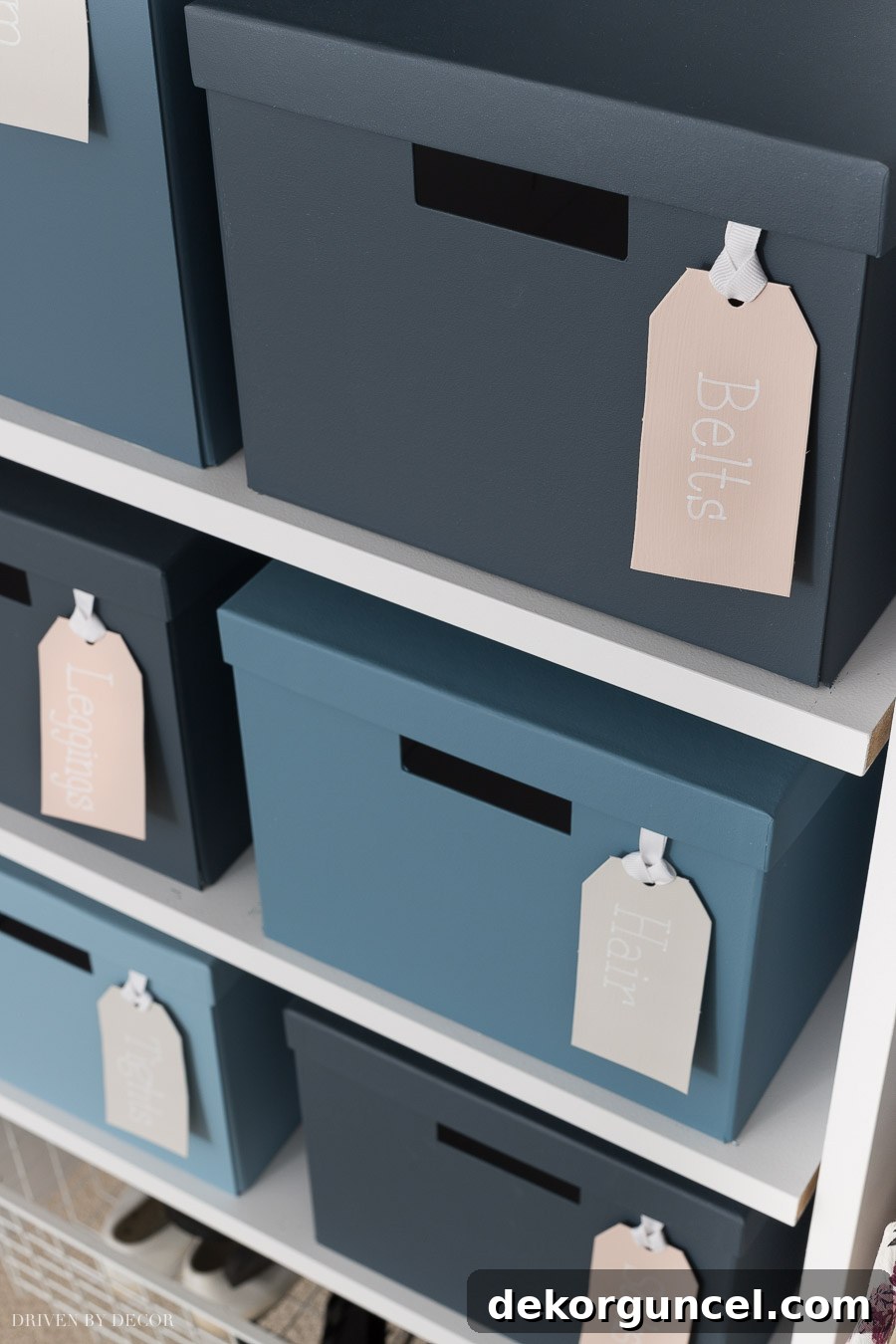
To ensure every detail contributed to the cohesive design, I even brought in the blush and neutral tones from the main bedroom area. I crafted personalized cardboard tags, painting them with Behr’s Sand Dance (the blush hue) and Cotton Grey (the soft neutral). Using a chalk pen, I neatly wrote the contents of each box onto its respective tag. To keep the tags securely in place, I looped a ribbon through the top of each tag and then taped the ribbon to the inside of the box. This small but thoughtful addition is both incredibly cute and highly functional, making organization a stylish affair.
Phew! Completing this extensive makeover in just a couple of weeks was indeed a lot of work, but witnessing my daughter’s sheer joy and happiness with her new, personalized space made every single effort absolutely worth it. It’s truly rewarding to create a room where she feels comfortable, inspired, and completely at home.
I sincerely hope you enjoyed this detailed tour of her newly refreshed and vibrant boho bedroom. May it spark your imagination and inspire you to embark on a creative project of your own! For even more decorating ideas and inspiration, be sure to check out my comprehensive post on kids’ room decorating ideas. Happy decorating!
