
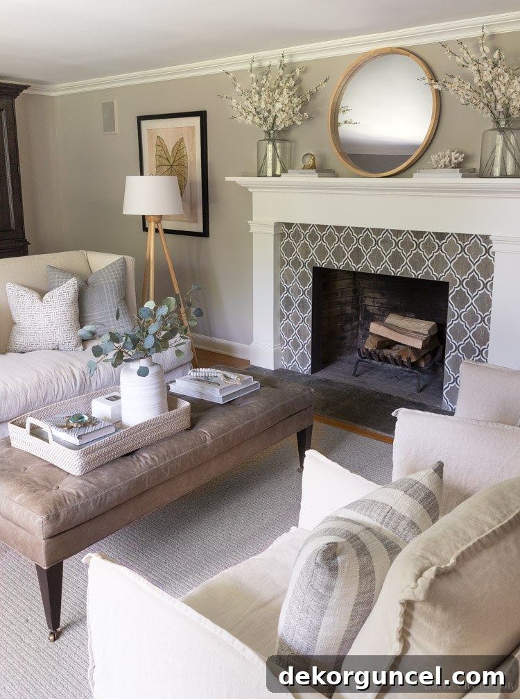
Discover Sherwin Williams Anew Gray, a captivating greige paint color that masterfully balances warmth and coolness. Join us for an inspiring tour of our living room, showcasing how Anew Gray transforms a space, and delve into a detailed comparison with other popular greige contenders to help you find your perfect shade.
Choosing the right paint color can be one of the most impactful decisions you make for your home. It sets the mood, influences perception of space, and forms the backdrop for all your cherished decor. When we first moved into our home, we ambitiously painted our living room and dining room in Sherwin Williams Keystone Gray. While this rich, deep greige brought a sophisticated coziness to our dining room, it quickly became apparent that it was too dark for our living room, which receives significantly less natural light throughout the day. The space, rather than feeling intimate, felt somewhat muted and heavy.
After several years of living with a color that never quite felt right in our primary gathering space, I knew it was time for a change. My goal was clear: find a lighter greige that would brighten the room while maintaining that beautiful balance of warm beige and cool gray tones. The search began, and after careful consideration, I narrowed down my choices to four promising contenders that offered the perfect blend of sophistication and lightness.
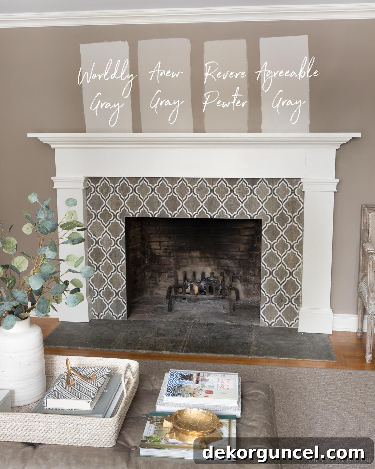
Ultimately, Sherwin Williams Anew Gray emerged as the clear winner. This decision has brought immense satisfaction, completely transforming our living room into the bright, inviting sanctuary I had envisioned. I often receive questions about this particular shade whenever I share glimpses of our home, which prompted me to share my experiences. In this comprehensive guide, I’ll walk you through what makes Anew Gray such an exceptional choice, how it appears in various lighting conditions within our living room, and provide an in-depth comparison to other popular greige paint colors. Let’s embark on this color journey together and tour our refreshed living room along the way! (post includes affiliate links; full disclosure statement available {here})
Anew Gray in Our Living Room: A Perfect Greige Harmony
My preference for greige paint colors over pure beiges or grays stems from their inherent versatility and balanced nature. They are often described as the “Goldilocks” colors—neither too warm nor too cool, but just right. The beige undertones infuse a welcoming warmth and softness, preventing the space from feeling sterile, while the subtle coolness of the gray tones ensures the color remains sophisticated and never looks dull or muddy. Anew Gray exemplifies this perfect balance beautifully.
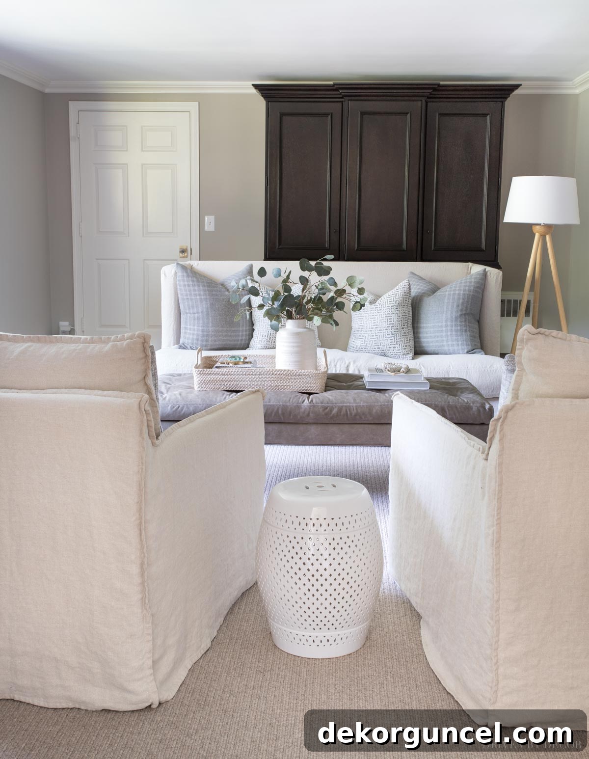
Sherwin Williams Anew Gray (SW 7030) is a sophisticated, mid-toned greige with an impressive depth and richness. Its Light Reflectance Value (LRV) of 47 strikes an ideal balance, preventing it from feeling overly dark or too starkly light. This particular characteristic was precisely what I sought when selecting a color for our living room—a shade that could offer visual weight and elegance without absorbing too much light, especially given the room’s modest natural light intake. Observing it in our space truly highlights Anew Gray’s chameleon-like quality, demonstrating how its appearance can subtly shift depending on the specific light it receives throughout the day:
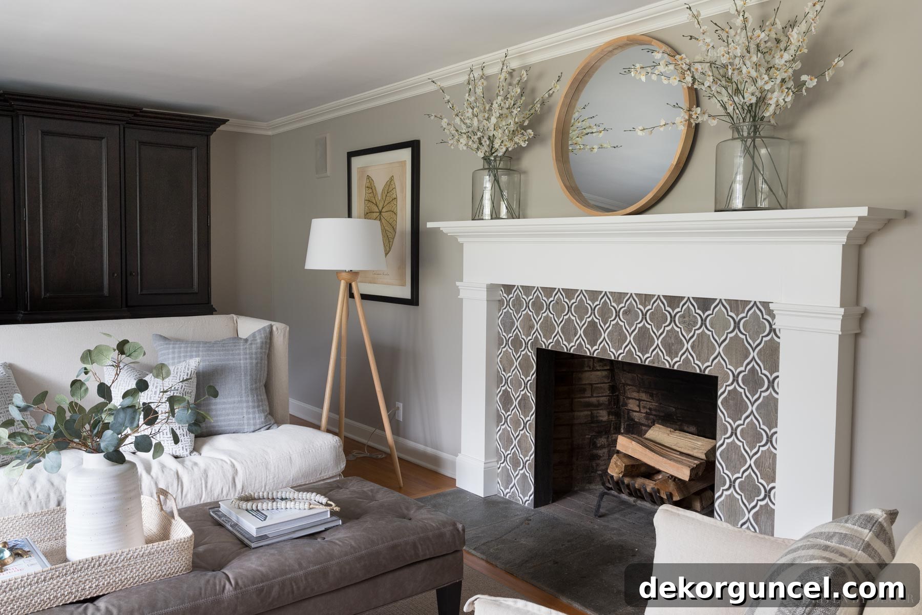
Sources: Loveseat & ottoman (custom order from Lee Industries) | Linen swivel chairs | Wood floor lamp | Framed leaf art print | Woven ottoman tray | White vase | Faux eucalyptus | Bone beads | Black & white striped pillows | Round mirror over fireplace | Vases on mantel – no longer available | Faux flowers in mantel vases
Upon closer inspection, particularly in the areas of the wall closest to the floor, you might detect very subtle purple undertones. This phenomenon is directly attributable to the specific lighting conditions in that spot. This section of the wall receives the most direct light from our north-facing window, which casts a cooler, bluer light into the room. It’s a common characteristic of many greiges, where cooler light sources can sometimes bring out their underlying cool pigments. However, higher up on the walls and across the majority of the room, Anew Gray consistently reads as a true, balanced greige. Furthermore, in more shadowed corners, such as to the right of my black cabinet, the color deepens, appearing richer and more saturated, adding to the room’s dynamic visual texture.
Observing the same space on a different day vividly illustrates the dynamic nature of Anew Gray. While the subtle variations in color from the top to the bottom of the walls remain, the overall perception of the color shifts significantly. With less of that cool northern natural light streaming into the space on this particular day, the walls appear less gray and more purely greige, highlighting its adaptability and warmth. This sensitivity to light is precisely why testing paint colors in your own home, throughout different times of day, is absolutely paramount.
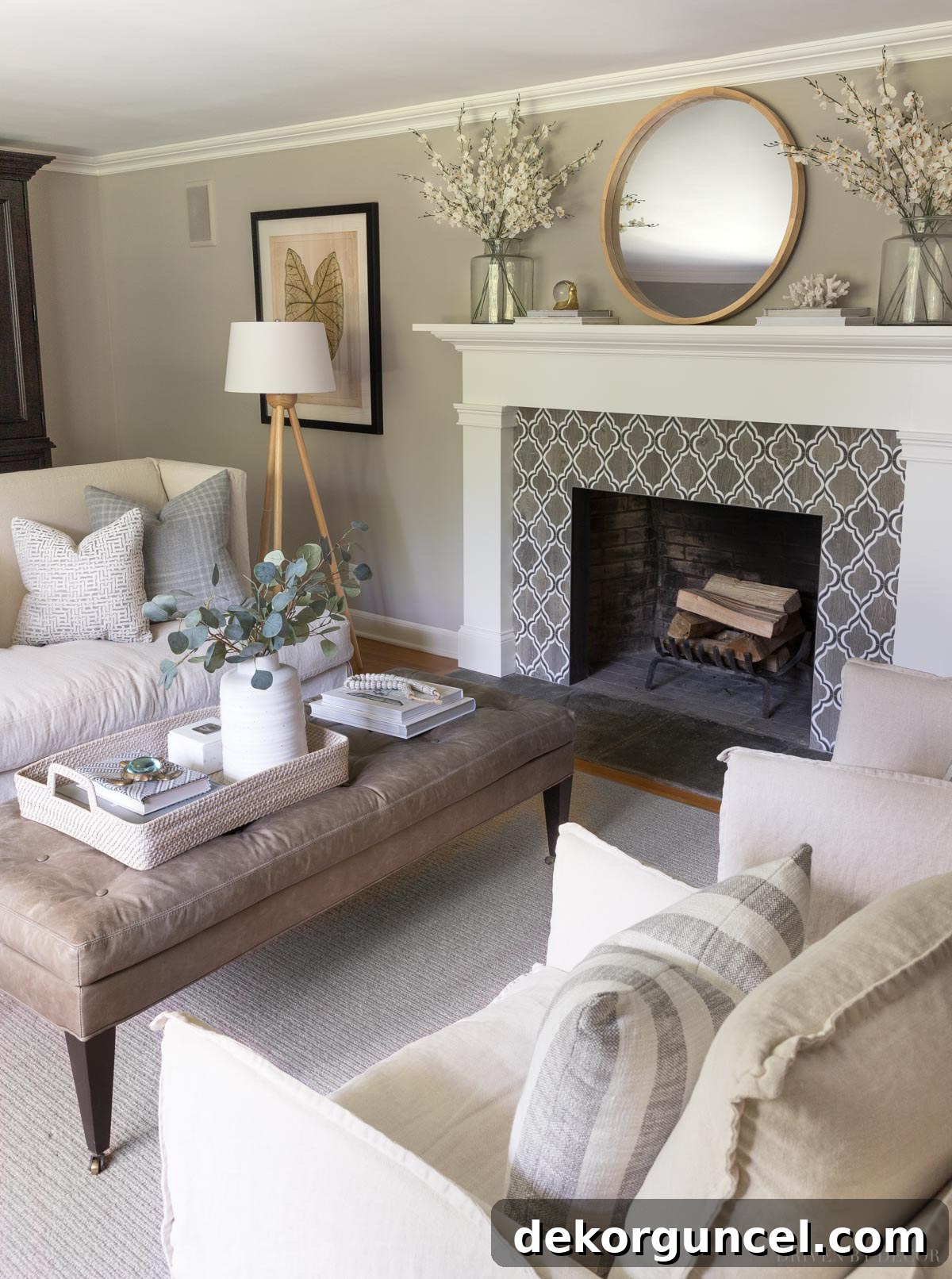
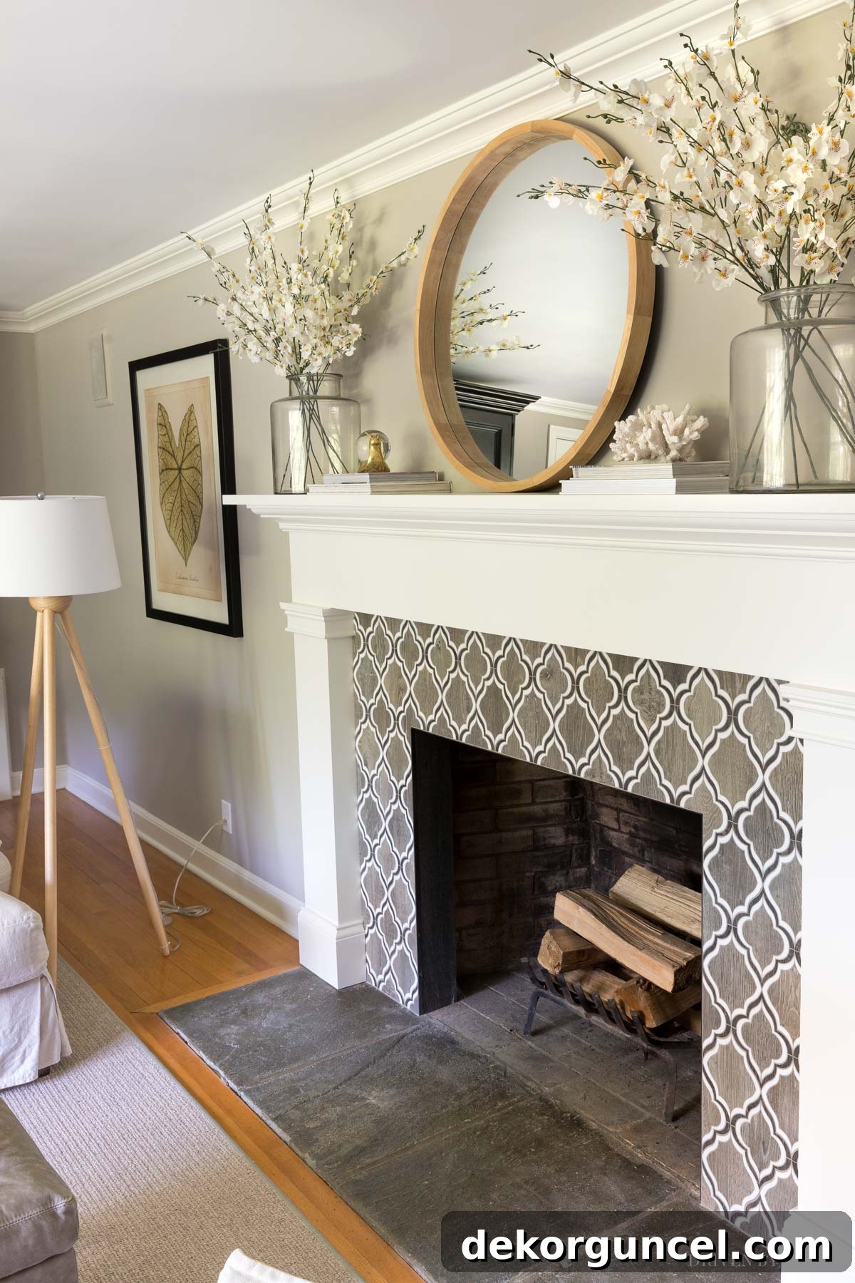
Sources: Fireplace tile | Round mirror over fireplace | Vases on mantel – no longer available | Faux flowers in mantel vases | Decorative snail | White coral (similar) | Wood floor lamp | Framed leaf art print
Beyond these occasional and minor purple undertones in the small area with direct northern exposure (a characteristic common to many greiges in such light), Anew Gray exhibits no other strong or distracting undertones in typical lighting conditions. It consistently presents as a beautifully balanced, warm neutral—a color that is neither too light nor too dark, offering a comforting embrace to our living space.
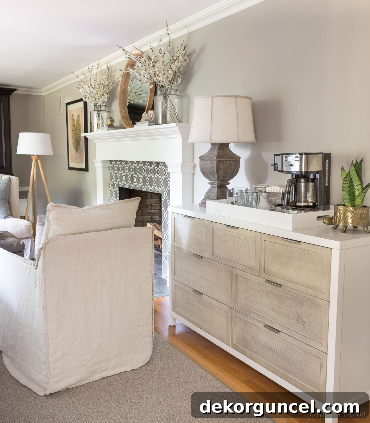
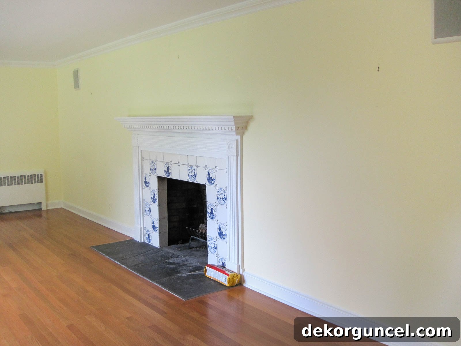
This space has undergone a remarkable transformation since we first moved in. It’s truly incredible to see how far it has come! For those who remember, it looked quite different many years ago:
On the wall directly across from our fireplace, you’ll find our cozy window seat—a beloved spot that was once one of Hope’s favorite perches. From here, she enjoyed a perfect bird’s-eye view of everything happening outside. I certainly miss that sweet little face and her constant companionship in this cherished nook:
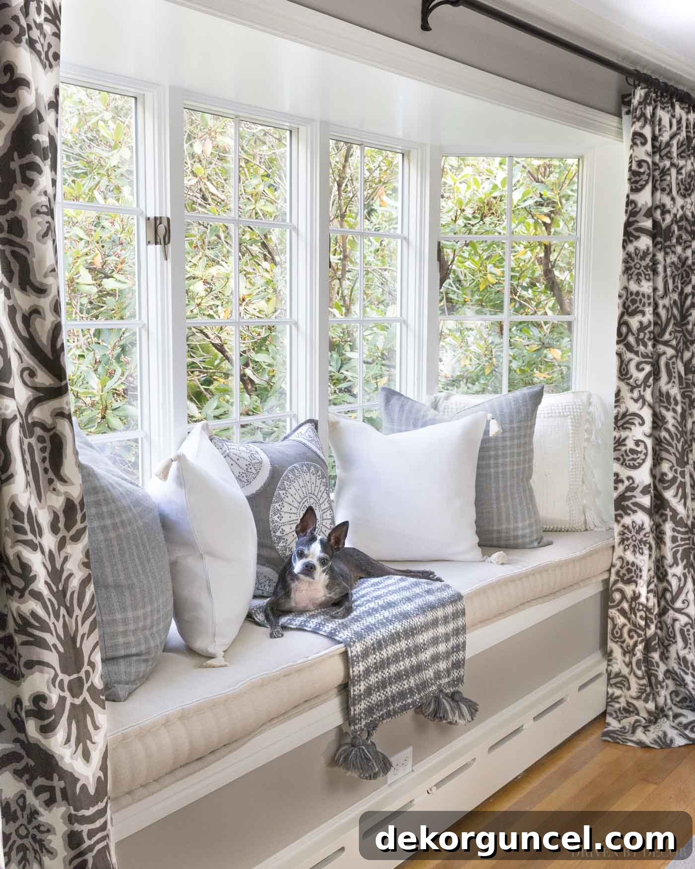
(See {this post} for window seat cushion details)
For a stark contrast, here’s what that very same space looked like on move-in day:
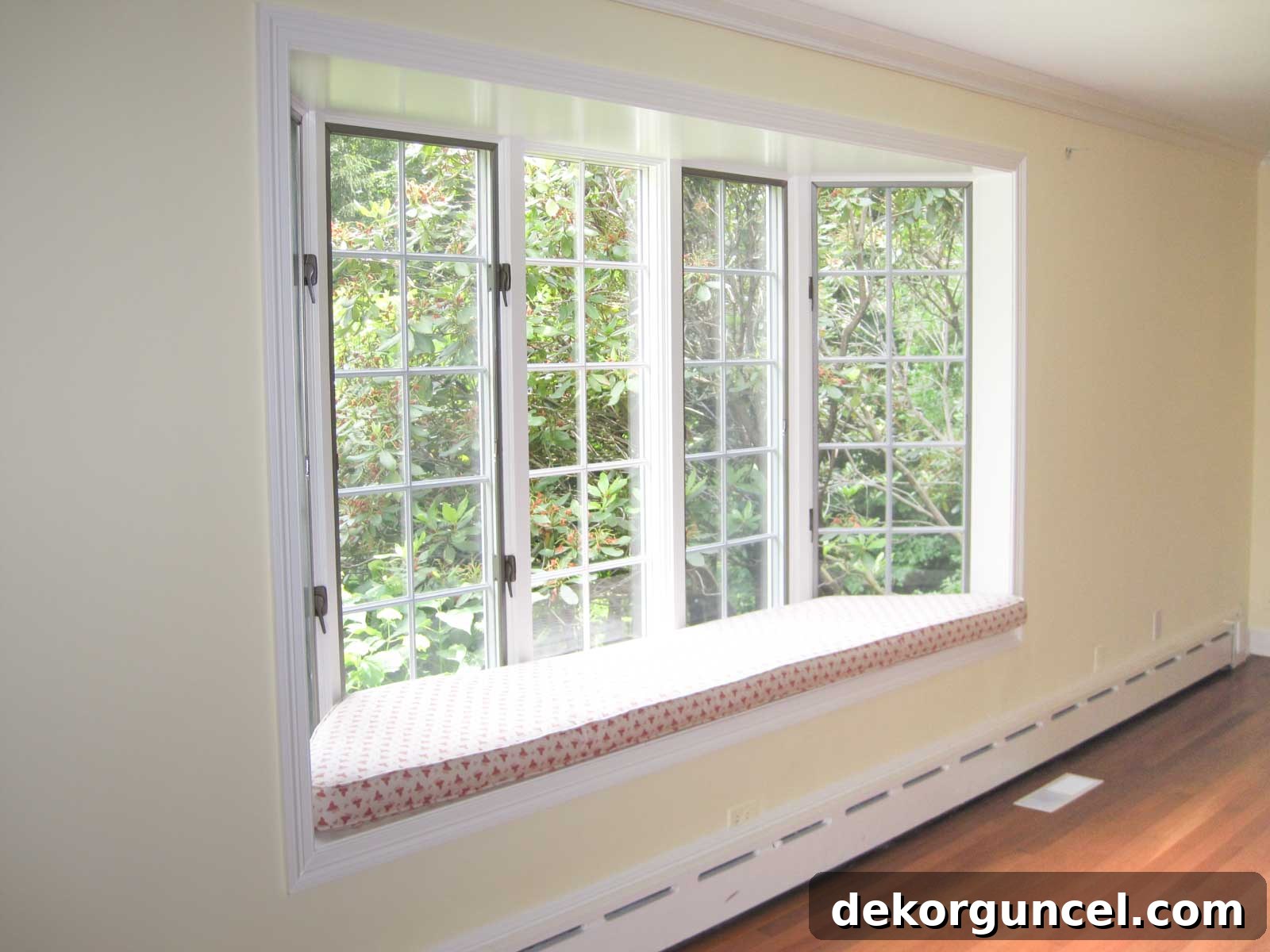
It’s always incredibly rewarding to reflect on the past and witness the journey of a space’s evolution. Sometimes, the changes are so gradual and integrated over time that we might not fully grasp their profound impact until we revisit the “before” photos and see where everything truly began. It’s a powerful reminder of the transformative potential of thoughtful design and the right paint color.
Choosing the Right Sheen: Why Flat Finish Works Best for Anew Gray
When it came to selecting the paint sheen for Anew Gray in our living room, I opted for a flat finish from Sherwin Williams’ Duration Home Interior Latex paint line. This choice is consistent across all the walls in our home, where I exclusively use either flat or matte finishes. Matte, while similar to flat, offers slightly more scrubbability, providing a practical advantage while retaining the desired aesthetic.
There are several compelling reasons for my preference for lower sheen paints. Primarily, flat finishes are remarkably effective at concealing minor wall imperfections such as small dents, bumps, or uneven textures. Their non-reflective surface absorbs light rather than bouncing it back, which naturally camouflages any irregularities. Higher sheen paints, conversely, reflect light more intensely, inadvertently highlighting every flaw and making them more noticeable.
Another significant benefit is the ease of touch-ups. With a flat finish, it’s much simpler to seamlessly blend a small touch-up into the existing painted surface, even years down the line. The repair becomes virtually invisible. Paint stores frequently recommend eggshell finishes for walls, suggesting that their higher sheen makes them easier to clean fingerprints, dirt, and scuffs from. However, my experience has taught me otherwise. When you scrub a spot on an eggshell wall, the friction and cleaning agents often remove the delicate sheen from that specific area, creating a noticeable dull patch that stands out against the rest of the wall. This defeats the purpose of “easy cleaning” as you’re left with an uneven finish. Moreover, attempting paint touch-ups on an eggshell finish years later is far more challenging, as the new paint often doesn’t match the aged sheen, resulting in more obvious repairs compared to the forgiving nature of flat or matte paint.
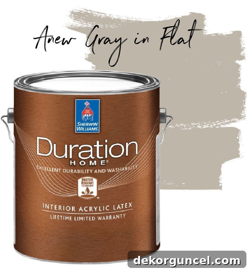
Complementing the Anew Gray walls, the trim throughout our living room is painted in Benjamin Moore Cloud White with a satin finish. While numerous white shades can harmonize beautifully with Anew Gray, I personally lean towards warm whites when pairing them with warm wall colors. This creates a cohesive and inviting palette. For a deeper dive into the world of white paint colors, including other favorites of mine like Benjamin Moore White Dove and Simply White, I encourage you to explore my dedicated post on white paint colors {here}.
Anew Gray vs. Other Similar Greige Paint Colors: The Ultimate Comparison
If you’re considering Anew Gray for your home, it’s highly likely you’re also exploring other comparable greige paint colors. The journey to selecting the perfect shade often involves a careful comparison of several strong contenders. To aid in this crucial decision-making process, I’ve prepared a thorough comparison between Anew Gray and six other greige paint colors that frequently appear in people’s top choices, based on popular searches and inquiries. These are the colors that homeowners most often find themselves deliberating between, according to Google trends.
To provide the most accurate and true-to-life comparison, I sourced 12″ x 12″ adhesive paint samples from Samplize. These samples are made with actual paint, not digitally rendered colors like the small paper strips you pick up at the paint store, offering an incredibly authentic representation of each hue. Here, you can see all six samples displayed directly on our Anew Gray walls, providing an excellent visual reference:
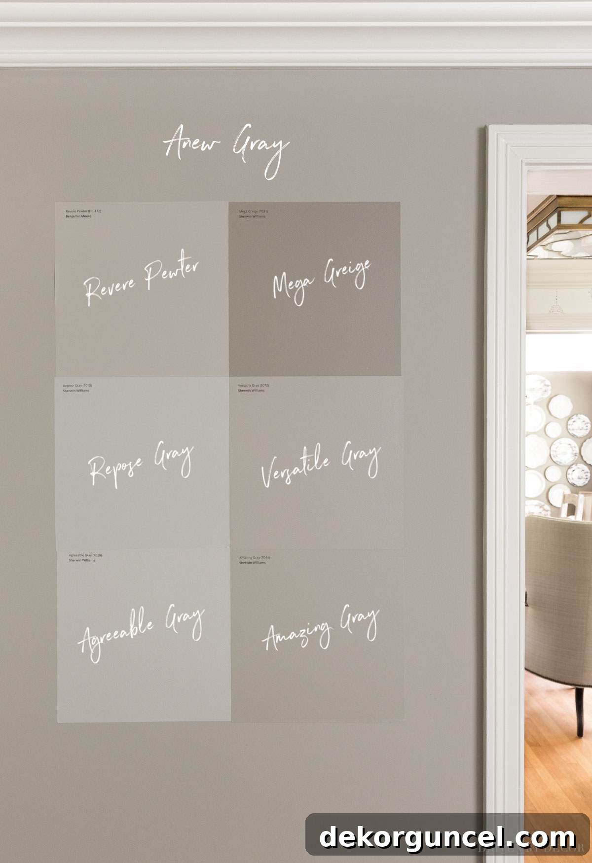
These Samplize samples are a game-changer because they eliminate the mess and uncertainty of traditional paint sample cans. They provide a precise feel for the color’s true tone and how it interacts with light, without the commitment of painting swatches directly onto your wall. You can find the Samplize sample for Anew Gray {here}.
It cannot be stressed enough: when choosing any paint color, testing it directly in your own space is an absolute imperative. It doesn’t matter if you’ve seen it look stunning in another room of your house, at a friend’s residence, or if an expert assures you a particular color “always” works. The unique natural and artificial light conditions that each room receives will significantly influence how a paint color appears in that specific environment. Factors like window direction (north, south, east, west), tree coverage outside, the color of your furnishings, and even your light bulb temperature will play a role in the final perception of the paint.
Beyond simply trying out samples in the room you’re painting, it’s crucial to move them around to different walls and observe them at various times of the day. The beauty of Samplize samples is their adhesive backing, allowing you to easily stick them to the walls for initial sampling, and then effortlessly peel and re-stick them in other parts of the room. This flexibility lets you assess a color on your brightest, most illuminated wall:
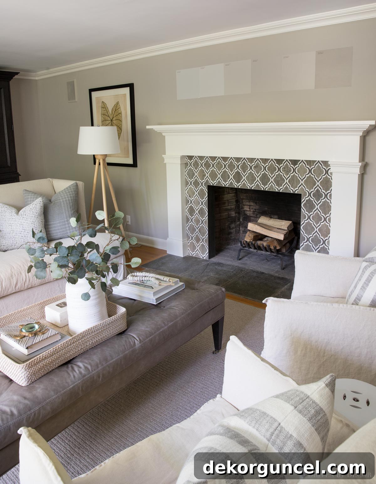
And then relocate them to a darker, more shadowed wall to understand their full spectrum of appearance throughout the room. This comprehensive testing approach ensures you make an informed decision and avoid any unwelcome surprises once the entire room is painted.
A crucial word of warning about many greiges, including Anew Gray and others within its hue family: they can exhibit purple undertones under certain lighting conditions. This is particularly noticeable in rooms that receive abundant natural northern light, which casts a cooler, bluer light that can pull out these cooler pigments. In contrast, in most rooms, especially those with southern exposure, these purple undertones are typically absent. If, during your sampling process, you notice purple undertones that you find undesirable, consider shifting your focus to paint colors that incorporate a higher concentration of beige or yellow, which will provide a warmer, less cool-leaning greige.
Now, let’s dive into a detailed comparison of these six popular paint colors against Anew Gray…
Amazing Gray vs. Anew Gray: A Subtle Distinction
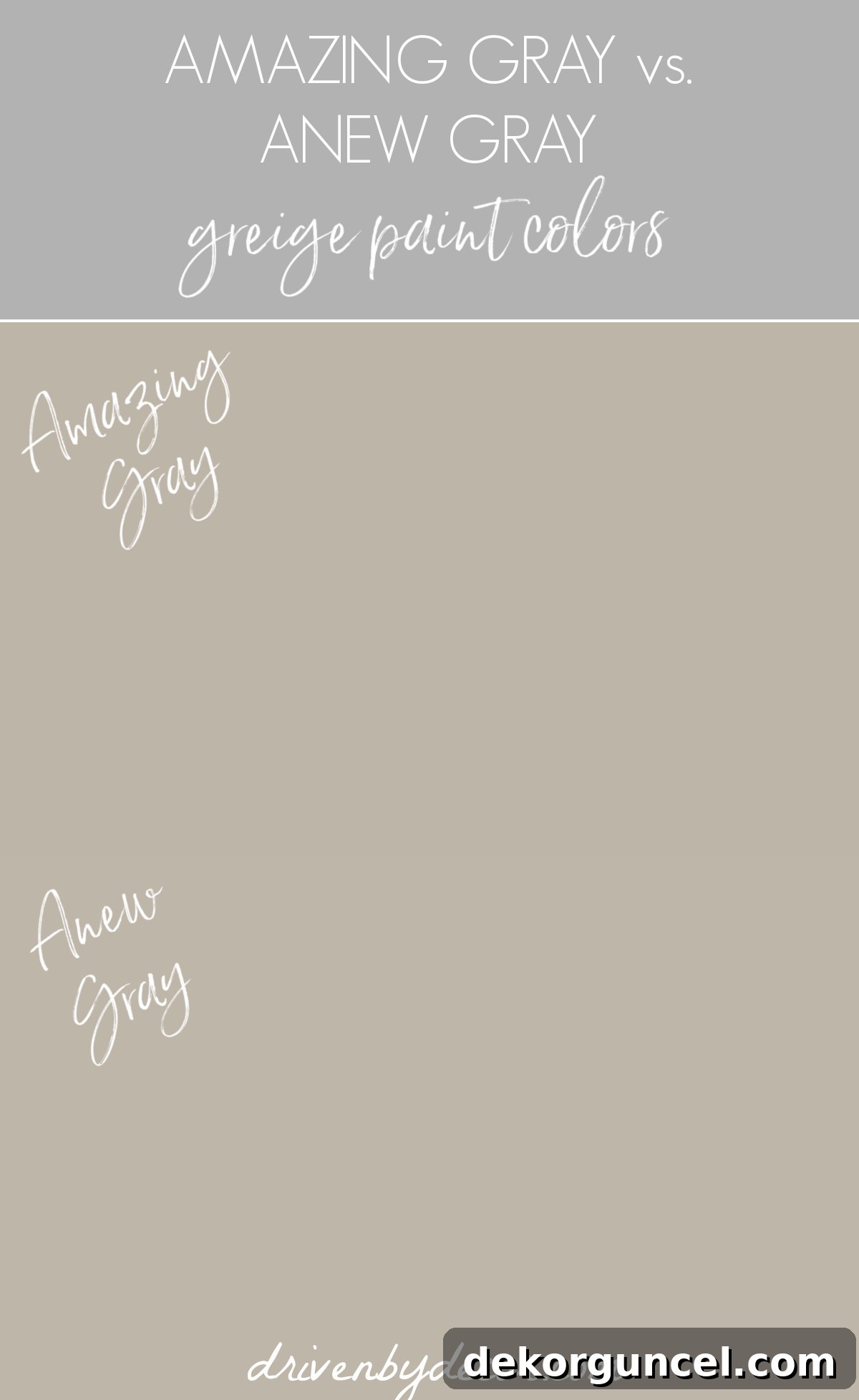
Sherwin Williams Amazing Gray (SW 7044) shares an incredibly close resemblance to Anew Gray, making it quite challenging to discern where one shade ends and the other begins in a direct comparison. Both colors boast an LRV of 47, indicating they possess almost identical “lightness” values. However, Amazing Gray has a very slight addition of black pigment, which makes it an almost imperceptible touch darker than Anew Gray. Furthermore, Amazing Gray introduces a hint more green into its undertone profile. This subtle green often gives it a slightly earthier, more grounded feel. While both are fantastic mid-toned greiges, Amazing Gray might appeal to those seeking that barely-there green undertone to complement specific decor elements. You can find a Samplize sample of Amazing Gray {here}.
Versatile Gray vs. Anew Gray: A Slightly Lighter & Warmer Greige
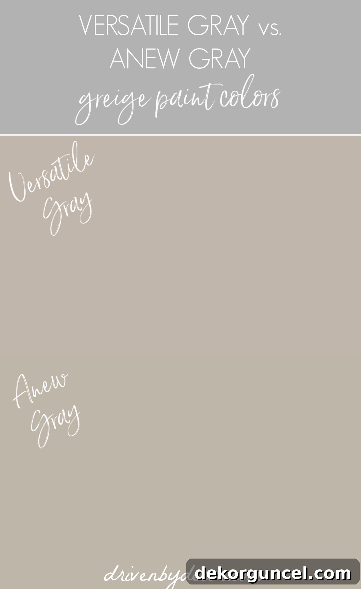
Sherwin Williams Versatile Gray (SW 6072) presents another wonderfully similar option to Anew Gray, but with its own distinct characteristics. It’s a touch lighter, featuring an LRV of 48, which could make it feel slightly brighter in a space. Where Versatile Gray truly distinguishes itself is in its undertone composition: it contains a little more red pigment compared to both Amazing Gray and Anew Gray. This added red often translates into a perceptibly warmer feel, leaning more towards a “greige-beige” than a “greige-gray.” If you appreciate the depth of Anew Gray but desire a hint more warmth and a slightly lighter presence, Versatile Gray could be an excellent alternative, offering a comforting and inviting ambiance. You can get a Samplize sample of Versatile Gray {here}.
Anew Gray vs. Agreeable Gray: Lighter & Brighter Charm
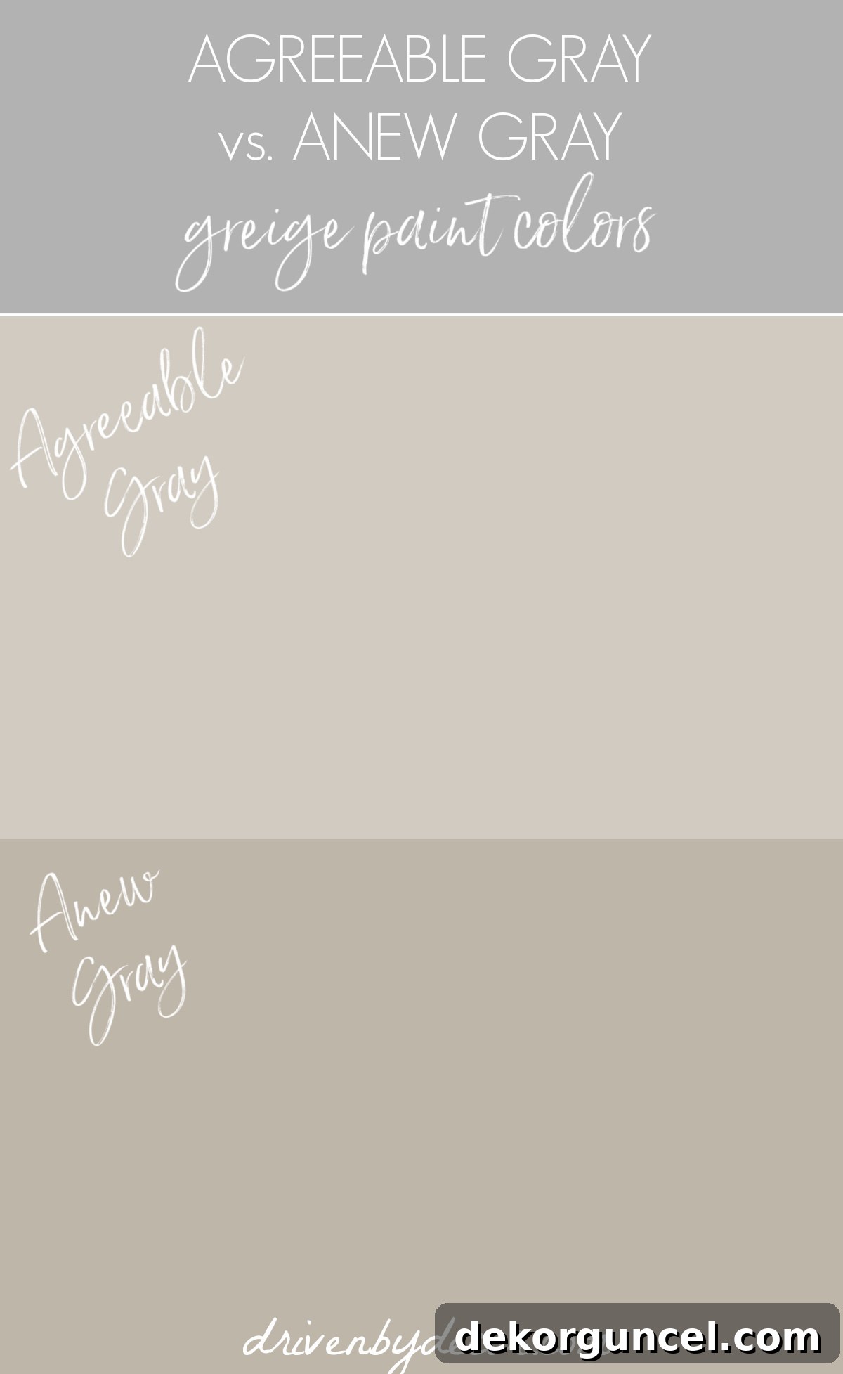
Sherwin Williams Agreeable Gray (SW 7029) is a hugely popular greige, and for good reason. It sits directly adjacent to Anew Gray on the color strip, indicating a close relationship in terms of underlying tones. However, the key differentiator is its lightness. With a significantly higher LRV of 60, Agreeable Gray is noticeably lighter and brighter than Anew Gray. This makes it an outstanding choice for those who are drawn to the beautiful balance and sophistication of Anew Gray’s greige character but require a more airy and illuminating presence in their room. It’s especially effective in spaces that could benefit from a lift, or for homeowners seeking a subtle, versatile neutral that doesn’t feel too heavy. You can get a Samplize sample of Agreeable Gray {here}.
Anew Gray vs. Revere Pewter: The “No-Fail” Classic
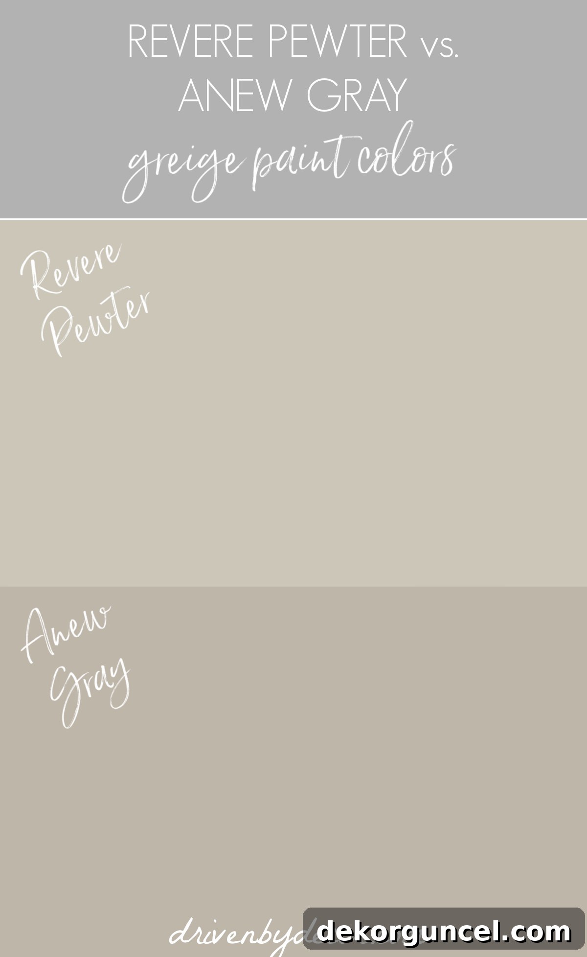
Benjamin Moore Revere Pewter (HC-172) is a legendary greige, a perennial favorite that I’ve personally recommended for years due to its remarkable versatility and widespread appeal. I recall a specific incident when my sister called me in a panic; her painter had applied the first coat of her chosen color for her family room, and she absolutely detested it. With the painter scheduled to return the next morning, she needed an immediate decision. Though separated by several states (making an in-person assessment impossible, which is always ideal for color selection), I confidently suggested Revere Pewter. It’s one of those rare “no-fail” greiges that works beautifully in a vast array of settings. She loved it, and we both breathed a huge sigh of relief—because, yes, paint choices can indeed be a source of serious first-world stress! In comparing Revere Pewter to Anew Gray, Revere Pewter is noticeably lighter and typically reveals more yellow undertones. This yellow component contributes to its warmer, often creamier appearance, making it a stellar option for those seeking a welcoming and luminous greige with a distinctly comforting feel. You can find a Samplize sample of Revere Pewter {here}.
Mega Greige vs. Anew Gray: Embracing Depth and Richness
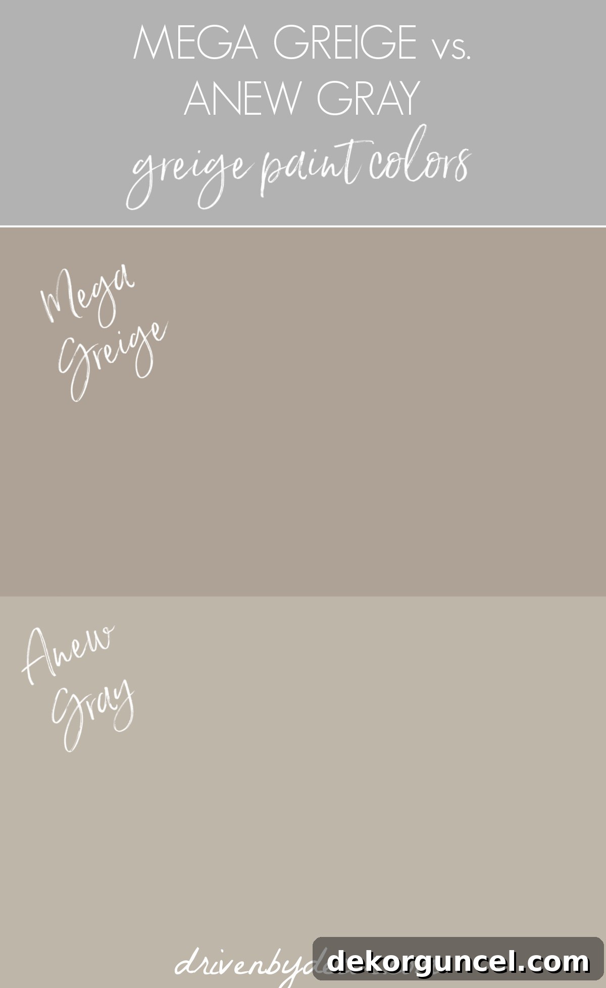
Sherwin Williams Mega Greige (SW 7031) stands out as quite distinct from Anew Gray, making it somewhat surprising that these two are often considered in direct comparison. With an LRV of 37, Mega Greige is the darkest among all the colors I’m comparing today. It actually falls between our previous living room color, Keystone Gray, and Anew Gray on the Sherwin Williams color strip, indicating its significantly deeper saturation. Much like I experienced with Keystone Gray, Mega Greige is an excellent choice if you’re aiming to create a room with a truly deep, rich, and enveloped feel. It exudes sophistication and warmth, making a bold statement. However, it’s crucial to consider the room’s natural light. In spaces with limited natural light, Mega Greige might feel a little too dark or intense, potentially overwhelming the area rather than enhancing it. It truly thrives in rooms where its depth can be appreciated without making the space feel closed in. You can find a Samplize sample of Mega Greige {here}.
Repose Gray vs. Anew Gray: The Cooler Greige Contender
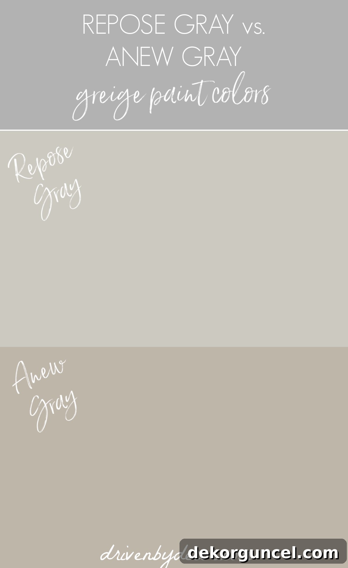
Last but certainly not least is Sherwin Williams Repose Gray (SW 7015). With an LRV of 58, Repose Gray is comparable to Revere Pewter in terms of its lightness, positioning it as a lighter greige option. However, its character diverges significantly; Repose Gray leans noticeably cooler, possessing less inherent warmth than both Revere Pewter and Anew Gray. This makes it a greige that clearly favors its gray components over beige, often revealing subtle blue or green undertones, particularly in cooler light. While Repose Gray might appear somewhat stark or even icy in a north-facing room with predominantly cool light, it can be an exceptional choice in other spaces. If your goal is a sophisticated greige that clearly reads as gray-dominant, perhaps in a room with ample warm light or where you wish to introduce a crisp, modern edge, Repose Gray offers a clean and refreshing aesthetic. You can find a Samplize sample of Repose Gray {here}.
Seeking more inspiration for beautiful greige paint color options? Be sure to check out {this post on the 10 best greige paint colors}, compiled from a survey of hundreds of homeowners like you! And with that, I’m off to tackle the final tasks at our North Carolina home before heading back to Connecticut one last time to pack and oversee our move. It’s hard to believe our moving date is almost upon us! I have so much more to share over the coming weeks, so please stay tuned for exciting updates and new adventures!
