
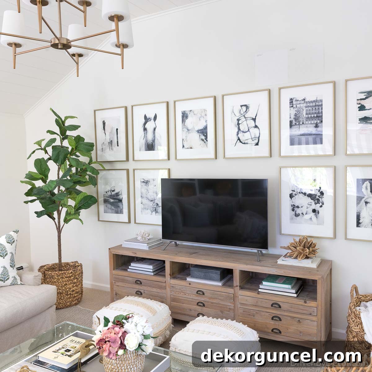
Are you on the quest for the perfect white paint color for your home? Instead of feeling overwhelmed by the vast selection at Benjamin Moore or Sherwin Williams, allow us to guide you. We’ve curated a list of 8 tried-and-true white paint colors that consistently deliver stunning results. We guarantee you’ll discover a shade that perfectly illuminates and enhances your space!
Choosing the ideal white paint color might seem deceptively simple, but it’s often more challenging than selecting a vibrant hue. Unlike other colors where the shade is evident on a paint chip, whites possess intricate undertones and subtle nuances that can dramatically alter their appearance once applied to your walls. A white that looks pristine in the store might appear too stark, too warm, or even slightly green in your home’s unique lighting conditions. Understanding these complexities is the first step toward making an informed decision (for more general guidance, be sure to read our comprehensive post on how to choose paint colors!).
Navigating the seemingly endless spectrum of white paint options can quickly become overwhelming. That’s why we’re simplifying the process by sharing our top eight favorite white paint colors. These selections are not just personal preferences; they are consistently praised by professional decorators and homeowners alike for their versatility, beauty, and ability to transform a room. From creating a serene bedroom retreat to brightening up a bustling kitchen, these whites have proven their worth time and again. (Please note: this post includes affiliate links – a full disclosure statement is available {here} for your reference).
To help you compare and contrast, we’re presenting these exceptional white paints in order from darkest to lightest, based on their Light Reflectance Value (LRV). The LRV is a crucial metric that indicates how much light a paint color reflects. Paints with a lower LRV will absorb more light, appearing darker and softer, while those with a higher LRV will reflect more light, resulting in a brighter, more expansive feel. This systematic approach ensures you can easily identify the perfect white to suit your desired ambiance and lighting environment.
1. Behr’s White (52) LRV 83 – The Soft, Slightly Cool Off-White
Kicking off our list is Behr’s White (52), a beautifully soft white that, with an LRV of 83, sits closest to the off-white spectrum among our favorites. This makes it an excellent choice for those seeking a gentle, muted white that still feels fresh and clean. Its subtle cool undertones—often leaning towards a hint of gray or blue—give it a sophisticated edge, preventing it from appearing yellow or overly creamy. This cool quality makes Behr’s White (52) particularly harmonious with other cool colors, such as various shades of blue and gray. It’s especially effective in creating a calming and collected atmosphere.
One striking example of its application is in my daughter’s bedroom, where it serves as the primary wall color. The slightly cool nature of Behr’s White (52) perfectly complements the accent wall painted in Behr Blueprint, creating a cohesive and serene blue-themed space. This combination prevents the room from feeling too cold by adding a soft layer of white that balances the deeper blue, ensuring the room remains inviting and cheerful. It’s a testament to how a “slightly cool” white can provide a neutral backdrop without feeling sterile.
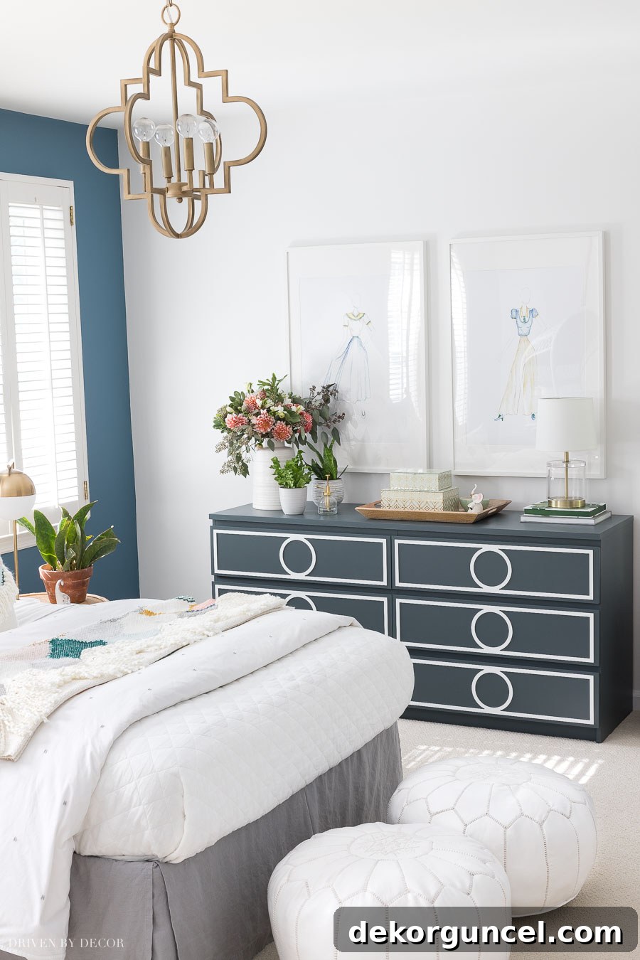
For a closer look at this charming space, including additional photographs and a full list of sources, delve into my post dedicated to her boho bedroom colors. You’ll see how this foundational white supports a vibrant yet harmonious design.
Room Sources: Elegant Gold Quatrefoil Pendant Light | Authentic Moroccan Leather Poufs | Chic Small Acrylic Lamp | Stylish Chest of Drawers | Luxurious White Linen Quilt
2. Sherwin Williams’ Alabaster (SW7008) LRV 82 – The Quintessential Warm White
Next up is Sherwin Williams’ Alabaster (SW7008), a beloved warm white with an LRV of 82. This shade offers a depth similar to Behr’s White (52), but with a distinctly inviting warm character. Unlike cooler whites that might have gray or blue undertones, Alabaster subtly leans towards creamy, yellow, or beige notes, preventing it from feeling stark or cold. This gentle warmth makes it incredibly versatile, working beautifully in a wide array of homes, from traditional to modern farmhouse, and even contemporary spaces seeking a softer touch.
Alabaster has gained significant popularity, even being named Sherwin Williams’ Color of the Year in the past, a testament to its broad appeal and timeless elegance. Its subdued warmth creates a comforting and harmonious atmosphere, making it a fantastic choice for entire homes, open-concept living areas, or any space where you desire a soft, welcoming glow. It pairs exceptionally well with natural wood tones, earthy textures, and a variety of accent colors, providing a sophisticated backdrop without competing for attention.
Brittany of Addison’s Wonderland masterfully utilized Alabaster throughout several rooms in her stunning historic home, showcasing its adaptability and charm. From the intricate details of a staircase to the expansive walls of living spaces, Alabaster maintains a consistent, cozy brightness. In the image below, you can appreciate how Alabaster graces both the walls and trim of a stairway, demonstrating its ability to create a seamless, elegant look that softens architectural elements. Its warmth ensures that even the brightest areas retain an inviting feel.
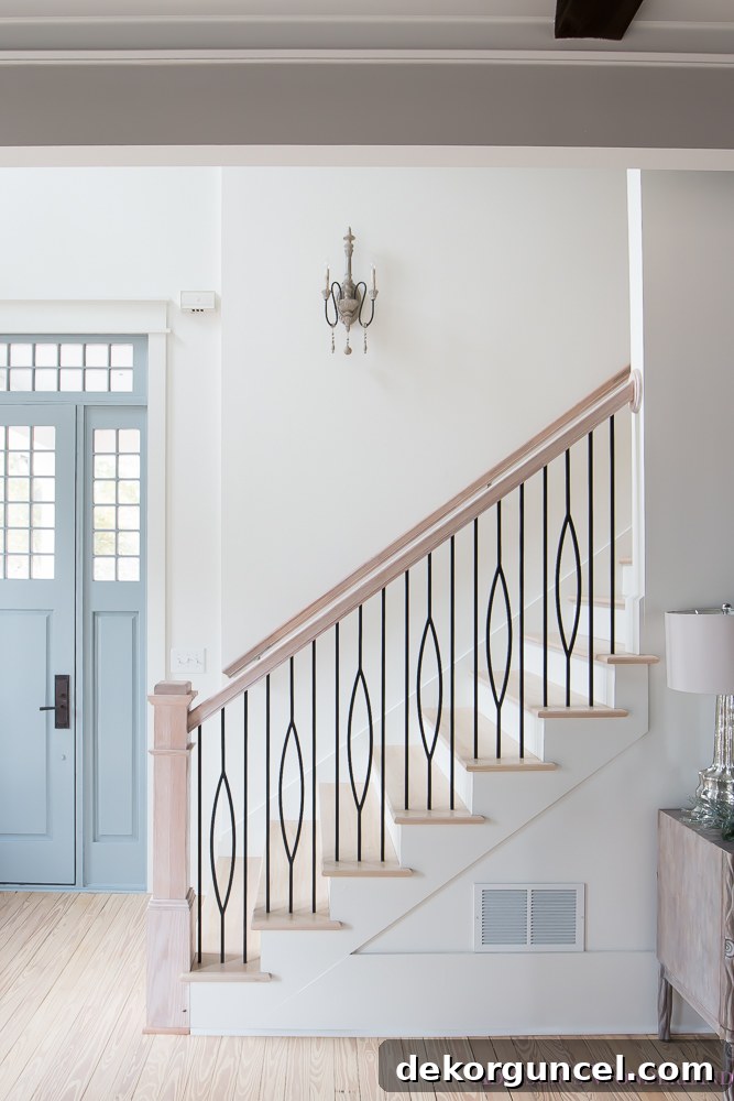
Beyond the stairway, Alabaster shines in Brittany’s mudroom, hallway, master bathroom, and various other spaces, offering a cohesive and comforting palette throughout her entire residence. You can embark on a full tour of her house and witness Alabaster in action across these diverse settings {here}. Seeing it in multiple environments truly highlights its versatility and enduring appeal.
3. Benjamin Moore’s Decorator’s White (CC-20, OC-149) LRV 82.68 – The Designer’s Cool Crisp Choice
With an LRV of 82.68, Benjamin Moore’s Decorator’s White (CC-20, OC-149) is a perennial favorite among designers for its impeccably clean and sophisticated character. This particular white is celebrated for its subtle infusion of gray, which tempers its brightness just enough to create a soft, refined appearance without ever looking dull. This hint of gray gives Decorator’s White a distinct cool undertone, making it a fantastic counterpart to modern aesthetics and cool-toned materials like marble, chrome, and stainless steel.
Decorator’s White excels in applications where a crisp, clean white is desired but without the starkness that some brighter whites can exhibit. It’s an especially popular choice for cabinetry and trim, where its inherent coolness provides a beautiful contrast against warmer wall colors or seamlessly integrates with other cool elements in a room. The gray undertone ensures that it always reads as a sophisticated white, rather than leaning too blue or too yellow, making it incredibly versatile in various design schemes. In kitchens, bathrooms, and laundry rooms, it provides a hygienic and refreshing feel that contributes to a sense of order and cleanliness.
A stunning illustration of Decorator’s White in action can be found in Bree of ZDesign at Home’s kitchen. Here, the cabinets and trim are meticulously painted in Decorator’s White, creating a luminous and inviting space. The cool, soft white beautifully offsets the other elements in the kitchen, contributing to an overall sense of brightness and contemporary elegance. The way it reflects light enhances the room’s spaciousness, making it feel both grand and approachable. You can explore more of this fabulous and inspiring kitchen design by visiting {here}.
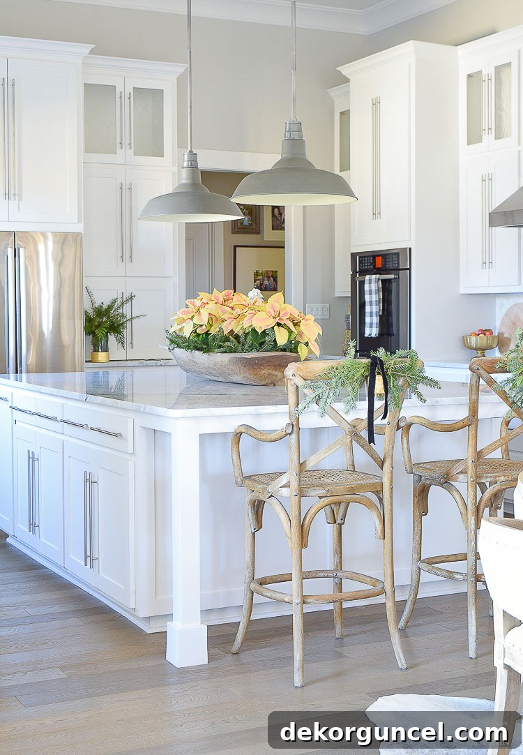
While close to being a pure white, Decorator’s White differentiates itself with that crucial touch of coolness and softness. This quality makes it a remarkable choice for wall paint as well, especially if your goal is a fairly pure white that avoids any harshness. It offers a clean canvas that allows artwork and furnishings to truly pop, while maintaining an understated elegance that elevates the entire room. Its versatility between trim, cabinetry, and walls is a testament to its universal appeal in achieving a sophisticated and contemporary interior.
Pro Tip: Mastering DIY painting techniques can lead to substantial savings on home renovation projects! Learn my proven step-by-step method in my comprehensive guide on how to paint a room like a professional.
4. Benjamin Moore White Dove (OC-17) LRV 83.16 – The Perennially Popular Soft Warm White
Benjamin Moore White Dove (OC-17), with an LRV of 83.16, is a truly iconic and beloved warm white that consistently graces the pages of design magazines and homes across the globe. What makes White Dove so captivating is its exquisite balance: it’s a warm white, but without appearing overly yellow or creamy. It achieves this delicate equilibrium through subtle yellow undertones that are perfectly softened by a whisper of gray. This combination results in a soft, inviting white that feels exceptionally welcoming and harmonious in virtually any setting.
White Dove’s versatility is unmatched; it’s not just a fantastic color for walls, but it also shines as a preferred choice for molding, trim, and kitchen cabinets. Its gentle warmth ensures that it never feels cold or stark, even in rooms with abundant natural light. Instead, it imparts a cozy yet refined ambiance, making spaces feel bright and airy without losing their sense of intimacy. This makes it ideal for creating a timeless and elegant foundation for your interior design, allowing other decorative elements to stand out.
Before our kitchen remodel, White Dove was the beautiful warm white we cherished in that very space, and it created such a welcoming heart of the home. Its ability to soften the light and create a harmonious backdrop was truly appreciated daily. The image below captures a glimpse of our former kitchen, bathed in the gentle glow of Benjamin Moore White Dove. You can observe how it beautifully complements various textures and materials, providing a serene backdrop that feels both classic and contemporary.
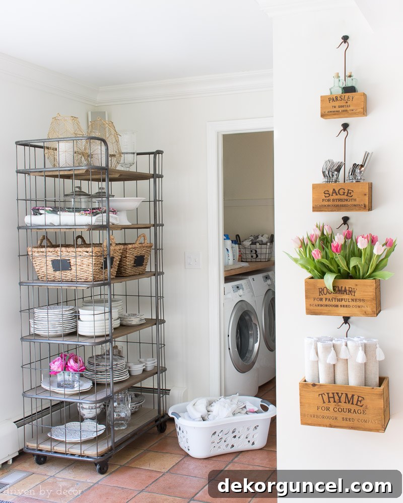
Its enduring popularity stems from its unique capacity to adapt: in rooms with north-facing light, it prevents harsh coolness, offering a much-needed warmth. In south-facing rooms, it tempers intense sunlight, maintaining a soft glow. This adaptability, combined with its sophisticated undertones, solidifies White Dove’s reputation as a top contender for anyone seeking a classic, inviting, and truly beautiful white paint. It’s a sophisticated choice that designers continually return to for its reliability and understated elegance.
Sources: Elegant Rolling Baker’s Rack (similar style) | Chic Hanging Herb Boxes
5. Benjamin Moore Cloud White (OC-130) LRV 85.05 – The Balanced Bright White
Benjamin Moore’s Cloud White (OC-130), boasting an LRV of 85.05, strikes a beautiful balance between the softer warmth of White Dove and the brighter clarity of Simply White. It’s a slightly brighter white than White Dove but still carries a delicate warmth, preventing it from ever feeling cold or stark. This warmth comes from subtle yellow and beige undertones, which are expertly balanced to provide a creamy, inviting glow without appearing overly saturated or dingy. Cloud White is often described as a ‘perfect neutral white’ because it has just enough depth to feel substantial, yet enough brightness to feel crisp.
The quest for the ideal white often involves rigorous testing, and my own experience with Cloud White highlights its exceptional qualities. When I was deciding on a white for our family room, I rigorously tested three popular contenders: Benjamin Moore White Dove, Simply White, and Cloud White. Observing how these samples interacted with the natural and artificial light in our space was crucial. The image below illustrates these comparisons, revealing how subtle shifts in undertone and brightness become apparent side-by-side, ultimately leading to Cloud White being the clear winner for its harmonious balance in our particular family room environment.
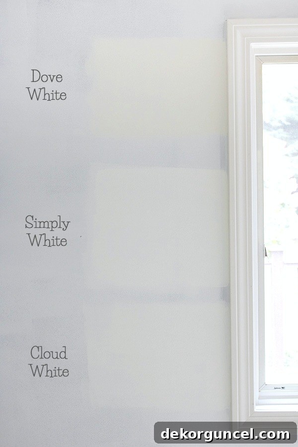
Ultimately, I chose Cloud White for its ability to provide a consistent, clean, and warm backdrop throughout our family room. I used it on the planked ceiling, the walls (in a matte finish for a soft, diffused look), and the trim (in a satin finish for a subtle sheen and durability). This cohesive application allowed Cloud White to unify the space, creating the perfect neutral canvas for our large gallery art wall around the TV. The subtle warmth ensured the room felt inviting and cozy, despite the generous amount of white. For more detailed photos of this transformation and a complete source list for all the decor elements, you can visit my post on the {One Room Challenge Family Room Reveal}.
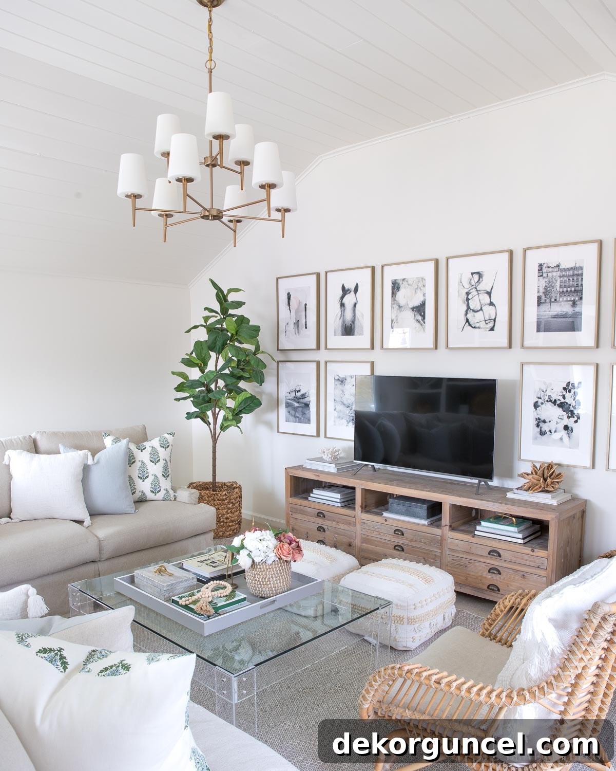
Sources: Modern TV Console (similar option) | Elegant Chandelier (satin bronze finish) | Stylish White Tasseled Pillow Cover | Classic Blue Linen Pillow Cover | Vibrant Green & Blue Block Print Pillow Cover | Realistic Faux Fiddle Leaf Fig Tree | Textured Area Rug | Pair of Versatile Floor Poufs | Curated Art Prints (detailed in {this post}) | Chic Acrylic Coffee Table (similar design) | Large Coffee Table Tray (28″ square) | Decorative Black and White Striped Box (on coffee table) | Quirky Brass Cricket Figurine (on coffee table) | Natural Wood Beads | Comfortable Rattan Chair
Cloud White’s charm extended into our kitchen remodel as well. While our previous kitchen featured the beautiful White Dove, our new cabinetry was a brighter, purer white. To ensure a harmonious blend and a more cohesive aesthetic, Cloud White proved to be the perfect fit for the walls, bridging the gap between the brighter cabinets and a desire for a warm, inviting atmosphere. This demonstrates its flexibility to adapt to changing design elements and maintain its appeal.
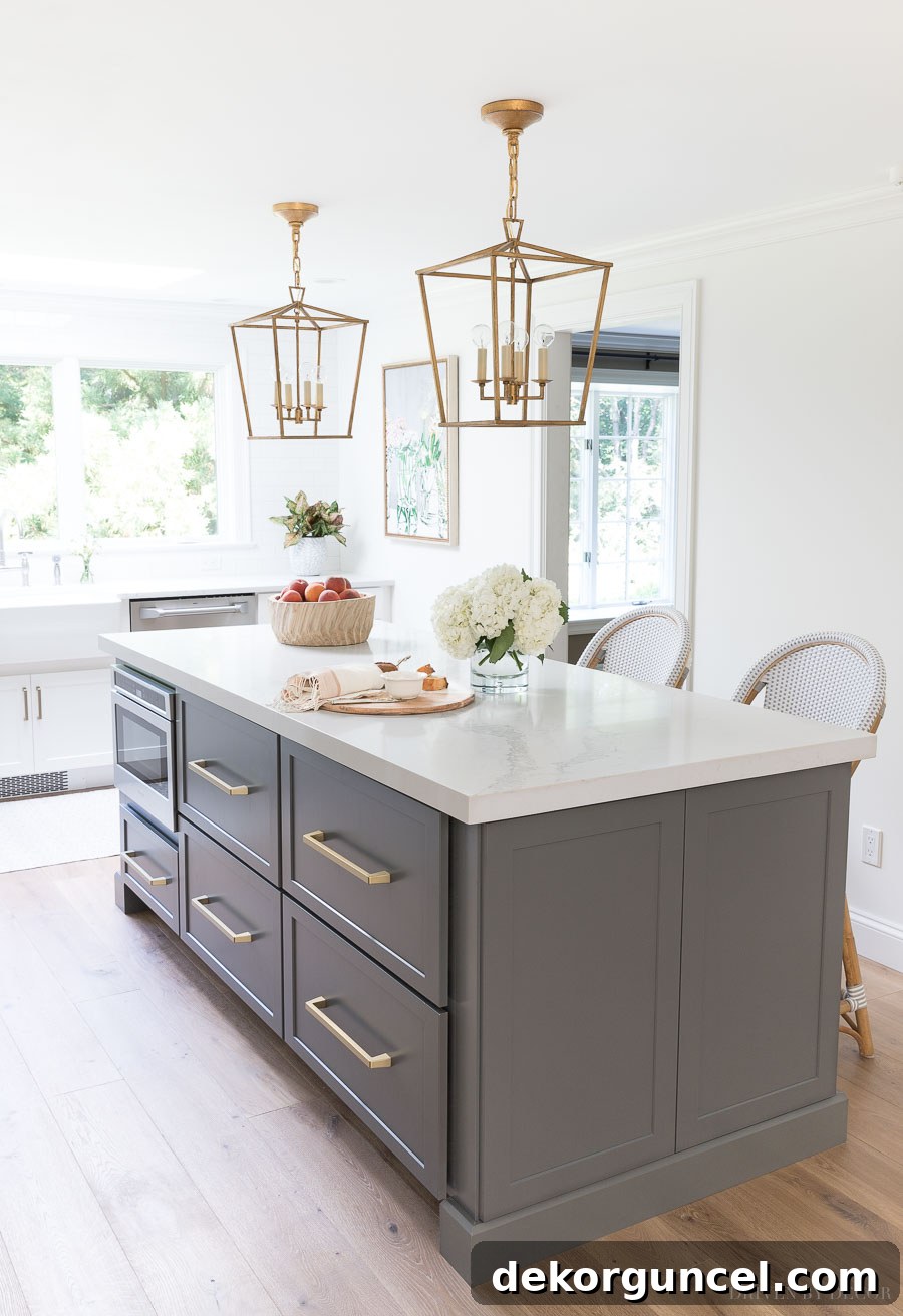
Sources: Elegant Lantern Pendants over Island (12.5″) | Stylish Rattan Counter Stools in Fog | Sleek Pulls on Island Drawers (12″) | Expansive Framed Floral Art Print
Furthermore, if you’re keen to see more of Cloud White, I encourage you to check out our kitchen eat-in area, where you can get another lovely peek at this versatile white adorning the walls. For an even deeper dive into its characteristics and how it stands up against other popular white paint colors, be sure to read my dedicated Benjamin Moore Cloud White review, which provides a comprehensive side-by-side comparison. This review is invaluable for understanding its nuanced undertones and performance.
6. Benjamin Moore’s Simply White (OC-117) LRV 89.52 – The Bright and Versatile Favorite
Benjamin Moore’s Simply White (OC-117), with an impressive LRV of 89.52, stands out as perhaps the most versatile and universally adored white paint color on our list. It offers a unique combination of brightness and warmth that makes it incredibly adaptable to various lighting conditions and design aesthetics. Like White Dove, it possesses warm undertones, but Simply White is distinctly lighter and brighter, offering a more vibrant and crisp feel without ever veering into starkness. Its underlying warmth comes from a subtle hint of yellow, which is just enough to keep it from feeling cold, ensuring a cheerful and inviting atmosphere.
Simply White’s exceptional balance of warmth and brightness makes it a phenomenal choice for almost any surface and any room. It’s fantastic for walls, trim, ceilings, and cabinetry, providing a cohesive and polished look throughout an entire home. Its popularity soared when it was named Benjamin Moore’s Color of the Year, cementing its status as a go-to for designers and homeowners alike. It reflects light beautifully, helping to make spaces feel larger and more open, while still maintaining a gentle, livable quality.
This is the white paint color I personally chose for the majority of our North Carolina home, a testament to its broad appeal and consistent performance. From common areas to private sanctuaries, Simply White creates a fresh, clean canvas that allows furnishings and natural light to truly sing. Our guest room, as pictured below, perfectly showcases Simply White’s ability to imbue a space with a sense of calm and effortless style. The clean backdrop highlights the textures and colors of the bedding and decor, creating an inviting retreat for visitors.
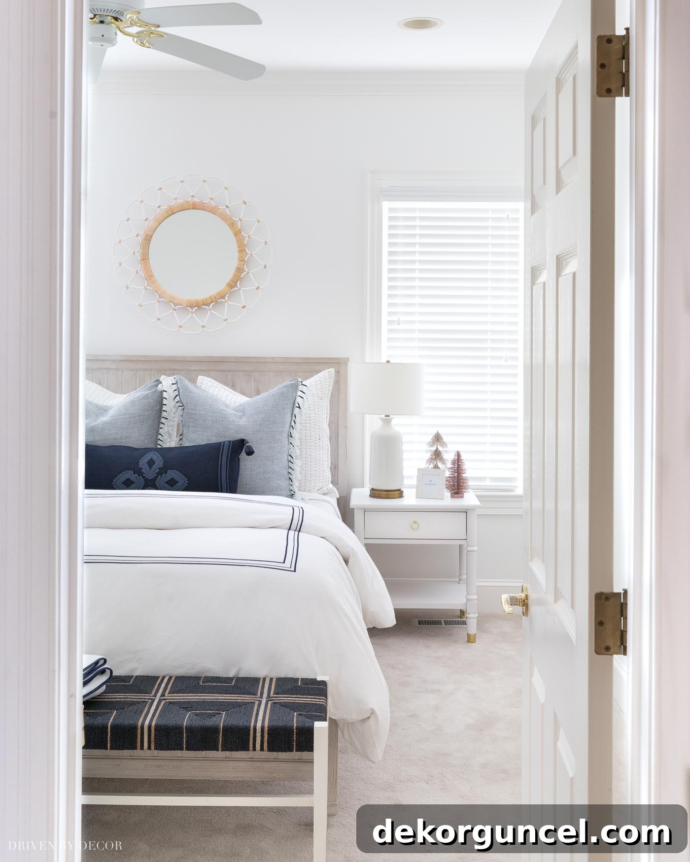
Sources: Charming Beadboard Bed (weathered white finish) | Comfortable 12″ Memory Foam Queen Mattress (no boxspring required) | Elegant Blue & White Quilted Shams (similar style) | Stylish Blue Tasseled Edge Pillow Covers | Sophisticated Navy Embroidered Lumbar Pillow Cover ( with {this} pillow insert) | Classic Navy Border Duvet Cover | Plush White Quilt | Textured Woven Bench | Elegant Nightstand (similar design) | Stylish Lamp (similar model) | Modern Round Mirror
For additional visual inspiration and to see more of Simply White’s beautiful effect, explore my posts on this serene blue and white bedroom and our small breakfast nook, both of which are gracefully painted in Simply White. These examples further demonstrate how this brilliant white can adapt to different functionalities and styles within a home, always ensuring a fresh and bright foundation.
7. Benjamin Moore’s Chantilly Lace (OC-65) LRV 90.04 – The Cleanest Crisp White
Approaching the highest end of the LRV scale, Benjamin Moore’s Chantilly Lace (OC-65) boasts an LRV of 90.04, solidifying its reputation as one of the cleanest, crispest, and brightest white paint colors available. What sets Chantilly Lace apart is its remarkable purity; it reads as a true white with virtually no discernible undertones of yellow or beige. Instead, it carries the slightest hint of blue, which contributes to its exceptional crispness and makes it feel incredibly fresh and expansive. This minimal undertone prevents it from ever looking cold or sterile, instead giving it a luminous, almost ethereal quality.
Chantilly Lace is an outstanding choice for contemporary spaces, where its bright, unadulterated white complements modern aesthetics, sleek lines, and minimalist design beautifully. It enhances natural light, making rooms feel larger and more open. However, its versatility extends beyond modern interiors; it can also look stunning in more traditional homes, particularly when aiming for a light and bright refresh. Its ability to serve as a pure, unblemished backdrop allows architectural details, vibrant artwork, and luxurious textiles to truly stand out and command attention.
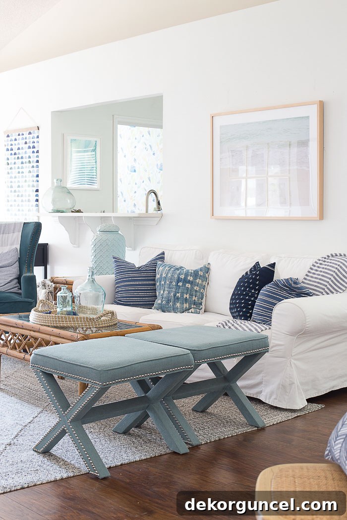
A fantastic illustration of its broad appeal is seen in this light and bright living room designed by Chelsea of Making Home Base. Here, Chantilly Lace provides an immaculate foundation that allows the room’s warm textures and curated decor to shine. It highlights the clean lines of the furniture and creates an airy, welcoming environment that feels both refined and comfortable. You can explore more details of this inspiring space and understand Chelsea’s design philosophy by visiting {here}.
When embarking on our master bathroom remodel, my vision was clear: white walls to create a serene, spa-like sanctuary. After careful consideration, I confidently chose Chantilly Lace, and it proved to be the absolute perfect crisp white for the space. Its bright, almost ethereal quality instantly elevated the bathroom, making it feel more expansive, cleaner, and incredibly refreshing. The way it reflects light amplifies the sense of calm and luxury, which is exactly what one desires in a master retreat.
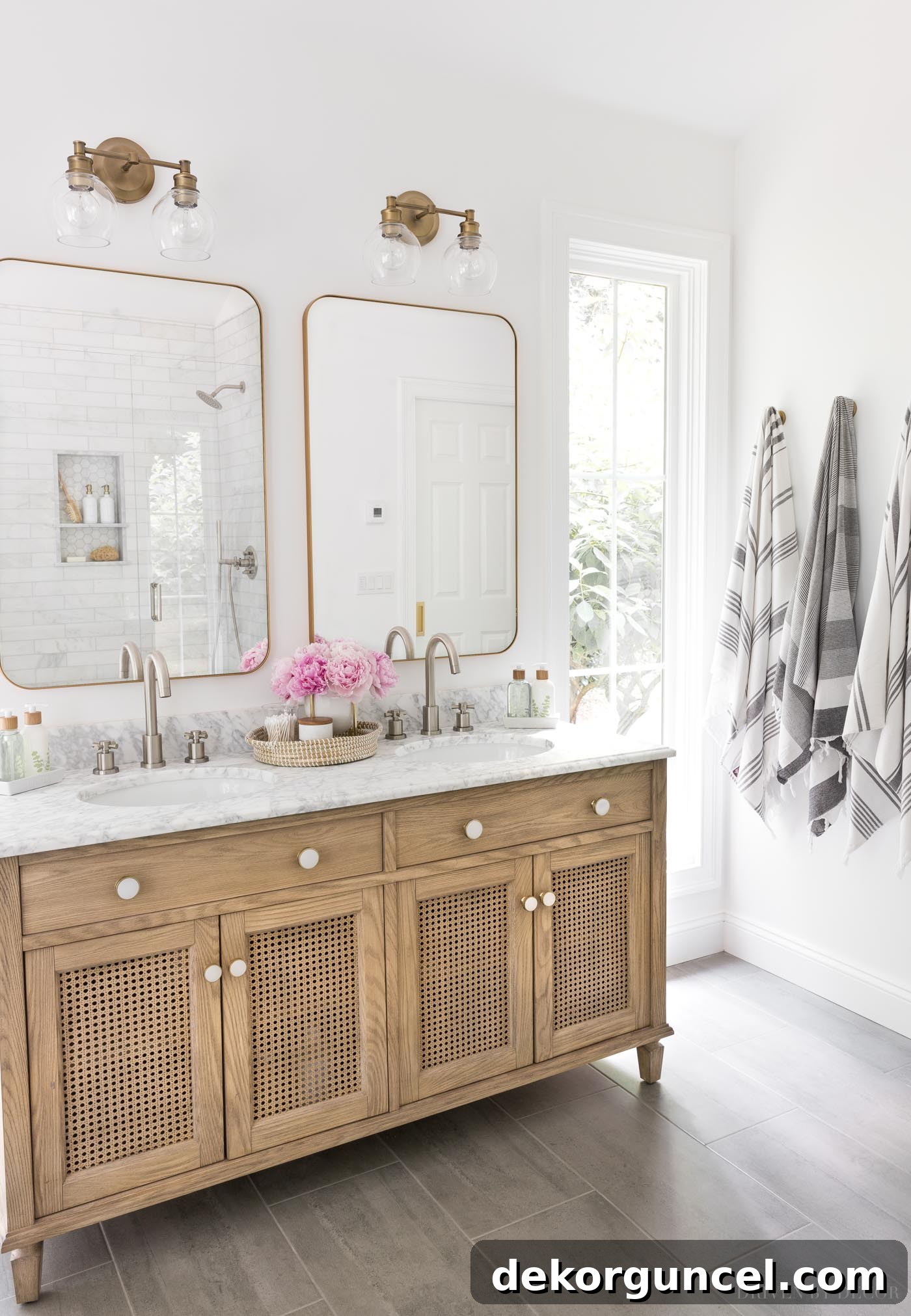
Sources: Stylish Wood & Rattan Double Vanity | Elegant Vanity Knobs | Modern Bathroom Faucets – brushed nickel finish | Chic Vanity Lights | Ornate Vanity Mirrors – gold finish | Luxurious Marble Stacking Dishes | Sophisticated Soap & Lotion Sink Set with Tray | Minimalist Toothbrush Holder | Eco-Friendly Bamboo Toothbrushes | Soft Gray & White Striped Towels | Decorative Robe Hooks – golden champagne finish
The cool undertone of Chantilly Lace makes it an absolutely perfect partner for marble, which also features cool white and gray tones. This natural synergy creates a cohesive and luxurious look, making Chantilly Lace a prime candidate for many bathrooms and kitchens that incorporate marble countertops or tile. If you’re seriously considering this exquisite white for your home, I’ve shared even more in-depth details about its characteristics and how it compares to other similar whites in my dedicated post on Benjamin Moore Chantilly Lace. This will provide you with all the information you need to make a confident decision.
8. Farrow & Ball’s All White (No. 2005) LRV 91.8 – The Purest, Unadulterated White
Concluding our curated list is Farrow & Ball’s All White (No. 2005), which, with an impressive LRV of 91.8, is perhaps the truest and most unadulterated white paint color you can find. The name itself is a declaration: it contains no other pigment except for white. This unique formulation is what gives All White its incredible purity, creating a soft yet exceptionally crisp white that stands apart from brilliant whites which often carry colder blue undertones. Instead, All White offers a clean, clear luminosity that feels incredibly natural and inviting.
This paint color is revered for its ability to brighten any space without feeling sterile or overly clinical. Its inherent softness prevents the harshness sometimes associated with high-LRV whites, making it a sophisticated choice for walls, ceilings, and trim in almost any room. All White creates a serene and timeless backdrop that allows natural light to truly sing, enhancing the architectural features of a room and making it feel more spacious and airy. It pairs beautifully with both traditional and contemporary furnishings, acting as a versatile canvas.
I personally selected Farrow & Ball’s All White for the shiplap walls and trim in our master bedroom remodel, and the result was nothing short of stunning. The paint imbued the room with an unparalleled sense of calm and freshness, transforming it into a peaceful sanctuary. The shiplap texture, highlighted by All White, added depth and character without overwhelming the space, demonstrating how a simple white can be both impactful and understated. Its purity created a perfect backdrop for the carefully chosen furnishings and textiles, allowing them to truly pop. You can delve into the complete master bedroom transformation and see more of All White in action by visiting {here}.
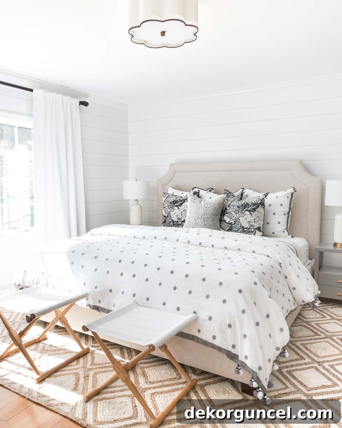
Sources: Luxurious Upholstered Bed (similar design) | Stylish Gray Nightstands | Versatile Camp Stools (similar options) | Elegant Table Lamps (similar style) | Contemporary Semi-Flushmount Light (available {here} and {here}) | Gray & White Patterned Linen Duvet – no longer available | Chic Gray & White Dragon/Floral Pillows | Cozy Quilt in King Size (color is Flagstone) | Elegant Drapes (mine are single-width blackout lined) | Textured Diamond Jute Rug
How To Figure Out the Best White Paint Color For Your Space
Selecting the perfect white paint color goes far beyond simply glancing at a paint chip in a store. This is especially true for whites, where subtle undertones can be heavily influenced by your home’s unique lighting conditions. The same “true white” can appear vastly different in a north-facing room with cool, indirect light compared to a south-facing room bathed in warm, direct sunlight, or under varying artificial light sources. This dynamic interplay means that a color you adore on a tiny swatch might look entirely different on your expansive walls.
To avoid costly mistakes and ensure you achieve your desired aesthetic, we cannot stress enough the importance of thoroughly testing paint samples in your actual space. We highly recommend utilizing peel-and-stick samples from Samplize (we’ve conveniently linked each recommended white paint color’s Samplize sample directly under its description in this guide). These large, high-quality samples allow you to apply the paint directly to your wall without the mess of traditional paint cans, observing how the color truly behaves throughout the day and night under various lighting scenarios. Place them on different walls in the room you intend to paint, live with them for a few days, and see how they interact with your furniture, flooring, and existing decor. This crucial step will empower you to make an informed decision and confidently choose a white that beautifully complements your home.
For even more in-depth advice and practical strategies on testing paint samples effectively, consult our comprehensive guide on how to choose paint colors. It’s packed with tips that will help you navigate this essential phase of your painting project.
What Color Should I Use for the Baseboards and Trim?
When working with white paint colors, a common and highly recommended design approach is to paint your baseboards, trim, and interior doors in the exact same white color as your walls, but with a different sheen. This strategy creates a sophisticated and seamless look while still allowing the architectural details of your trim to stand out subtly. The beauty of this technique lies in the way different sheens reflect light, providing a natural contrast that defines the trim without introducing a conflicting color or undertone.
Typically, for walls, I suggest using a flatter sheen such as flat, matte, or eggshell. These sheens are excellent at hiding imperfections, offer a soft, velvety appearance, and diffuse light beautifully, making a room feel calm and expansive. For the baseboards and trim, opting for a higher sheen like satin or semi-gloss is ideal. These finishes are more durable and easier to clean, which is practical for high-traffic areas like trim. More importantly, their higher reflectivity makes the color appear slightly brighter and crisper than the walls, even though it’s the exact same shade. This subtle luminosity creates the perfect amount of visual contrast, highlighting the trim details while maintaining a harmonious, cohesive color palette throughout your room. The shared undertones ensure a perfectly matched base, allowing the sheens to do all the work in creating dimension and visual interest.
What Color Should I Use for the Ceiling?
For most interior spaces, my general recommendation for ceiling paint is to use the very same white paint color that you’ve selected for your walls. This approach creates a visually seamless transition from wall to ceiling, which can make a room feel taller, more expansive, and more cohesive. When the ceiling is painted the same color, it eliminates the harsh line that often occurs when a traditional stark white ceiling paint is used, softening the boundaries of the room and creating a more integrated design. This technique is particularly effective in spaces where you want to emphasize height or create an uninterrupted flow of color.
When painting the ceiling, it’s crucial to select the correct sheen. I typically advise using a flat or matte finish for ceilings. These low-luster options are excellent at concealing minor imperfections, roller marks, and any irregularities on the ceiling surface, providing a smooth, uniform appearance. The diffused light reflection of a flat finish helps to create a soft, even glow across the ceiling, which is often desirable. Alternatively, if you prefer a dedicated ceiling paint that offers a consistent bright white throughout your home, regardless of your wall color, Benjamin Moore Muresco ceiling paint is a personal favorite for its reliable performance and crisp, clean finish. This option ensures a standard, bright ceiling that contrasts effectively with any wall color, including various whites.
How About Color Matching?
The idea of color matching – taking a paint color from one brand (like Benjamin Moore) and having another brand (like Sherwin Williams) replicate it – can be tempting, especially if you have a preferred paint manufacturer. While it often works reasonably well for more saturated colors, the landscape changes drastically when it comes to white paints. For whites, my unequivocal advice is: just don’t do it! There’s a critical reason behind this strong recommendation, particularly with such nuanced shades.
The core issue with color matching white paints stems from their extremely low pigment content. White paints contain very little actual color pigment; their distinct characteristics are often derived from the precise balance of a few specific white pigments and tiny amounts of other tints to create subtle undertones (e.g., a touch of yellow for warmth, a hint of black for softness, or a microscopic amount of blue for crispness). When a different brand attempts to “match” this delicate composition, they use their own proprietary base whites and tinting systems. Even the slightest deviation in the blend or the base can lead to a significant and noticeable difference in the final appearance once painted on your walls. What might look identical on a small sample card can easily translate into an entirely different undertone – perhaps too yellow, too gray, or too cool – once it covers a large surface area and interacts with your home’s unique lighting. To ensure you get the exact white you fell in love with, always purchase the specified color from its original brand.
Now that we’ve explored the fascinating world of white paint colors, perhaps you’re curious about other popular hues? Expand your color horizons by checking out some of my other top recommendations:
Discover the best blue paint colors for serene and sophisticated spaces.
Explore the best greige paint colors for the perfect balance of warm and cool neutrals.
And for a comprehensive look at how these and other colors come together, be sure to check out {this post} where I share all of the paint colors used throughout my own home! Thank you, as always, for stopping by and happy painting!
