
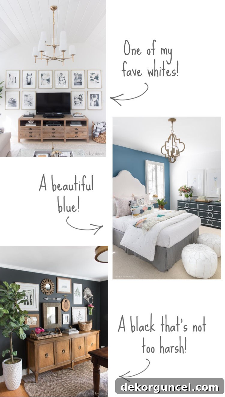
“What paint color is that?” This seemingly simple question is, without a doubt, the most frequent query I receive across all my platforms—emails, messages, and comments alike. As someone who has, on occasion, been known to boldly knock on the front doors of strangers’ homes to inquire about their stunning exterior paint choices, I completely understand this persistent curiosity! Selecting the perfect paint color is a significant decision, capable of transforming a space and reflecting personal style. It’s not just about a shade; it’s about the mood, the light, and the overall feel it creates in a home. Finding those truly exceptional, timeless colors can be a challenge, which is why I’ve compiled this comprehensive guide featuring all the paint colors from our previous home. These are more than just colors; they are proven winners, each thoughtfully chosen and loved for its unique character and impact. Consider this your definitive resource for tried-and-true recommendations that I wholeheartedly endorse. (Please note: this post includes affiliate links. For full transparency, you can review my complete disclosure statement {here}.)
Exterior Paint Color – Benjamin Moore Coventry Gray
The exterior of our home exuded a sophisticated charm, painted in the exquisite Benjamin Moore Coventry Gray with a flat finish. While I can’t claim credit for its initial selection – it was the existing color when we purchased the house – I absolutely adored it. This shade is a magnificent mid-tone gray, striking a perfect balance between light and dark. In person, it possesses a slightly deeper intensity than what often translates in photographs, giving it a rich, grounded presence. A crucial tip to remember when selecting an exterior paint color is that it will almost always appear lighter on the vast expanse of your home than it does on a small paint chip. This phenomenon occurs due to the sheer amount of natural light that an exterior surface receives, which washes out the color, making it seem less saturated. It’s essentially the opposite effect of choosing interior paint colors, where shades tend to deepen once applied to a room’s walls. Coventry Gray offers incredible versatility, complementing various architectural styles from traditional to modern farmhouse, and providing a stunning backdrop for landscaping.
When choosing an exterior paint, consider how it harmonizes with fixed elements like your roof, stone accents, or brickwork. Coventry Gray’s balanced undertones allowed it to pair beautifully with a variety of materials, contributing significantly to our home’s curb appeal. The flat finish, while not as common for exteriors as satin or eggshell, lent a classic, understated elegance that we found particularly appealing.
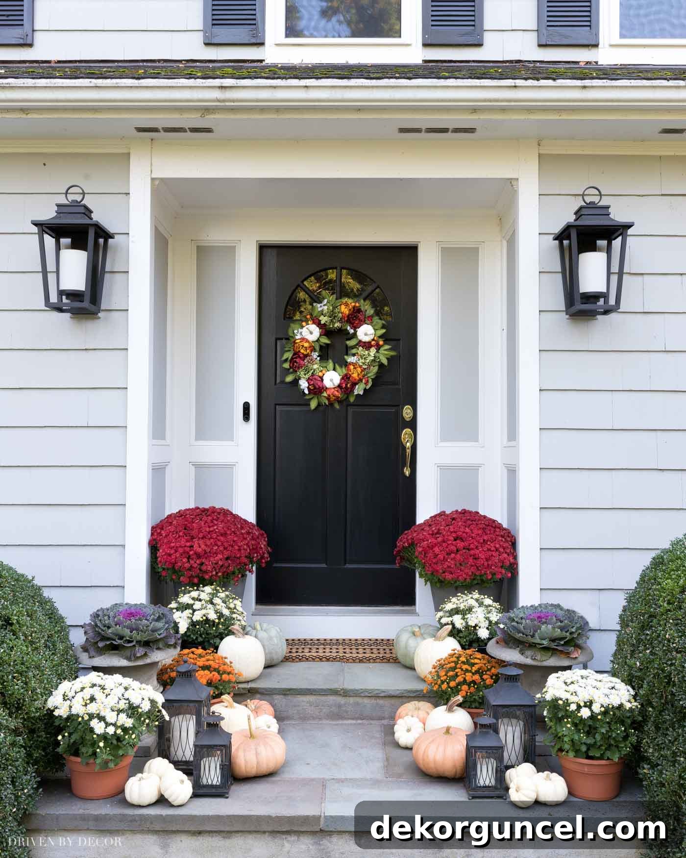
Porch Sources: Fall wreath | Doormat | Lantern sconces | Large planters (closest to door) | Urn planters | Set of black lanterns
Home Office Paint Color – Benjamin Moore Nightfall
Our home office was transformed by the deep, intriguing shade of Benjamin Moore Nightfall, applied in a Regal Select Matte finish. This particular color often sparks conversation because, in photographs, it can sometimes be mistaken for a rich navy. However, Nightfall is truly a sophisticated, dark charcoal gray that leans into a soft black, possessing the merest hint of a green undertone that subtly reveals itself in certain lighting conditions. It’s an exceptional choice for anyone aspiring to paint a room black without it feeling stark, overwhelming, or unwelcoming. Instead, it creates an atmosphere of cozy sophistication, perfect for a productive yet comfortable home office environment.
I owe a huge thank you to my dear friend, Lisa, for this brilliant recommendation. Before her intervention, I had tried no less than five different black paint samples on our office wall, each one falling short of my vision. Nightfall was the game-changer, proving that sometimes, finding the perfect shade requires a fresh perspective or an experienced eye. The beauty of Nightfall lies in its ability to adapt to varying light. The accompanying image of our home office wonderfully illustrates this chameleon-like quality: on the left, you see its appearance in average light, showcasing its deep gray-black essence; in the middle, under brighter light, its softness and subtle undertones emerge; and on the right, in low light, it deepens to an almost true, velvety black, yet still retains its inherent warmth, avoiding any harshness. This makes it an incredibly versatile option, capable of creating a dramatic yet inviting space.
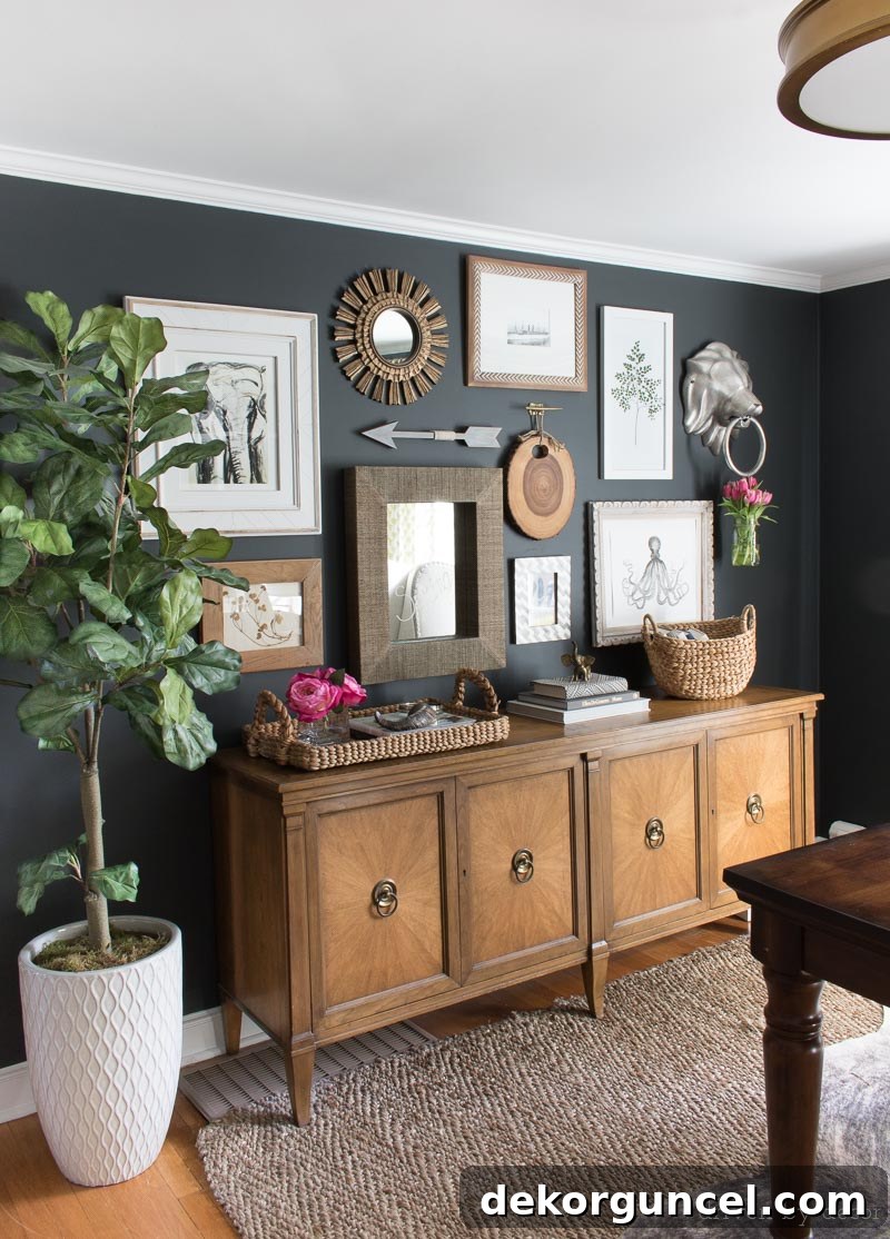
Office Sources: Faux fiddle leaf fig tree (similar) | Console is thrifted | Rug (similar) | Semi flush mount ceiling light | Elephant art print | Woven tray | Curved basket (similar) | Other sources no longer available
Dining Room Paint Color – Sherwin Williams Keystone Gray (tweaked!)
Our dining room showcased a refined, personalized touch with a tweaked version of Sherwin Williams Keystone Gray, applied in a Duration Home matte finish. This wasn’t my first encounter with Keystone Gray; I had fallen in love with its character in a previous home, making it an easy choice for a repeat performance. Keystone Gray is a beautiful, warm brownish-gray, often categorized as a versatile “greige.” It’s an excellent selection for those who desire a color that offers more depth than typical light grays, yet maintains an incredible ability to harmonize with virtually any decor style or color palette. Its warmth makes a dining room feel inviting and elegant, perfect for gathering with loved ones.
However, I did make a slight adjustment to the original formula. Keystone Gray, in its purest form, has some subtle purple undertones that I personally wanted to minimize. By having the paint mixed with a hair less of the purple pigment, or adding a tiny drop of its complementary color (which a good paint store can assist with), we achieved a perfectly balanced greige that was exactly what I envisioned. This ‘tweaking’ process highlights the importance of understanding undertones and not being afraid to customize a shade to suit your specific lighting and aesthetic preferences. It’s a color that transitions effortlessly from day to night, looking sophisticated under natural light and cozy under artificial illumination. For the exact modified paint formula I used, you can refer to the end of {this post}.
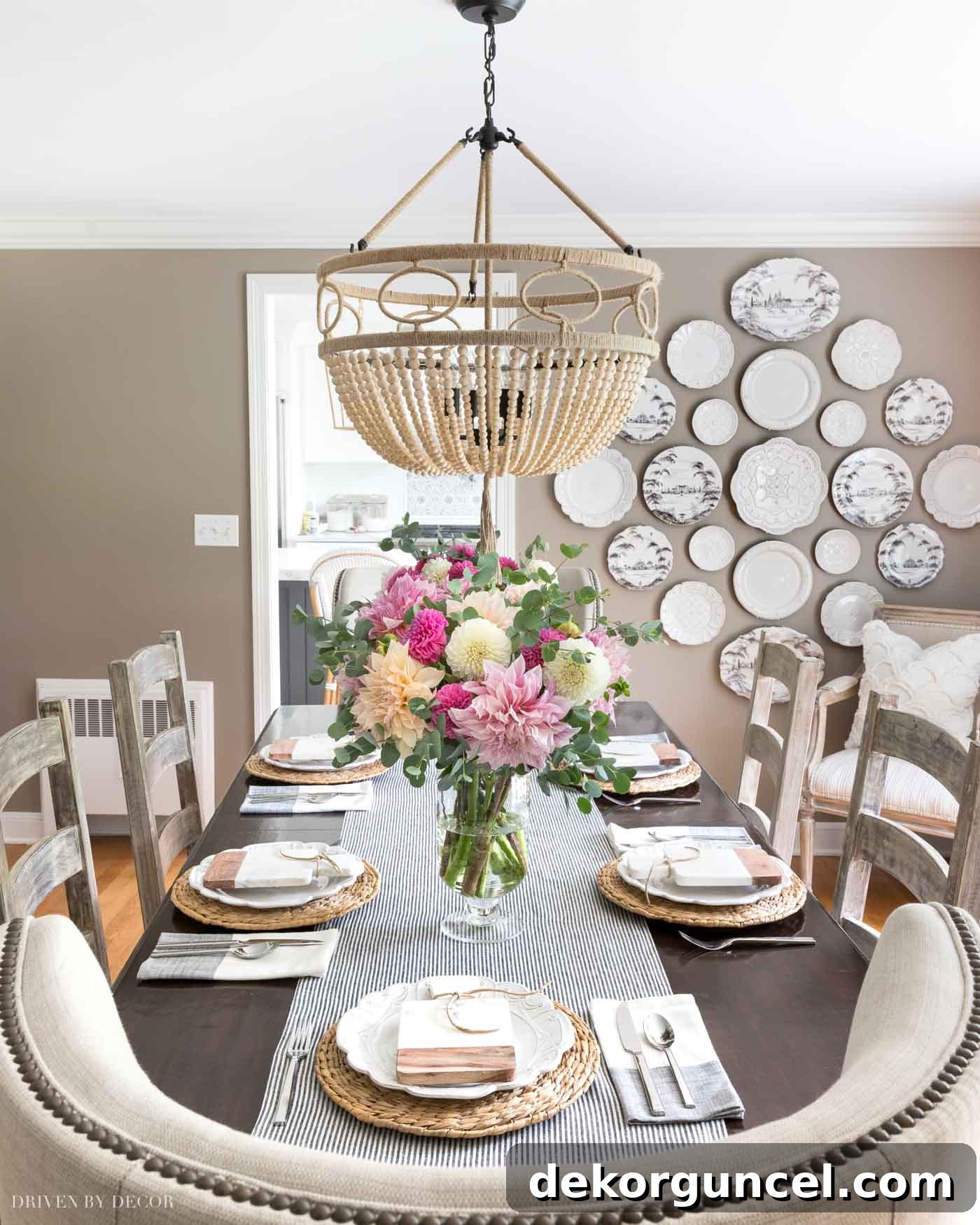
Dining Room Sources: Wood bead chandelier | Table & chairs – no longer available | Rattan chargers (similar) | Colorblock napkins | Table runner (similar) | Glass hurricane vases | White wall plates | Patterned wall plates | White chenille scalloped pillow
Living Room Paint Color – Sherwin Williams Anew Gray
Initially, our living room shared the same warm hue as our dining room, painted in Keystone Gray. However, the living room receives considerably less natural light, rendering Keystone Gray a bit too dark for the space. Last year, I decided it was time for a refresh, opting for a lighter, airier paint color to brighten the room. My quest led me to explore several popular greige paint colors, a category that offers the perfect blend of warmth from beige and coolness from gray. To help readers on their own paint journey, I’ve even compiled {this post} showcasing readers’ favorite greiges.
After careful consideration and numerous swatches, I narrowed it down to four strong contenders, which you can see in the comparative image below: Worldly Gray, Anew Gray, Revere Pewter, and Agreeable Gray. Each of these greiges has its own unique charm and undertones, making the selection process both exciting and challenging. Worldly Gray offered a slightly lighter feel, while Revere Pewter leaned a bit more gray, and Agreeable Gray lived up to its name with widespread appeal. Ultimately, I chose Sherwin Williams Anew Gray, which is the second swatch from the left in the picture. I am absolutely delighted with this decision! Anew Gray strikes a beautiful balance, providing warmth without feeling heavy, and brightening the room without appearing stark. It’s a truly versatile greige that adapts wonderfully to different lighting conditions and complements a wide range of decor styles. This color truly transformed the living room into a more inviting and visually expansive space.
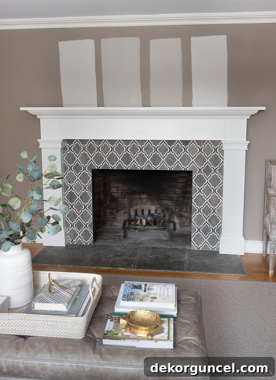
I ended up going with Sherwin Williams Anew Gray (second from the left in pic above) and love it so much!
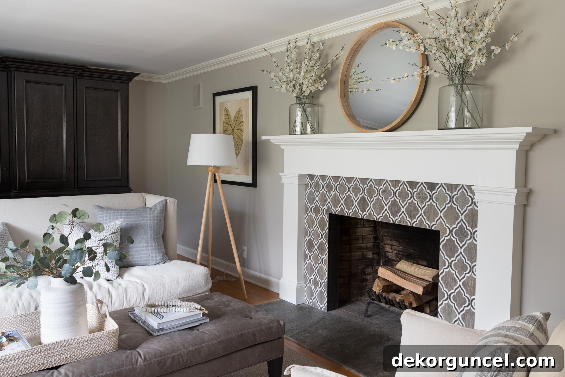
Living Room Sources: Loveseat & ottoman (custom order from Lee Industries) | Linen swivel chairs | Wood floor lamp | Framed leaf art print | Woven ottoman tray | White vase | Faux eucalyptus | Bone beads | Gray plaid pillows | Gray crosshatch pillows | Black & white striped pillows | Round mirror over fireplace | Vases on mantel – no longer available | Faux flowers in mantel vases
For an even deeper dive into this versatile shade, I’ve dedicated an entire post to Anew Gray {HERE}. This comprehensive guide compares it to other similar greige paint colors and also provides a complete list of all the sources for our living room decor, offering even more inspiration and detail.
Girls’ Bathroom – Sherwin-Williams Alpaca
One of my most satisfying home improvement projects was the delightful transformation of my daughters’ bathroom. This makeover involved not only painting the walls but also giving the existing vanity a much-needed refresh. For the walls, I selected Sherwin-Williams Alpaca, applied in an Emerald Interior Latex Matte finish. Alpaca is another outstanding greige that I frequently recommend and have featured in my post on the 10 Best Greige Paint Colors. It strikes a beautiful balance, being a light greige that still offers sufficient depth and warmth without washing out the space. Its subtle, neutral quality makes it incredibly versatile, creating a serene and clean backdrop that is perfect for a bathroom. I would absolutely choose this color again for its undeniable charm and adaptability.
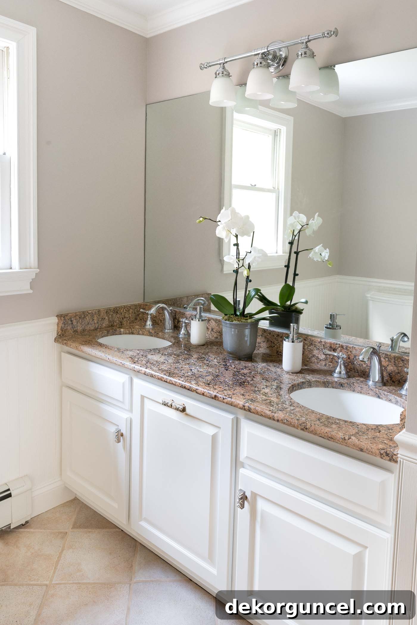
Beyond the walls, the vanity and cabinets received a remarkable facelift with Sherwin-Williams Alabaster. This crisp, soft white instantly revitalized them, completely erasing their previously dated and worn appearance. The power of paint to dramatically update existing fixtures is truly incredible, and this transformation was a testament to that. Alabaster provided a clean, fresh contrast to the Alpaca walls, creating a bright and inviting atmosphere in the bathroom. You can explore all the intricate details of how I expertly transformed our bathroom cabinets with paint in {this post}, offering valuable insights for your own renovation projects.
Kitchen Paint Color Before Remodel – Benjamin Moore White Dove
Prior to our kitchen remodel, the space was adorned with Benjamin Moore White Dove, applied in a Regal Select matte finish. This particular shade holds a special place among my top favorite white paint colors, and you can explore more of my beloved whites in {this post}. White Dove is celebrated for being a warm white, characterized by subtle yellow undertones. Its warmth makes it incredibly inviting and prevents it from feeling stark or cold, which can sometimes be a challenge with other white paints. I’ve used it in various spaces over the years, and it’s fascinating how its yellow undertones can appear more pronounced in some rooms compared to others, largely depending on the quality and quantity of natural light received.
The accompanying image perfectly illustrates this characteristic: in areas where the light pours in abundantly, such as near {these wall hanging herb crates}, White Dove presents as a true, luminous white, bright and clean. However, in more shadowed corners, like by the baker’s rack, its gentle yellow undertone becomes more apparent, adding a layer of creamy softness that contributes to a cozy and welcoming ambiance. This dynamic quality is what makes White Dove so captivating – it’s a white that truly lives and breathes with the light, offering a soft glow rather than a harsh glare. It was an ideal choice for the kitchen before the remodel, creating a timeless and comforting atmosphere.
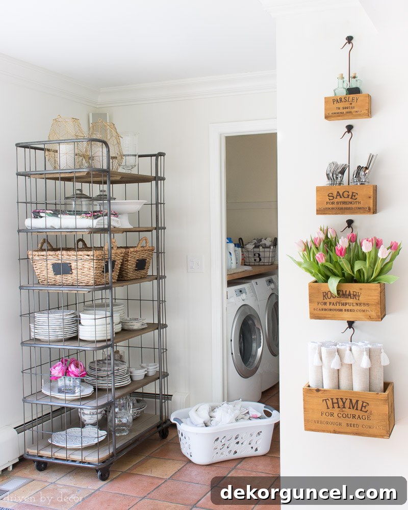
Sources: Rolling bakers rack (similar) | Nesting herb crates on wall
Kitchen Paint Color After Remodel – Benjamin Moore Cloud White
Following the extensive remodel of our kitchen – which you can revisit with “before” and “after” comparisons {here} if you missed it – I decided to subtly adjust the white paint color to perfectly complement the fresh, updated aesthetic. My choice for the newly renovated space was Benjamin Moore Cloud White, applied with a Regal Select flat finish for the walls. Cloud White shares many similarities with White Dove, both being warm whites with gentle yellow undertones. However, Cloud White has a slightly “cleaner” quality to it, meaning its undertones are a touch less pronounced, resulting in a more pristine yet still inviting white.
This nuanced difference was crucial in pairing with the new materials and finishes introduced during the remodel, allowing the cabinetry and countertops to truly shine. To maintain a cohesive and polished look, the trim throughout our kitchen was also painted in Cloud White, but with a satin finish. The interplay between the flat finish on the walls and the satin finish on the trim creates a subtle contrast in sheen, adding depth and dimension without introducing a new color. This technique is particularly effective with white paints, as the varying sheens can highlight architectural details and provide visual interest. Cloud White has proven to be an excellent choice, contributing to the bright, fresh, and modern feel of our remodeled kitchen.
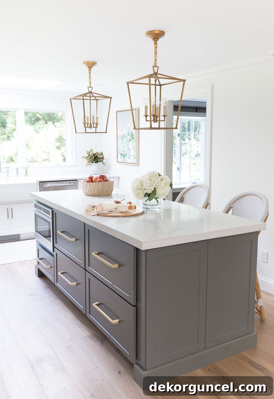
Kitchen Sources: Lantern pendants over island in gild size small (12.5″) | Rattan counter stools in Fog | Pulls on island drawers (12″) | Large framed floral art print | Flooring
The other room in our house that’s painted Cloud White is our family room, further demonstrating its versatility and appeal.
Family Room – Benjamin Moore Cloud White
Choosing the perfect white for our family room was a meticulous process, as white paints can behave so differently depending on the specific light conditions of a room. To ensure the ideal choice, I meticulously tested three of my favorite white contenders directly on the walls: White Dove, Cloud White, and Simply White. In this particular space, White Dove appeared a bit too yellow for my taste, creating a warmer tone than desired. Conversely, Simply White, while beautiful, felt a little too stark and crisp for the cozy ambiance I envisioned for the family room. Benjamin Moore Cloud White, however, landed perfectly in the middle – it was truly the “Goldilocks” of white paint colors, offering just the right balance of warmth without being overly creamy, and brightness without feeling cold.
Both the ceiling and the walls in our family room are painted in Cloud White, yet they exhibit a noticeable difference in appearance. This is primarily due to the variation in paint sheen: the ceilings are finished in a satin sheen (using Benjamin Moore Advance paint), while the walls maintain a matte finish (using Regal Select). With white paint especially, sheen plays a significantly larger role in the final look than it does with more saturated colors. The satin on the ceiling reflects more light, making it appear a good bit brighter and more luminous than the matte walls, which absorb light and provide a softer, more sophisticated backdrop. Cloud White provides an airy, welcoming foundation for the room, allowing furniture, textiles, and artwork to truly pop without competing for attention.
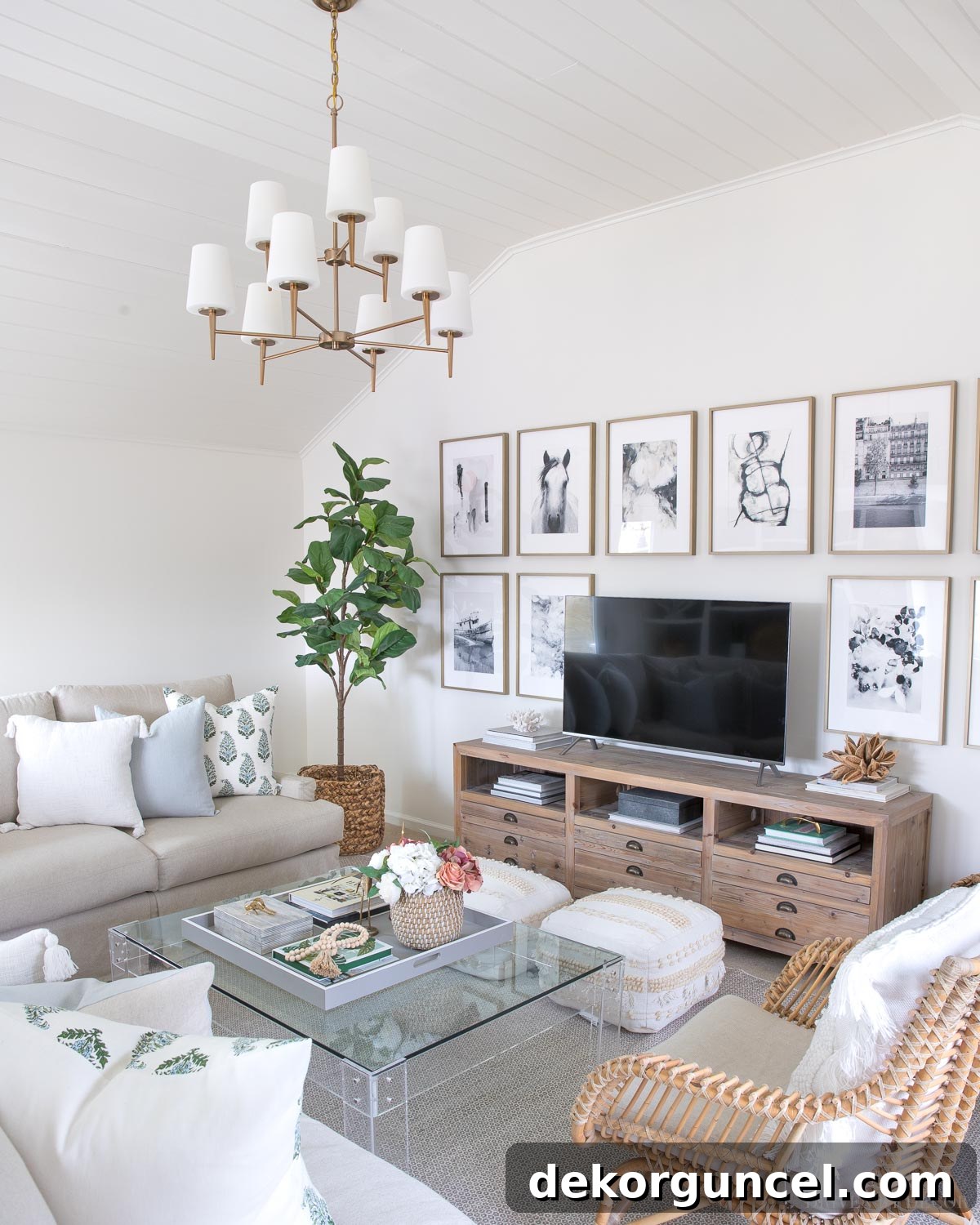
Sources: TV console (similar) | Chandelier (satin bronze) | White tasseled pillow cover | Blue linen pillow cover | Green & blue block print pillow cover | Faux fiddle leaf fig tree | Rug | Pair of floor poufs | Art prints (details in {this post} | Acrylic coffee table (similar) | Coffee table tray (28″ square) | Black and white striped box (on coffee table) | Brass cricket (on coffee table) | Wood beads | Basket planter | Rattan chair
For a complete visual journey of this transformation, you can view the detailed “before” and “after” pictures of our family room {here}.
Powder Room Paint Color – Benjamin Moore Chelsea Gray & Platinum Gray
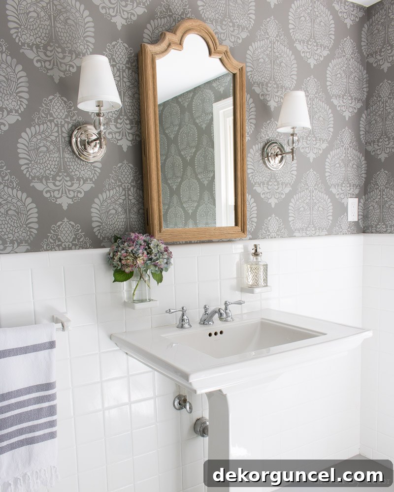
Our powder room received a truly unique and personalized touch through an ambitious stenciling project involving two distinct shades of gray. The background color for the walls was Benjamin Moore Chelsea Gray, applied in an Aura Bath & Spa matte finish. Chelsea Gray is one of my absolute go-to dark grays; it’s a sophisticated, deep gray with balanced undertones that lends an air of elegance and grounding to any space. Over this rich base, the intricate stenciling was meticulously applied using Benjamin Moore Platinum Gray, mixed in a Behr Premium Plus Ultra satin finish. Platinum Gray is a lighter, more ethereal gray, providing a beautiful contrast and highlighting the delicate pattern of the stencil.
To complete the cohesive design, I also undertook the project of painting our tile floors in Platinum Gray, utilizing a durable Floor & Patio Low Sheen Enamel. The combination of these two grays created a stunning, layered effect, demonstrating how different shades of the same color family can add immense depth and character. They work exceptionally well together, but it’s important to note that both Chelsea Gray and Platinum Gray are fantastic standalone colors as well, offering versatility for various applications. For detailed information on my stenciled walls, including a comprehensive how-to guide and a link to the specific stencil used, please refer to my post on wall stencils. Furthermore, you can discover more images of our powder room, a full source list, and insights into my newly painted bathroom tile floors in {this post}.
Powder Room Sources: Annapakshi Indian Damask Wall Stencil (11.25″ x 15.5″) | Arched wood mirror (similar) | Pedestal Sink | Sconces (Polished Nickel)
Master Bedroom – Farrow & Ball’s All White
For the serene retreat of our master bedroom, I selected Farrow & Ball’s All White, applied in an Estate Eggshell finish, for both the shiplap walls and the trim. This choice was integral to creating the clean, fresh, and slightly coastal aesthetic we desired. All White is a truly exceptional shade because, as its name suggests, it is a very pure white, devoid of any significant blue or yellow undertones. This makes it incredibly versatile and ensures it reads as a crisp, unadulterated white in almost any lighting condition. While you might observe a slight bluish tint in some areas of the wall in the accompanying bedroom image, this is purely a reflection of the drapes and not an inherent quality of the paint itself.
The beauty of All White lies in its ability to be both bright and clean without ever veering into starkness. It provides a perfect blank canvas that allows other elements in the room – such as textiles, artwork, and furniture – to truly pop. The Estate Eggshell finish, characteristic of Farrow & Ball paints, offers a beautiful, low-sheen durability that is ideal for both walls and trim, adding to the sophisticated feel of the room. You can explore more captivating images of our bedroom, along with a comprehensive source list for the room {here}. Additionally, for those interested in tackling a similar project, be sure to check out my post on our DIY shiplap walls, which provides all the intricate details on the installation process.
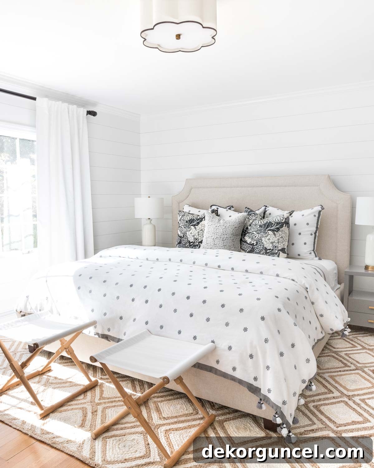
Sources: Upholstered Bed | Gray nightstands | Camp stools (similar) | White USB table lamps | Semi flushmount light (available {here} and {here}) | Gray & white patterned linen duvet – no longer available | Gray & white dragon/floral pillows | Gray velvet crosshatch pillow | Quilt in king (color is Flagstone) | Drapes (mine are single-width blackout lined) | Diamond jute rug
Guest Room Paint Color – Pratt & Lambert Ever Classic
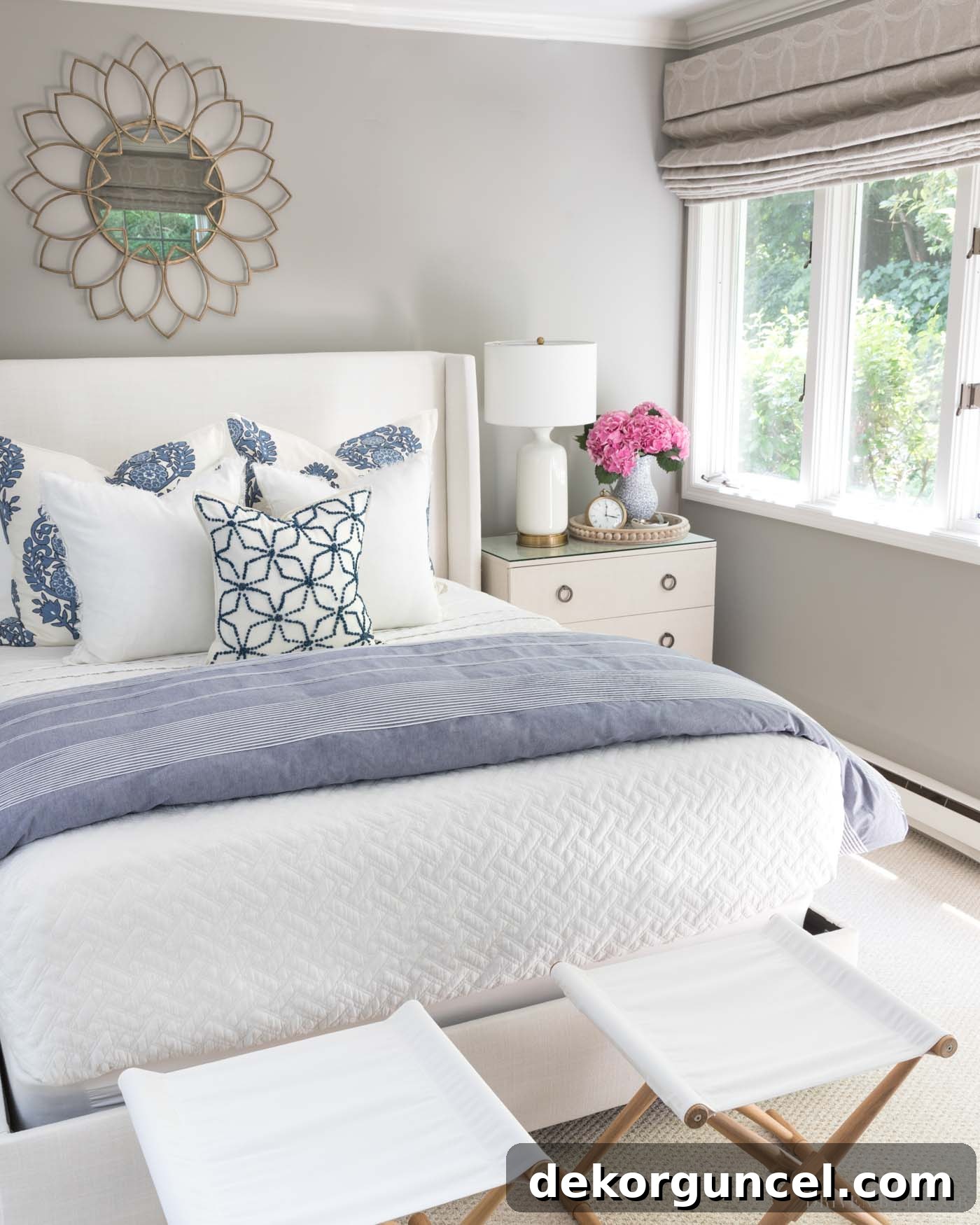
For our guest room, I opted for Pratt & Lambert’s Ever Classic, applied in an Accolade flat finish. This color is a beautifully warm greige, sharing a similar comforting quality with the paint colors in our living room and dining room, but with a distinctly lighter presence. It offers that ideal balance of gray and beige, ensuring the room feels both inviting and versatile. Its gentle warmth creates a serene and welcoming atmosphere, which is paramount for a guest space. Guests often appreciate a room that feels clean, calm, and adaptable to their personal style, and Ever Classic delivers precisely that. The lighter nature of this greige prevents the room from feeling closed in, even in spaces with less abundant natural light, making it a sophisticated yet understated choice.
Guest Room Sources: Mirror over Bed | Upholstered Wingback Bed (fabric is Zuma White) | Quilt (similar) | Pillows & duvet cover – no longer available | White Bedside USB Lamps | Round Wood Beaded Tray | Clock | Folding camp stools
My Daughter’s Bedroom (Original Look) – Sherwin-Williams Lucky Green
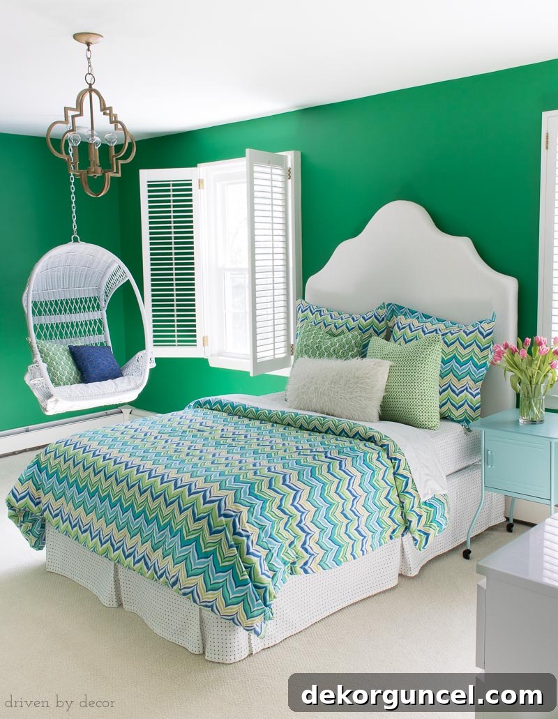
When we embarked on making over my youngest daughter’s bedroom several years ago, her primary request was to paint her walls green. This was a significant departure, almost a 180-degree turn, from my typical preference for neutral palettes. However, I found myself genuinely excited by the prospect of embracing such a bold and vibrant color choice. After carefully trying several green paint samples to ensure we found just the right shade, we ultimately settled on Sherwin-Williams Lucky Green, applied in a Duration Home matte finish. Lucky Green is an absolutely wonderful choice for a child’s room or any space needing a burst of cheerfulness. It’s a bright, lively green that invigorates the room without ever becoming overly aggressive or “obnoxiously bright,” a common pitfall with highly saturated colors. It struck the perfect balance between playful and sophisticated, creating a happy and inspiring environment for her. This experience truly highlighted the joy of stepping outside one’s comfort zone when it comes to color, especially when designing for a personality as vibrant as a child’s.
My Daughter’s Bedroom (New Look) – Behr Blueprint
A few years after the vibrant green transformation, my daughter decided she wanted a more toned-down, mature aesthetic for her room. Embracing her evolving style, we embarked on another refresh. This time, we painted three of her walls a clean, crisp white to provide a serene backdrop, and chose Behr’s 2019 Color of the Year, Blueprint, for a striking accent wall. Blueprint is an absolutely beautiful blue – it’s richly saturated without being overly bright, creating a sophisticated yet inviting focal point. It perfectly captured the calm yet chic vibe she was aiming for, demonstrating how a single accent wall can completely redefine a space. You can delve into more pictures and details of her transformed room in my post on her boho bedroom colors.
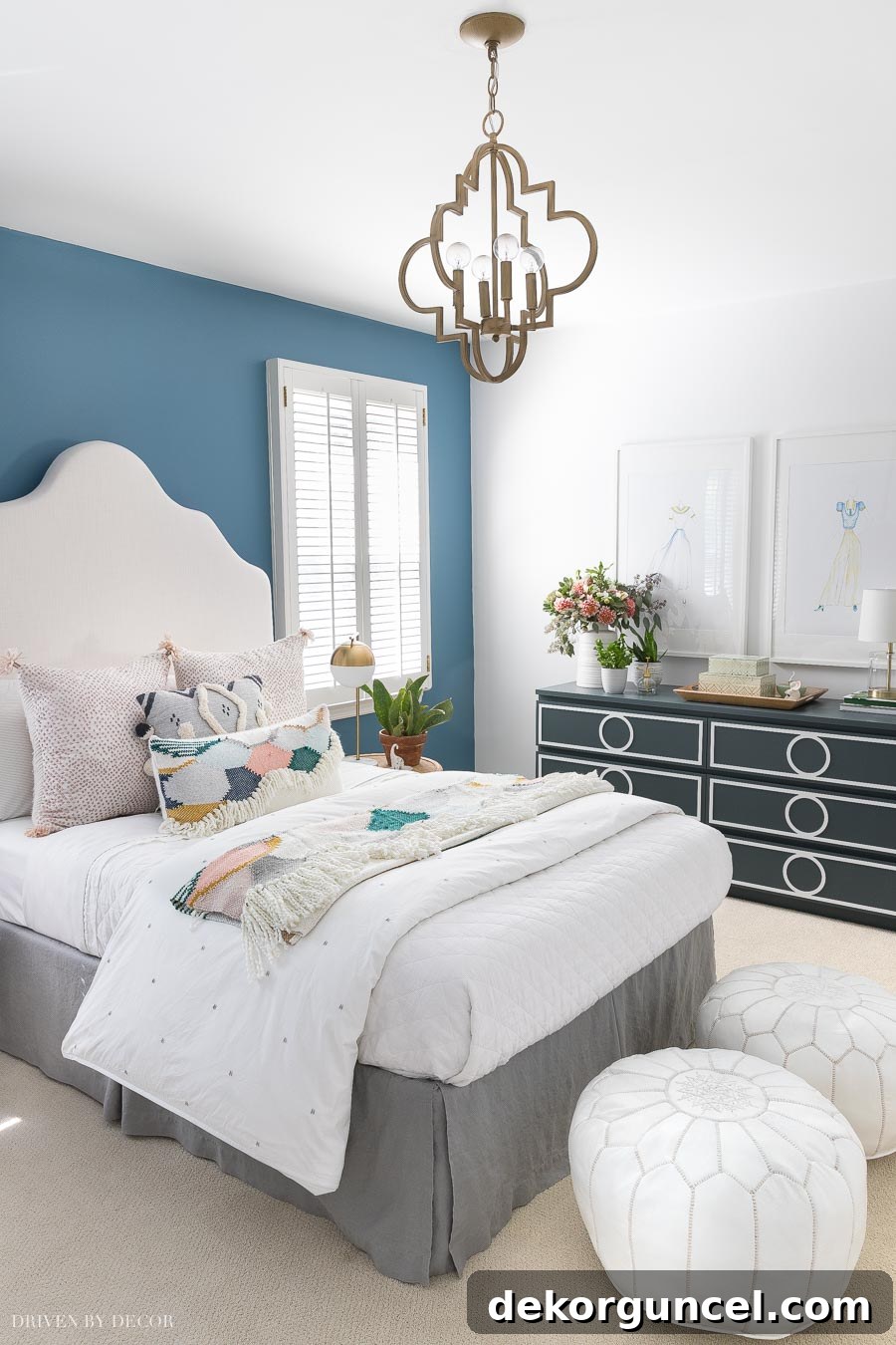
Room sources: DIY upholstered headboard | Quatrefoil pendant | White quilt | White leather poufs | Other bedding & accessories no longer available
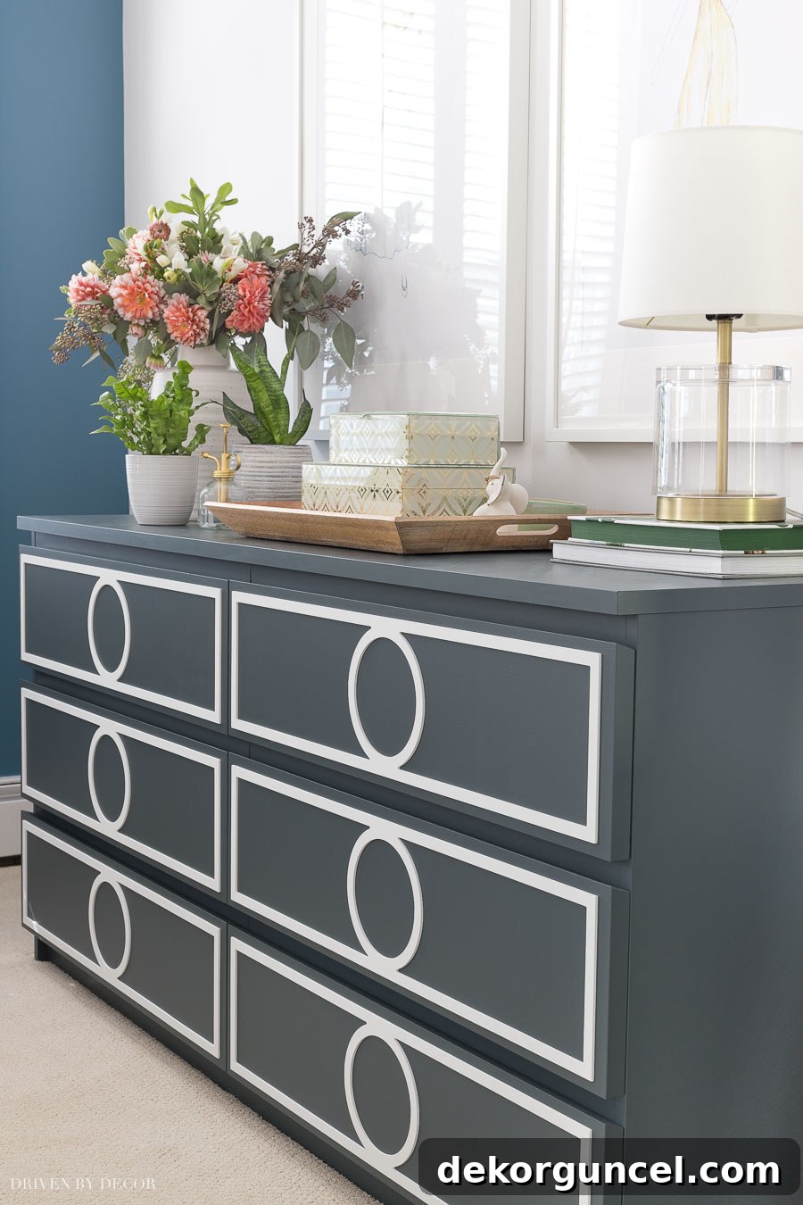
Adding another layer of character to the room is the striking navy dresser. This wasn’t purchased in its current form; it’s actually a standard white IKEA dresser that I meticulously painted and enhanced with decorative overlays. The paint color I chose for this piece is Behr’s Blue Metal. It’s an incredibly pretty shade in person, offering a rich, deep navy with a subtle metallic sheen that adds a touch of glamour and sophistication. This project perfectly illustrates the transformative power of paint, allowing a simple, affordable furniture piece to become a customized statement item.
Master Bathroom – Benjamin Moore Chantilly Lace
The most recent paint project in our home was for the highly anticipated master bathroom addition. For this luxurious space, my goal was to select a white that felt impeccably crisp and clean, one that would perfectly complement the abundant marble features throughout the room. After careful consideration and testing, Benjamin Moore Chantilly Lace emerged as the undeniable winner. I couldn’t be happier with this choice; it has truly solidified its place as my new go-to white paint color specifically for bathrooms.
Chantilly Lace is celebrated for its incredibly pure, bright white quality, lacking discernible undertones of yellow or blue, which can sometimes complicate pairings with natural stone like marble. Its clean luminosity enhances the pristine beauty of the marble, making the entire bathroom feel expansive, fresh, and incredibly sophisticated. It’s a white that feels simultaneously timeless and modern, providing a perfect backdrop that allows the luxurious textures and finishes of the bathroom to take center stage. The result is a spa-like retreat that is both bright and inviting, demonstrating how the right white paint can elevate an entire design scheme, particularly in a space dedicated to relaxation and rejuvenation.
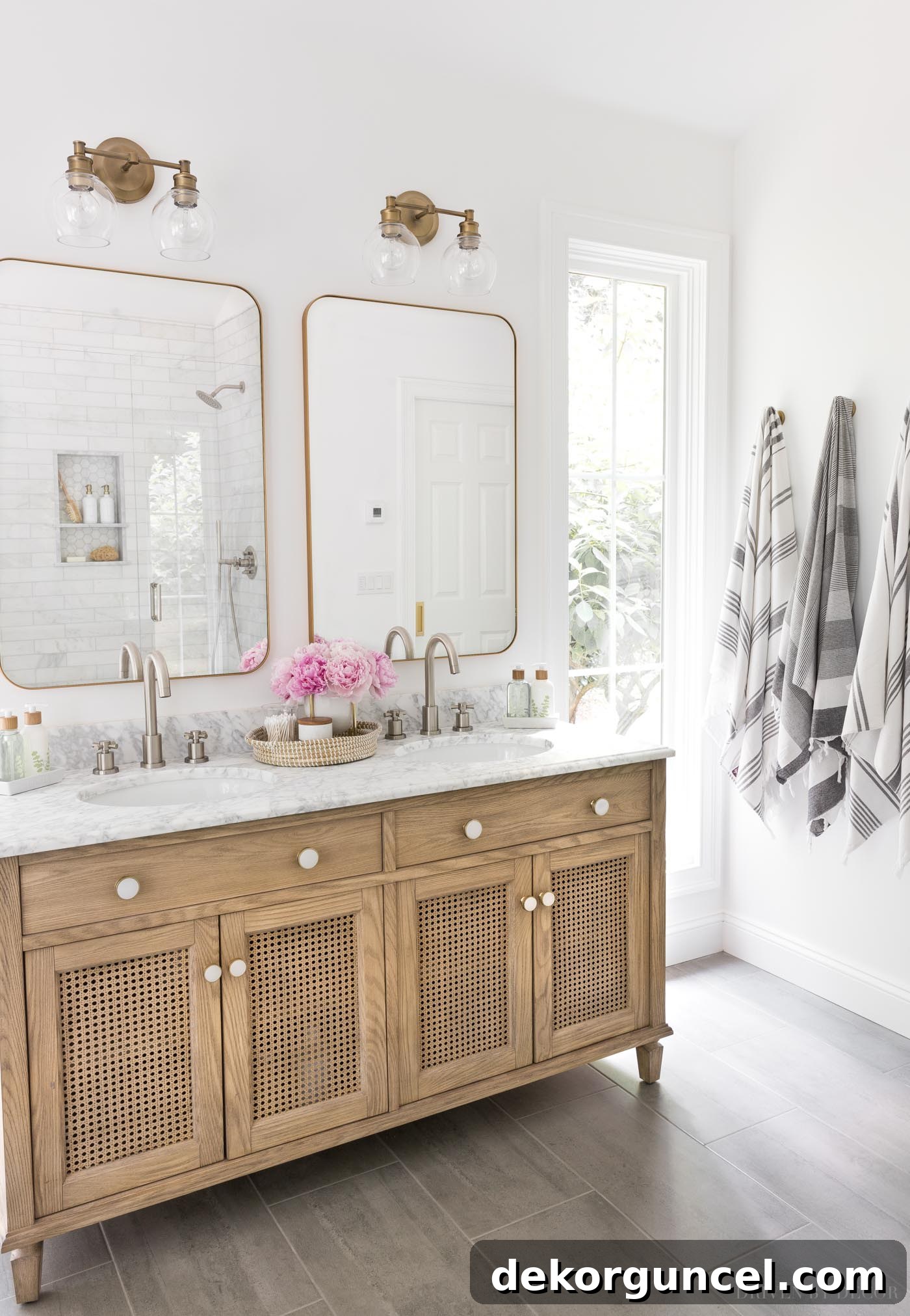
Vanity Area Sources: Wood & rattan double vanity | Vanity knobs | Bathroom faucets – brushed nickel | Vanity lights | Vanity mirrors – gold | Woven seagrass tray on vanity (similar) | Cross base planter | Marble stacking dishes | Soap & lotion sink set with tray | Toothbrush holder | Bamboo toothbrushes | Gray & white striped towels | Robe hooks – golden champagne
For an in-depth exploration of this popular white, I’ve dedicated an entire post to Benjamin Moore Chantilly Lace, where I compare it to other similar white paint colors. You can read my detailed Chantilly Lace post {here} for more insights.
Guest Bedroom in NC – Benjamin Moore Simply White
Last but certainly not least, my journey with paint colors continued into our new house in North Carolina. This home, with its abundant natural light, presented a unique challenge and opportunity for selecting white paints. After carefully testing three of my most cherished white shades – Simply White, Cloud White, and White Dove – directly on the walls of several rooms, Benjamin Moore Simply White emerged as the clear winner for our guest bedroom. This experience perfectly underscores how vastly different white paints can appear from one home to another, heavily influenced by factors like natural light exposure, geographical location, and surrounding environment.
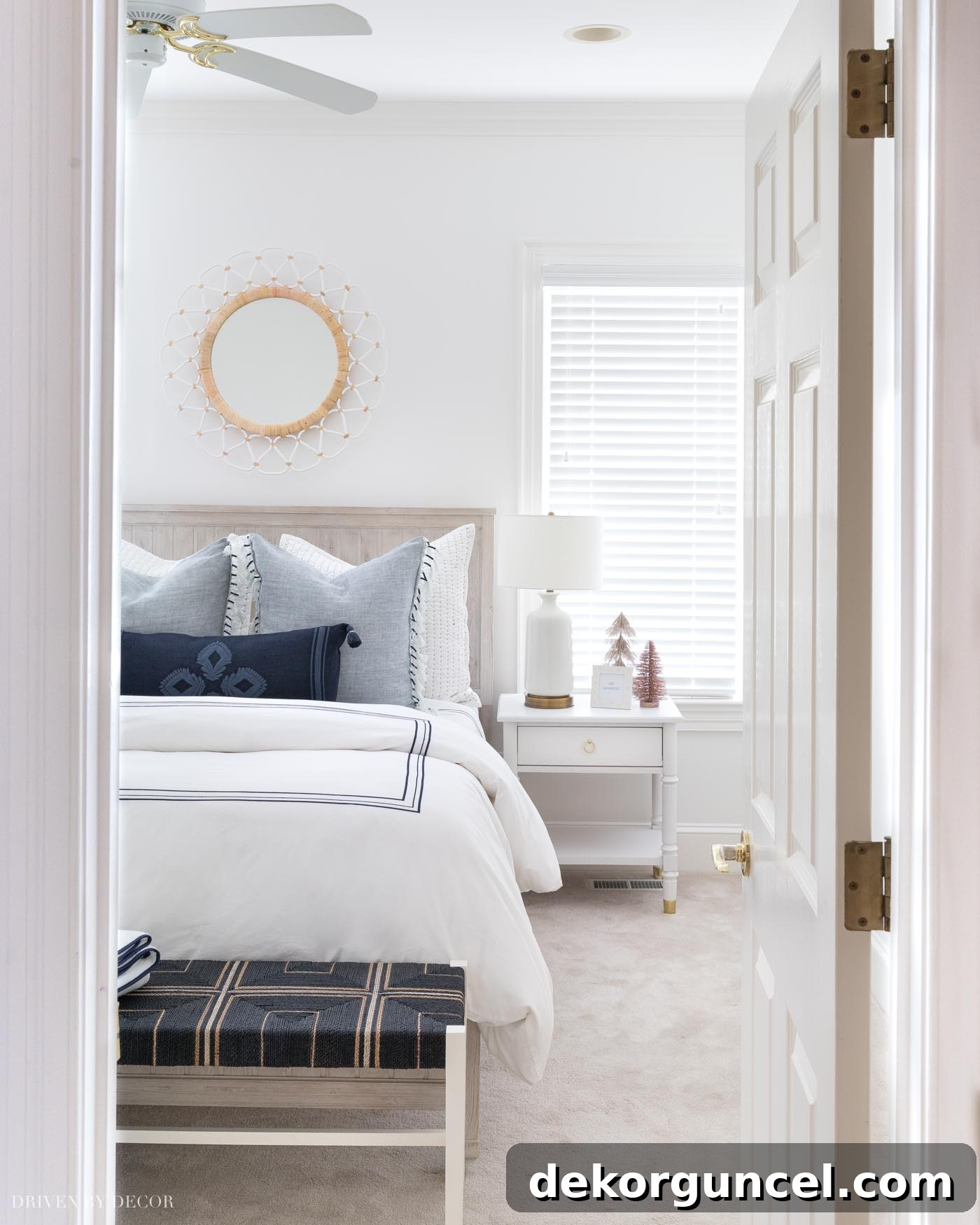
Sources: Queen beadboard bed (weathered white) | 12″ Memory foam queen mattress (no boxspring needed) | Blue & white quilted shams | Blue tasseled edge pillow covers | Navy embroidered lumbar pillow cover ( with {this} pillow insert) | Navy border duvet cover | Navy border sheets | White quilt | Backless bench at foot of bed | Nightstand | USB Lamp | Round mirror
It just goes to show how whites can look so different from home to home because when I tested those same three colors in our current home, I liked Cloud White the best! You can see more pics of our NC guest room {here}.
And with that, we’ve journeyed through each and every room, uncovering the carefully chosen paint colors that have defined our home’s character. I sincerely hope this comprehensive guide has provided you with valuable inspiration, perhaps sparking an idea or two for your own home transformations. Whether you’re drawn to the serene calm of a greige, the sophisticated depth of a soft black, or the timeless elegance of various whites, remember that paint is a powerful tool for self-expression and creating the atmosphere you desire. Thank you for stopping by and exploring these cherished hues with me. Enjoy the rest of your weekend!
