
The phrase “boring neutrals” often conjures images of uninspired spaces, but nothing could be further from the truth. Neutral home decor, when executed thoughtfully, has the power to transform any room into a haven of tranquility, warmth, and inviting elegance. Far from being dull, a well-designed neutral space can be incredibly sophisticated and rich in character, rivaling the visual interest of any vibrant, color-saturated interior. Today, we’re diving deep into proven strategies for decorating with neutral colors, ensuring your home feels both serene and captivating. Get ready to discover how to infuse your neutral palette with dynamic flair that is anything but boring. (This post includes affiliate links; a full disclosure statement is available here.)
Embrace the Power of Patterns
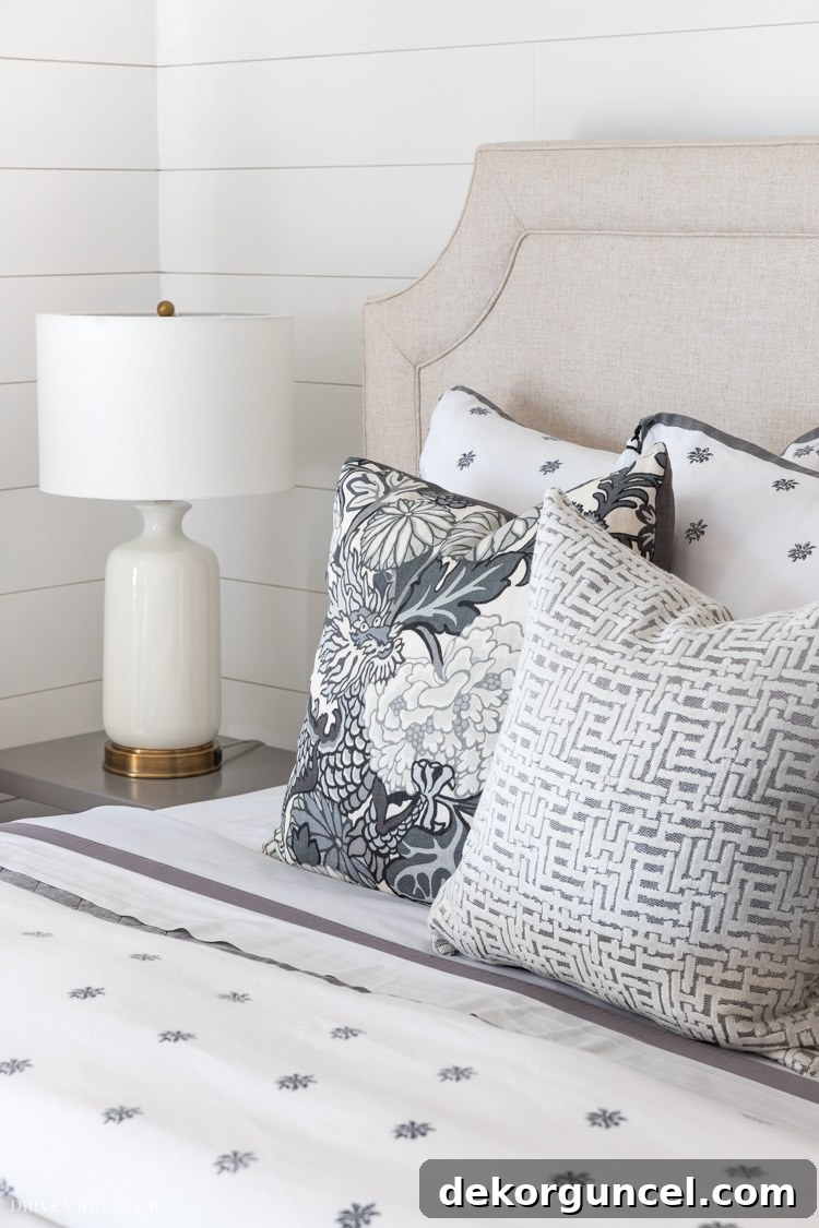
A common misconception is that neutral rooms must rely solely on solid hues, leading to a flat and uninspired aesthetic. However, integrating diverse patterns is a game-changer, immediately injecting life and visual intrigue into your space. Think beyond mere color and consider the fascinating interplay of shapes, lines, and motifs that patterns bring. For instance, imagine a bedroom adorned with pillows in various neutral shades. While the colors are consistent, a thoughtful mix of geometric designs, subtle stripes, organic motifs, or intricate damasks can create a layered look that is both cohesive and endlessly engaging. This approach prevents the room from feeling monotonous, inviting the eye to explore different details.
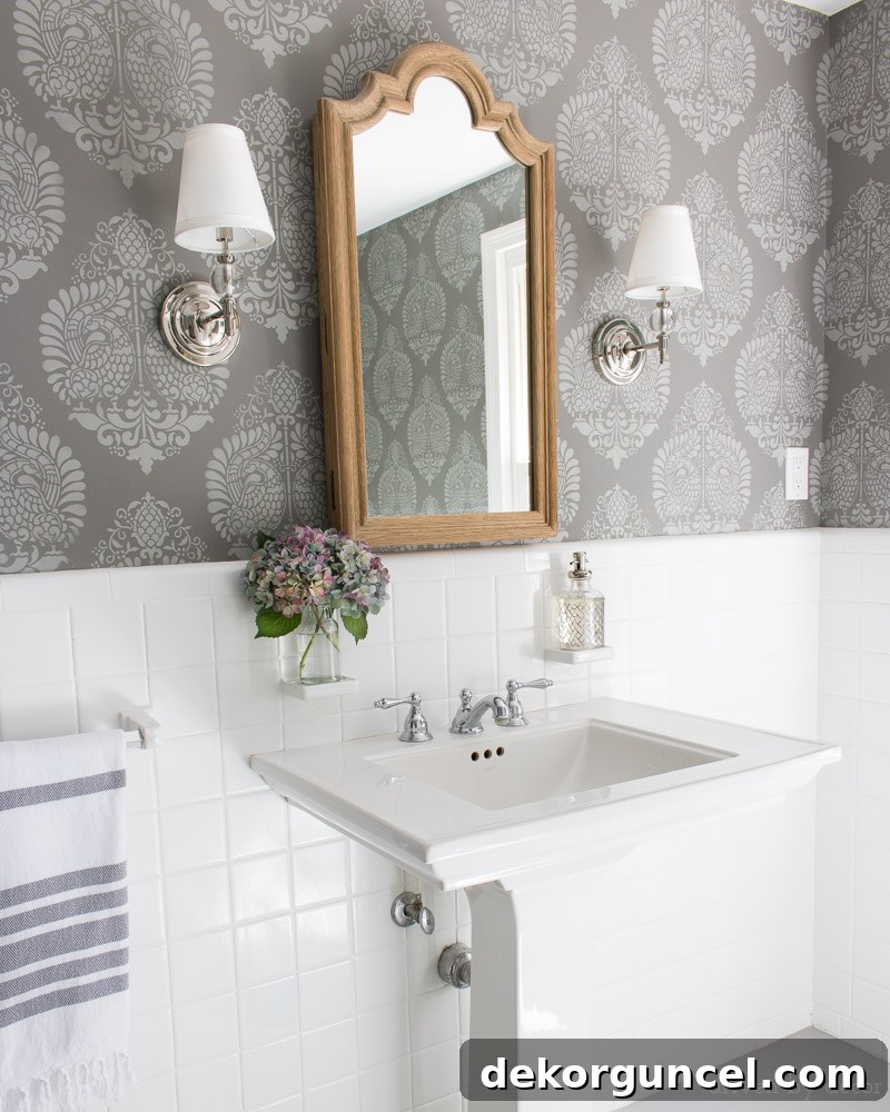
The beauty of patterns isn’t confined to textiles alone. Expand your vision to incorporate patterns on larger surfaces. Instead of plain, solid-colored walls, consider the transformative effect of patterned wallpaper or a chic stencil design. A textured wallpaper with a subtle botanical print or a geometric stencil in a slightly contrasting neutral tone can add immense character and depth without overwhelming the space. This clever application of pattern ensures that even your walls contribute to the rich visual tapestry of your neutral interior, as demonstrated in our budget bathroom remodel where stenciling brought a personalized touch.

When selecting patterns, consider the scale and complexity. A larger, more open pattern might work well on a feature wall or a prominent rug, while smaller, more intricate patterns can be reserved for accent pieces like throw pillows or decorative objects. Don’t be afraid to mix patterns, but remember to vary their scale to create harmony rather than chaos. For example, pair a bold stripe with a delicate floral in complementary neutral tones. This strategic use of pattern is fundamental to achieving a dynamic and stylish neutral interior.
Layer Rich Textures for Depth
In the realm of neutral decor, texture is paramount. It’s the secret ingredient that transforms a potentially flat space into a tactile wonderland, inviting touch and adding significant visual interest without the need for bold color. Every thoughtfully designed neutral room benefits immensely from an abundance of varied and intriguing textures. Think beyond just soft furnishings; incorporate textures through every element of your design.
Imagine the sensory delight of nubby woven fabrics, the luxurious sink-in feel of plush throw rugs, the rustic charm of woven baskets, or the cool, smooth surface of a ceramic vase. These elements, when combined, create a multi-dimensional sensory experience. For our master bathroom remodel, a space often dominated by hard, cold surfaces, introducing natural textures was crucial. We added this elegant lidded basket to serve as a hamper, its intricate weave providing warmth and softness. Complementing this, this smaller basket was perfect for holding washcloths, further enhancing the tactile appeal and adding functional beauty to the room.
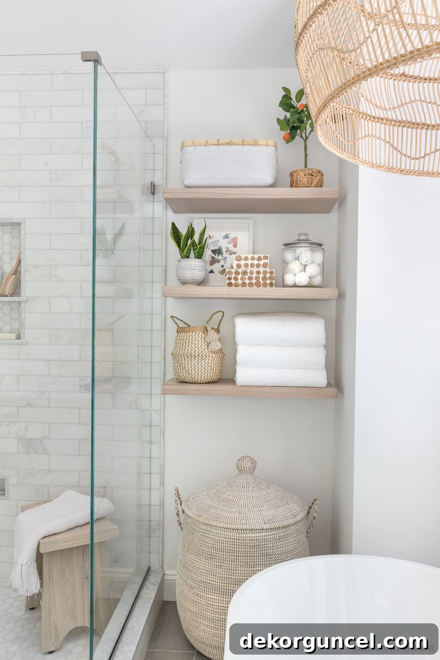
Sources for everything in our master bathroom remodel can be found here.
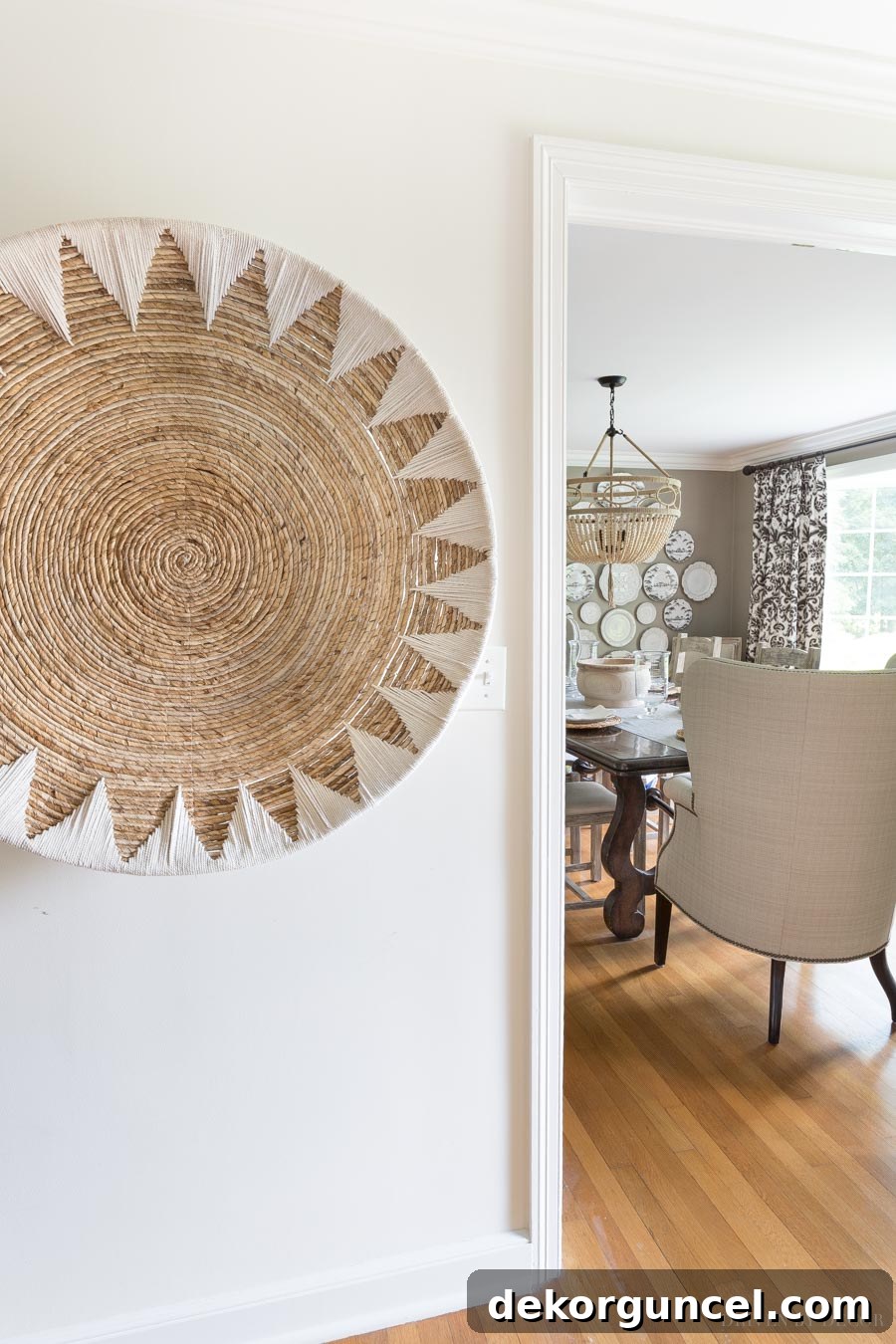
Beyond functional pieces, texture can also be a form of art. In our hallway, for example, a large woven basket is artfully hung on the wall. This not only adds a unique sculptural element but also introduces another layer of organic texture and warmth to an otherwise functional space. Consider incorporating materials like linen, velvet, faux fur, chunky knits, natural stone, ceramic, polished metal, and glass. Each material offers a distinct tactile experience and visual sheen that contributes to the overall richness of a neutral room. Layering these different textures ensures that your neutral space feels inviting, luxurious, and visually compelling from every angle.
Strategic Color Accents for Vibrancy
While the essence of neutral decorating lies in its calm and cohesive palette, a touch of carefully chosen color can elevate a room from merely peaceful to truly vibrant and captivating. It’s not about abandoning neutrals, but rather about using accent colors strategically to create focal points and introduce a subtle pop of personality. Not every room demands color, but many spaces can benefit immensely from a thoughtful dash of it, preventing them from feeling too muted or subdued.
Consider our home office, a space predominantly furnished with neutral pieces—from the furniture to the art and wall colors. To inject a fresh burst of energy without disrupting the overall serenity, we opted for drapery fabric with a delicate hint of citrine yellow. This bright, cheerful hue immediately enlivened the room, offering a pleasant contrast and a delightful visual surprise. The key is moderation and intentionality; choose one or two accent colors and distribute them sparingly throughout the room through smaller elements like throw pillows, artwork, decorative objects, or fresh botanicals.
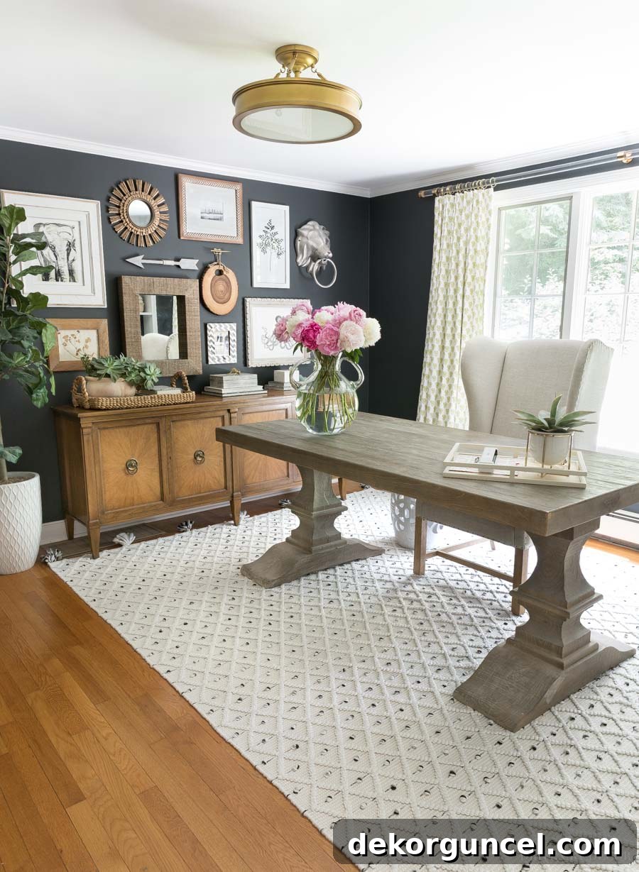
Notice how we also incorporated a highly textured rug in this office. This demonstrates how texture and a touch of color can work in tandem to create a dynamic and inviting space. When selecting an accent color, consider the existing neutral tones in your room. Warm neutrals like beige and cream pair beautifully with earthy greens, soft blues, or a rich terracotta. Cooler neutrals like gray and greige can be complemented by deep navies, emeralds, or even a soft blush pink. The goal is to enhance, not to overwhelm. A strategic splash of color can be the perfect finishing touch, adding vibrancy and defining the character of your neutral home decor.
Choosing Paint Colors with Undeniable Depth
When it comes to wall colors in a neutral scheme, the choice of paint can profoundly impact the room’s overall feel. While personal preference plays a significant role, there’s a distinct difference between a truly rich, sophisticated neutral paint and a bland, ‘builder’s beige’ that can instantly make a room feel uninspired. My strong preference leans towards either a crisp shade of white or a neutral color that possesses a noticeable depth and complexity.
A well-chosen paint color with depth will react beautifully to varying light conditions throughout the day, revealing subtle undertones and preventing the walls from appearing flat. Take, for example, the Pratt & Lambert Ever Classic paint color in our guest room. This particular shade embodies a luxurious richness, creating an inviting and refined atmosphere that feels anything but plain. Its inherent depth gives the room a sense of grounded elegance and warmth, demonstrating how a neutral wall color can be a star in its own right.
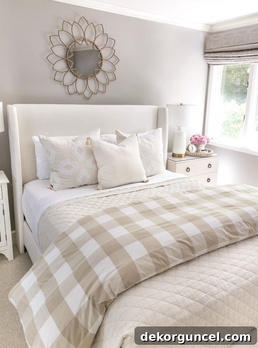
When selecting a neutral paint, pay close attention to its undertones. A gray might have subtle blue, green, or even purple undertones, while a beige could lean yellow, pink, or orange. These undertones will significantly influence how the color appears in your home’s specific lighting conditions and how it harmonizes with your furniture and textiles. Always test paint samples on your walls and observe them at different times of day before making a final decision. For guidance, explore my favorite white paint colors here and my top picks for greige paint colors here. Investing time in finding the right paint color with genuine depth will lay a sophisticated foundation for your entire neutral decor scheme.
Master the Art of Layering
Layering is arguably the most crucial principle in creating a dynamic and visually appealing neutral interior. It’s the process of building interest by combining different elements, one atop the other, to create a sense of richness, comfort, and collected charm. Think of it as composing a beautiful symphony, where each instrument (or layer) contributes to the overall harmonious sound.
This technique extends beyond simply adding a throw blanket to a sofa. Layering encompasses textures upon textures, subtle tone-on-tone variations, and even the physical arrangement of art and accessories. For instance, consider how you can layer textiles: a jute rug beneath a softer, plush area rug; a collection of throw pillows in varied patterns and fabrics on a sofa; or multiple blankets draped artfully over an armchair. Each layer adds a new dimension, contributing to a cozy and inviting atmosphere.
Beyond fabrics, layering applies to lighting—combining overhead ambient light with task lighting from lamps and accent lighting to highlight specific features. Art is another prime candidate for layering; instead of a single piece, create a gallery wall or lean smaller framed pieces against larger ones on a console table or bookshelf. As demonstrated by tip #3 in my post on how to decorate a bookshelf, the strategic layering of a few neutral home decor pieces instantly elevates the display, making it feel curated and infinitely more interesting than simply placing items in a row.
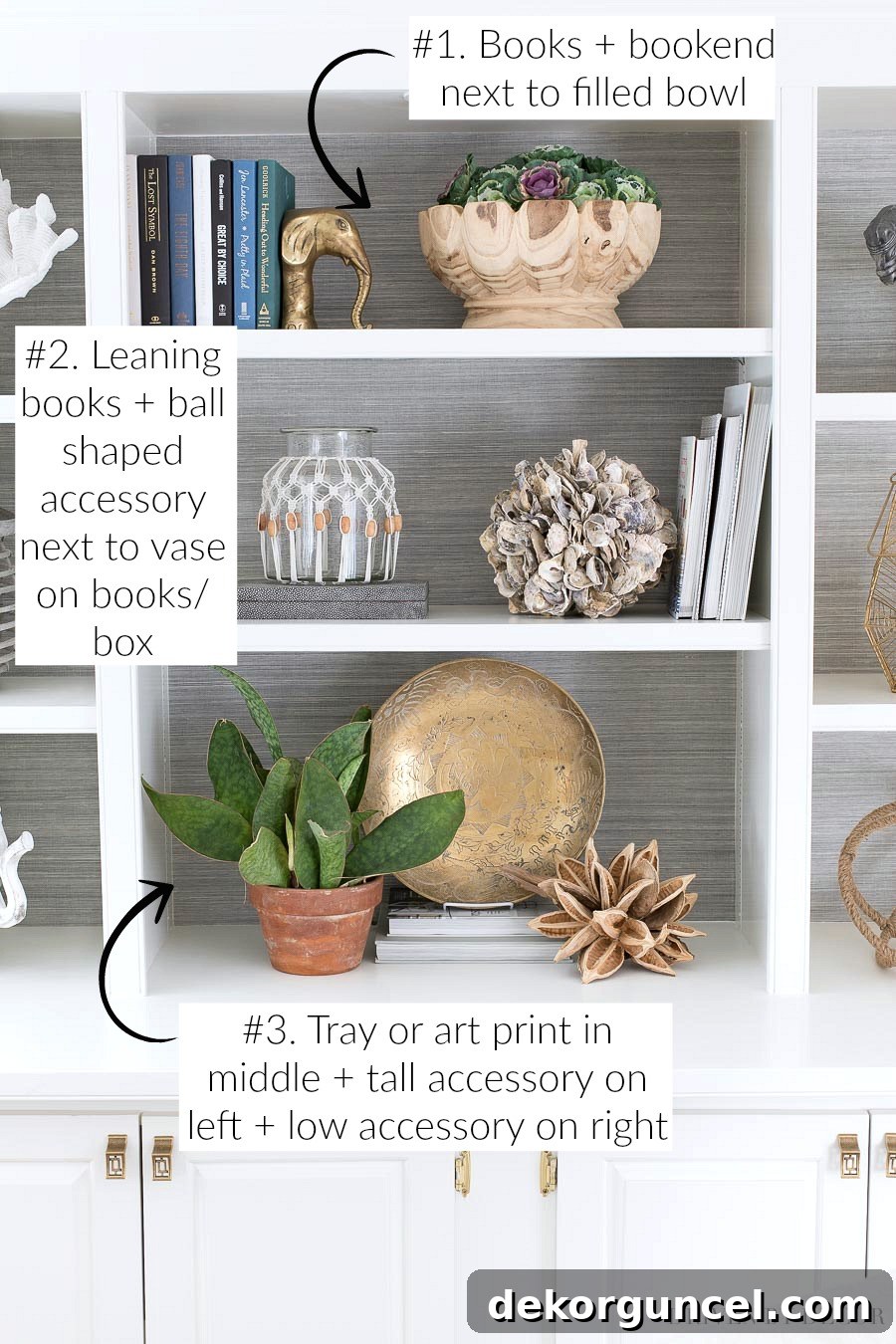
Layering also involves combining different materials and finishes. A matte ceramic vase next to a gleaming metal tray, or a rough-hewn wooden bowl alongside smooth glass objects. The interplay of these diverse elements creates visual tension and prevents the room from feeling one-dimensional. By mastering the art of layering, you unlock the full potential of neutral decor, creating spaces that are deeply inviting, visually complex, and utterly sophisticated.
Infuse Warmth with Natural Woods
Natural wood pieces are indispensable in any neutral decor scheme, acting as a grounding force and imparting an immediate sense of warmth, depth, and organic beauty. In a palette dominated by whites, grays, and creams, the rich tones and distinctive grain patterns of wood introduce a vital element of natural texture and an inviting, earthy feel. This warmth is crucial for preventing neutral spaces from appearing cold or stark.
Almost every room in our home features at least one wood-toned element, whether it’s a small accent or a substantial furniture piece. These pieces serve to anchor the space and connect it to nature, fostering a calm and welcoming environment. Examples include the elegant wood lamps that flank the bed in our guest room, providing both ambient light and a touch of organic texture. In our home office, a beautiful wood credenza offers practical storage while contributing significant visual weight and warmth to the room’s design. And in our kitchen eat-in area, this natural wood table serves as a central gathering point, its materiality bringing an inviting, rustic charm that perfectly complements the surrounding neutrals.
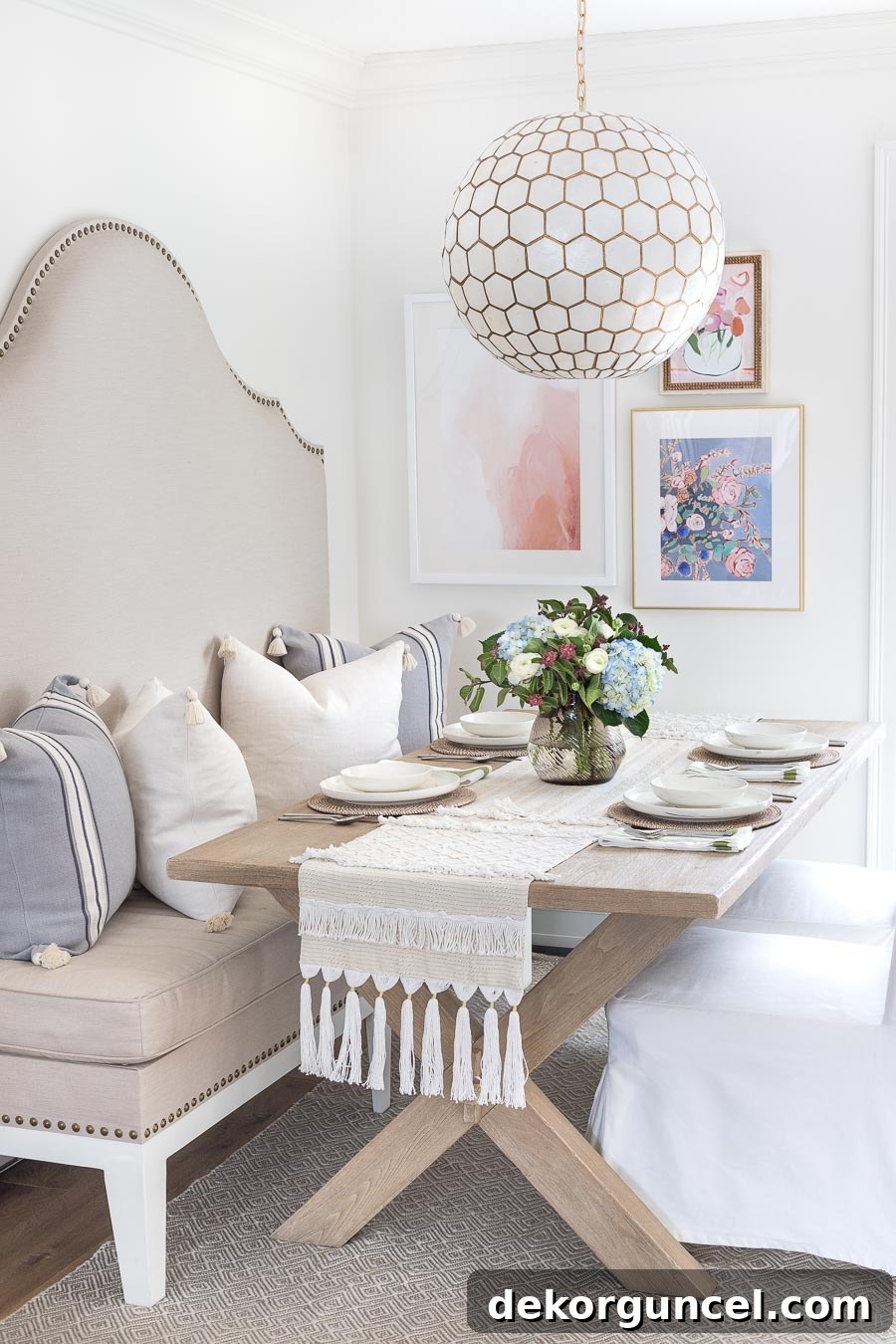
You can find all sources for our kitchen eat-in and see more photos of this space here.
When selecting wood pieces, consider the variety of tones available—from light, airy maple and birch to rich, deep walnut and mahogany, or even character-filled reclaimed wood. Each offers a different aesthetic contribution. Incorporate wood through furniture like dining tables, coffee tables, shelving units, and accent chairs. Don’t overlook smaller elements such as wooden bowls, cutting boards, picture frames, or decorative sculptures. The tactile quality and visual appeal of natural wood are unparalleled, making it an indispensable component for creating a truly sophisticated and inviting neutral home. By thoughtfully integrating natural woods, you ensure your neutral decor scheme feels balanced, warm, and deeply rooted in timeless elegance.
And there you have it—a comprehensive guide to decorating with neutral home decor that promises sophistication, warmth, and undeniable style. By strategically incorporating patterns, layering rich textures, introducing thoughtful color accents, choosing paint with depth, mastering the art of layering, and infusing spaces with natural woods, you can create a home that is both serenely neutral and incredibly captivating. These aren’t just tips; they are foundational principles for transforming any room from potentially bland to beautifully nuanced. Do you have any other personal tips or tricks for elevating neutral spaces? We’d love to hear them!
XOXO,