
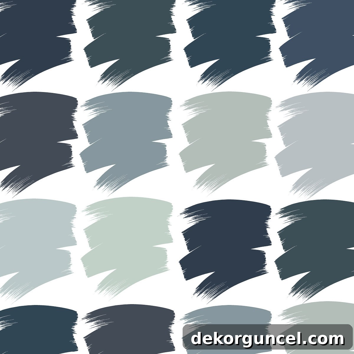
Seeking inspiration for your next home transformation? Dive into the world of stunning blue paint colors with our curated list of readers’ top 10 favorites!
When the conversation turns to neutral paint colors, our minds typically conjure images of crisp whites, warm beiges, and sophisticated grays. However, it’s high time that blue paint colors earned their rightful place on that esteemed “neutrals” list. Blue possesses an unparalleled versatility, effortlessly harmonizing with nearly every shade on the color wheel. Whether you’re envisioning lush greens, vibrant yellows, fiery oranges, or muted grays, blue acts as a magnificent canvas, enhancing and complementing its companions with grace and style.
Beyond its remarkable adaptability, blue exudes a profoundly cool, calming, and serene vibe that is simply irresistible. This inherent tranquility is precisely why I, along with countless design enthusiasts, consistently find myself gravitating towards various shades of blue when selecting elements like rugs, luxurious bedding, captivating wallpaper, and other cherished decor pieces. The allure of blue is so strong that I’ve even contemplated adorning the walls of our guest room in a beautiful blue hue. Inspired by the overwhelming and incredibly helpful suggestions you all shared for the best greige paint colors, I decided to pose the question again: What are your absolute favorite blue paint colors?
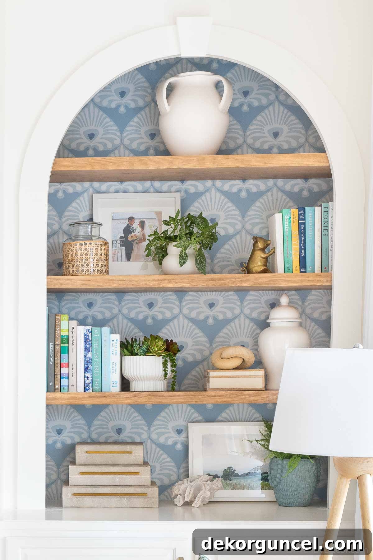
The response was phenomenal! I meticulously gathered and compiled over 500 recommendations shared across Instagram and Facebook. From this treasure trove of reader favorites, I’ve distilled the ultimate list of the ten blue paint colors that rose to the top. These are the tried-and-true, go-to hues that our community has embraced, loved, and enthusiastically recommends to fellow homeowners looking to infuse their spaces with the captivating charm of blue. (Please note: this post includes affiliate links, meaning I may earn a small commission if you make a purchase through them, at no extra cost to you. Full disclosure statement is available here)
Your Ultimate Guide to the Most Loved Blue Paint Colors
Blue is more than just a color; it’s an experience. It brings the tranquility of the sky and the depth of the ocean into our homes, creating spaces that feel both comforting and expansive. From deep, dramatic navies that command attention to soft, airy pastels that whisper serenity, blue offers an incredible spectrum for every design sensibility. It’s a color that can feel both traditional and contemporary, making it a timeless choice for any interior. Its ability to evoke feelings of calm and stability makes it particularly popular for bedrooms, bathrooms, and living areas where relaxation is paramount. However, don’t underestimate its power in more dynamic spaces like home offices or kitchens, where a vibrant blue can inspire creativity and focus.
Understanding LRV and Choosing the Right Paint Samples
To help you navigate these beautiful blues, I’m presenting them in order from darkest to lightest, using each paint color’s LRV (Light Reflectance Value) as our guiding principle. The LRV is a measurement that indicates how much light a paint color reflects. A lower LRV number signifies a darker color that absorbs more light, while a higher LRV denotes a lighter color that reflects more light, making a room feel brighter and more open. For instance, a pure black has an LRV of 0, and a pure white has an LRV of 100.
It’s crucial to remember that the appearance of a paint color can drastically change based on various factors unique to your home. The amount of natural and artificial light your room receives, the direction your windows face (north, south, east, west), and even the existing furnishings and decor all play a significant role in how a paint color will truly manifest in your space. This is why I cannot stress enough the importance of obtaining large peel-and-stick paint samples. These allow you to observe how the color interacts with your home’s unique lighting conditions throughout the day, ensuring you make the most informed decision before committing to gallons of paint. For more detailed insights and expert tips on how to confidently choose the perfect paint colors for your home, be sure to read my comprehensive post on how to choose paint colors. Now, let’s embark on this journey through our readers’ most beloved blue hues!
1. Sherwin Williams Naval (6244) LRV: 4
We’re kicking off our list with a blue paint color that has undoubtedly graced many conversations among design enthusiasts. Sherwin Williams Naval was crowned their prestigious paint color of the year in 2020, and its popularity has only continued to soar, cementing its status as a steadfast reader favorite! Naval is a breathtakingly deep, sophisticated navy that imparts an incredibly rich and luxurious feel, whether applied to expansive walls or meticulously crafted cabinetry. It’s the kind of blue that creates immediate depth and a sense of grounding elegance in any room.
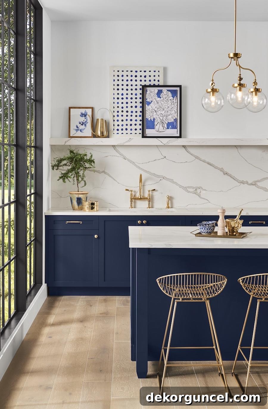
With an impressively low LRV of 4, Naval stands as the darkest blue on our list, possessing a depth so profound that its light reflectance is even lower than that of the blackened gray paint color, Benjamin Moore Nightfall, which I personally used on the walls of our home office. This characteristic makes Naval an exceptional choice for creating a dramatic focal point, a cozy library, or a bedroom sanctuary where deep, enveloping color is desired. It pairs beautifully with crisp whites for a classic nautical feel, or with warm metallics and rich wood tones for a more opulent aesthetic.
Smart Tip: Mastering DIY painting can lead to significant savings! Explore my comprehensive step-by-step guide on how to paint a room to get started.
2. Farrow & Ball Hague Blue (No. 30) LRV: 7
Hague Blue, a hallmark paint color from the renowned British brand Farrow & Ball, exemplifies their reputation for producing paints with extraordinary depth and richness. This particular shade is beautifully described as a deep and wonderfully dramatic blue, infused with subtle yet distinct green undertones. It’s a captivating hue that provides an enveloping warmth without feeling overwhelming, perfect for those who desire a space with a moody-but-not-gloomy ambiance. Hague Blue truly shines in creating intimate, luxurious settings.
As showcased in this stunning living room by House on the Way, the wall color possesses an incredible richness that rivals the luxurious dark velvet couch placed before it. This demonstrates Hague Blue’s power to elevate a space, making it feel both grand and inviting. To discover more beautiful interiors and innovative DIY projects from their inspiring work, explore House on the Way on Instagram here.
I couldn’t resist including one more breathtaking image featuring Hague Blue, as this festive holiday mantel truly captivated me! It perfectly illustrates how this deep blue can serve as a magnificent backdrop, allowing decorative elements to pop with vibrant contrast and festive cheer.
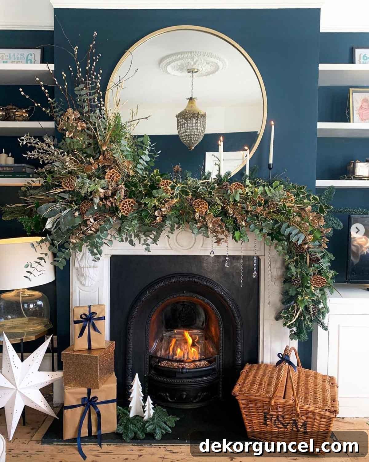
Isn’t the effect absolutely amazing? The way Hague Blue frames the mantelpiece, creating a cozy and dramatic focal point, is simply masterful. For a continuous stream of captivating decorating inspiration, be sure to follow Jenny & Sam on Instagram here.
3. Benjamin Moore Gentleman’s Gray (2062-20) LRV: 7.26
Despite its intriguing name, Benjamin Moore’s Gentleman’s Gray leans decidedly more towards a sophisticated blue than a true gray. This particular hue is best described as a blackened blue, subtly infused with just a touch of teal, which adds a unique depth and character. It’s a color that evokes a sense of refined elegance and subtle drama, making it perfect for creating a luxurious and inviting atmosphere.
A truly exquisite application of Gentleman’s Gray can be admired on the walls of Bree of ZDesign at Home’s stunning guest room. The color transforms the space into a serene retreat, offering guests a feeling of calm and comfort that is both stylish and welcoming.
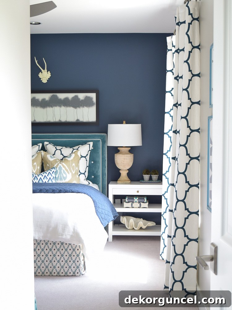
The dark, rich blue with its hint of teal creates a cozy yet sophisticated backdrop, allowing lighter furnishings and decor to truly pop. You can explore more captivating details of Bree’s guest room and discover all the room sources on her insightful blog here. Gentleman’s Gray is an excellent choice for those seeking a deep blue that offers more nuance than a simple navy, providing a complex and intriguing hue that adapts beautifully to various lighting conditions.
4. Sherwin Williams Indigo Batik (7602) LRV: 8
Sherwin Williams Indigo Batik is a paint color that perfectly lives up to its name, evoking the rich, vibrant indigo hues often seen in traditional batik fabrics. This captivating shade is a true, deep indigo blue, brimming with character and a delightful intensity. While its vibrancy might be a bit too bold for some to apply to all four walls of an entire room, it absolutely excels when used in smaller doses or as a dynamic accent, where its striking beauty can truly shine without overpowering the space.
Consider the spectacular nursery designed by Michelle of @designed.by.belle, where Indigo Batik is ingeniously used as the front layer of a painted mountain mural. The color brings a playful yet sophisticated depth to the scene, creating a magical and inspiring environment for a child. This demonstrates the power of Indigo Batik to transform a feature wall or a specific architectural element into a true work of art.
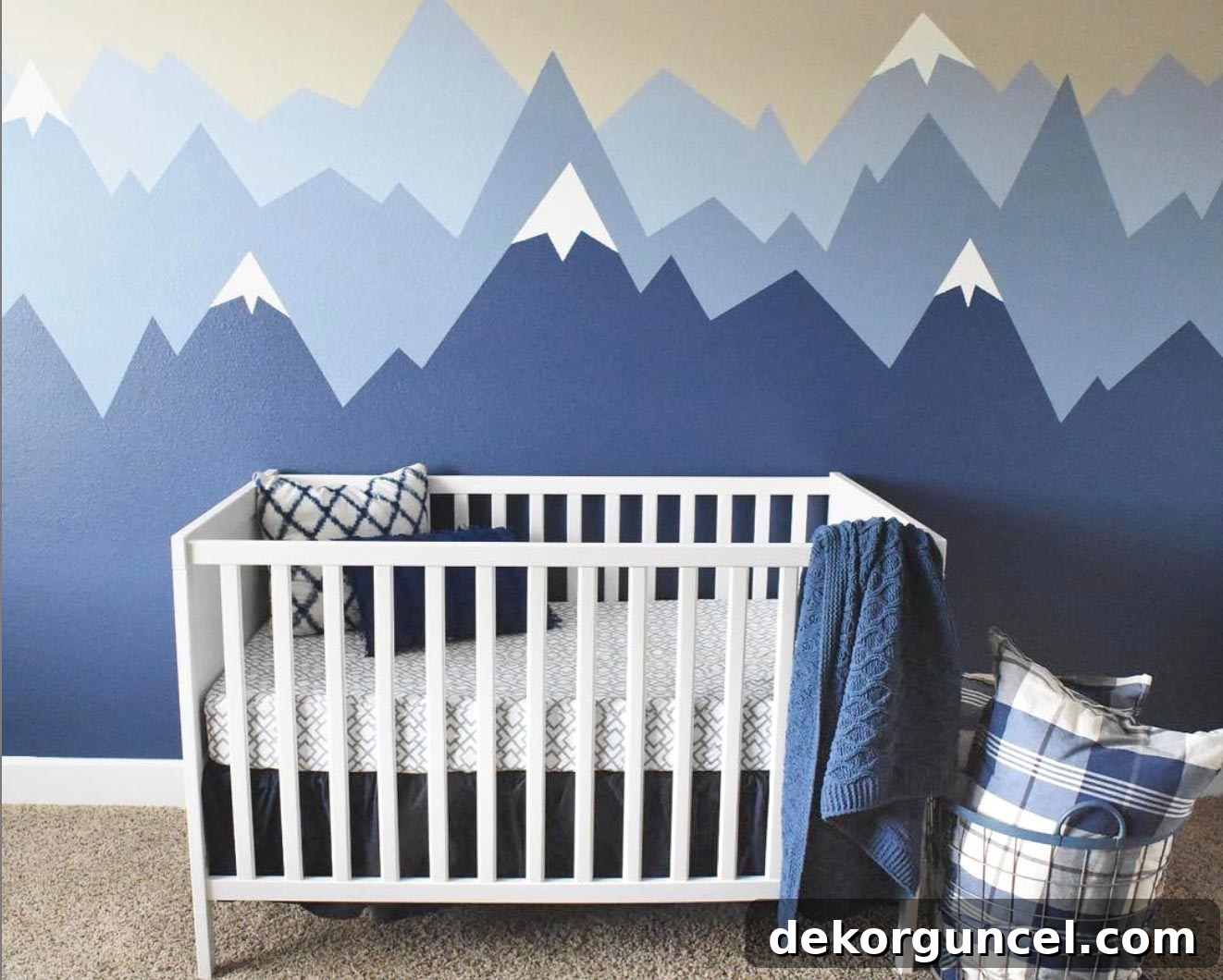
For those curious about the full color palette, Michelle expertly combined Indigo Batik with Sherwin-Williams Bracing Blue and Aleutian for the other mountain layers, achieving a harmonious and multi-dimensional effect. You can explore more of Michelle’s exquisite home designs and gain endless inspiration by visiting her Instagram account @designed.by.belle here. Indigo Batik is ideal for accent walls, kitchen islands, or furniture pieces that need a vibrant touch of rich blue.
5. Benjamin Moore Hale Navy (HC-154) LRV: 8.36
Without a doubt, Benjamin Moore Hale Navy emerged as the undisputed champion, securing the #1 spot as the most recommended blue paint color from every single person who shared their favorites. This is for good reason: Hale Navy is an undeniably gorgeous, deep shade of blue that consistently impresses in every room I’ve ever seen it in. It’s a timeless classic, offering a perfect balance between a rich, commanding presence and a welcoming, cozy feel.
Sarah of Life on Virginia Street beautifully utilized this immensely popular blue on the walls of her home office. The result is absolutely perfect, especially when paired with her exquisite wall molding. The deep navy creates a sophisticated and focused environment, ideal for productivity while maintaining an elegant aesthetic.
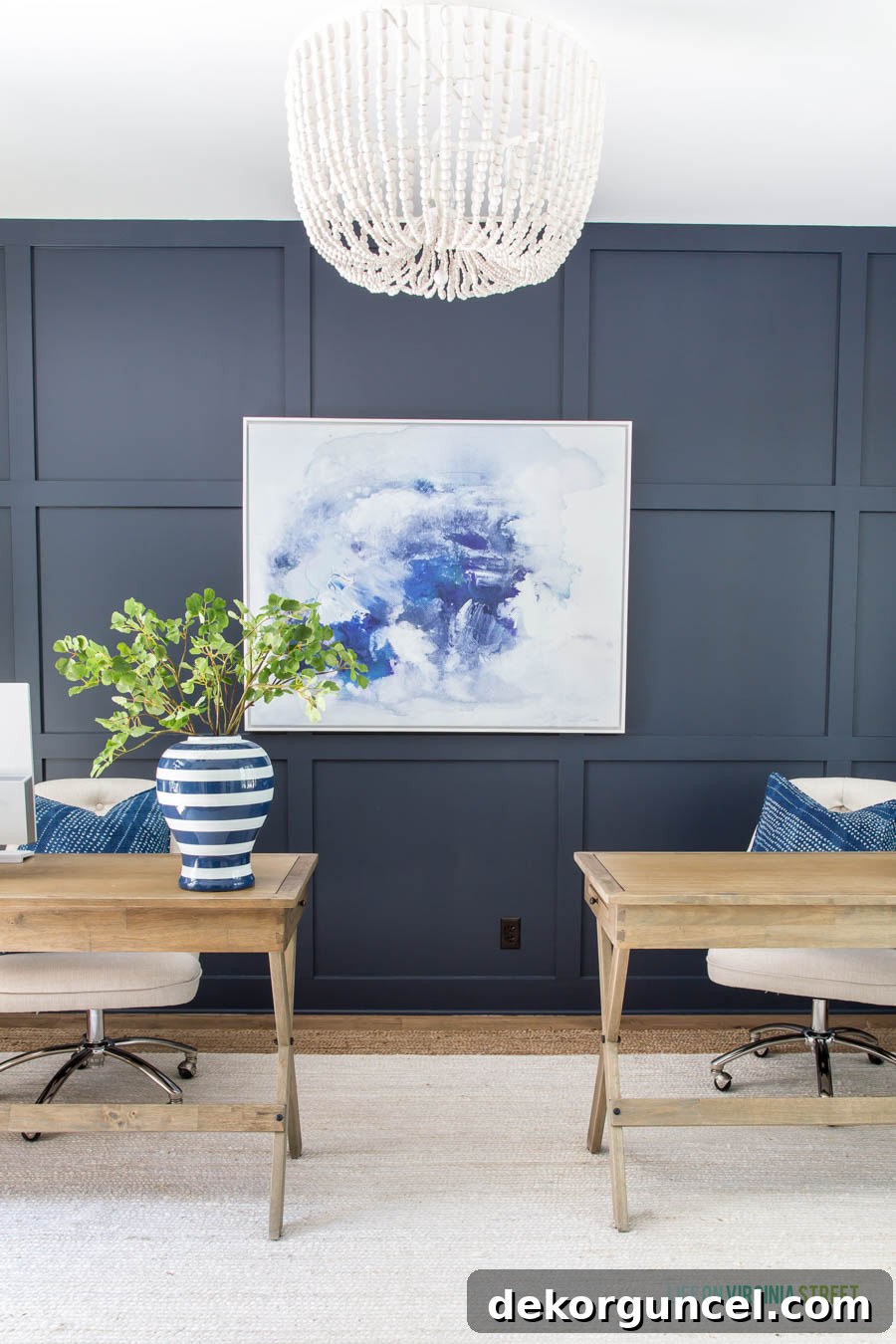
One of Hale Navy’s greatest strengths is its exceptional compatibility with a variety of materials and colors. As seen in Sarah’s office, it works harmoniously and beautifully with warm wood tones and crisp whites, creating a balanced and visually appealing contrast. It’s also incredibly versatile, looking equally stunning in traditional, transitional, and even modern spaces. You can delve deeper into Sarah’s beautifully designed office and find sources for all the elements in this inspiring space on her blog here. Hale Navy is truly a blue that never disappoints.
6. Benjamin Moore Van Courtland Blue (HC-145) LRV: 31.47
Benjamin Moore describes Van Courtland Blue as a decorative “Old World” blue, a hue that carries a sense of history and timeless charm. However, don’t let this description limit your perception; this sophisticated shade works equally well, if not spectacularly, in more contemporary and transitional spaces. When viewed on a color strip, it might initially present a more traditional vibe compared to some of the other blues on our list. Yet, its application in actual interiors proves it to be anything but dated, showcasing a remarkable ability to blend classic elegance with modern sensibility.
A prime example of its enduring appeal can be seen on the cabinetry in this impeccably designed laundry room by Stephanie Gamble. Here, Van Courtland Blue breathes fresh life into the space, offering a unique alternative to typical neutrals. Its depth and subtle complexity elevate functional cabinetry into a stunning design feature.
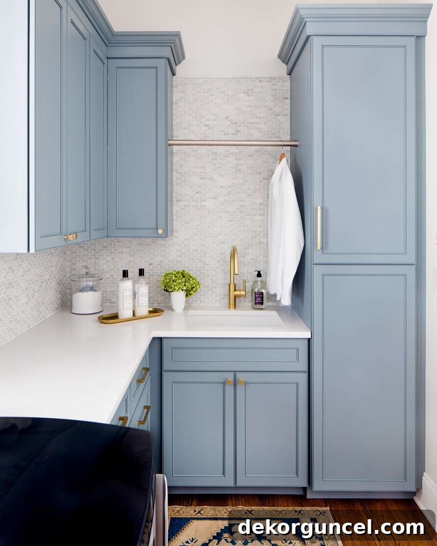
Fabulous, isn’t it?! The color truly shines, demonstrating how a historical hue can feel utterly current and fresh. Van Courtland Blue offers a wonderful midpoint between dark and light, providing a noticeable pop of color without overwhelming. It’s an excellent choice for cabinets, built-ins, or even entire rooms where you want to infuse a refined, calming blue. To explore more of Stephanie’s beautiful and inspiring designs, you can find her on Instagram here.
7. Benjamin Moore Beach Glass (1564) LRV: 49.7
Benjamin Moore’s Beach Glass is officially described as a wonderfully calming blue with a soft gray undertone. However, it’s a fascinating chameleon of a color, as many, including myself, perceive it as leaning more towards a gentle green than a traditional blue. This unique characteristic is what gives Beach Glass its exceptional appeal and versatility. It has been a consistently popular color for many years, celebrated for its serene and tranquil vibe, making it a perennial top choice for bedrooms where peace and relaxation are paramount.
This beautiful bedroom design by Jennifer Davenport serves as a perfect illustration of how Beach Glass creates an atmosphere of ultimate calm. The color washes the walls in a soft, ethereal glow, perfectly complementing the light and airy decor, and inviting a sense of quietude into the space.
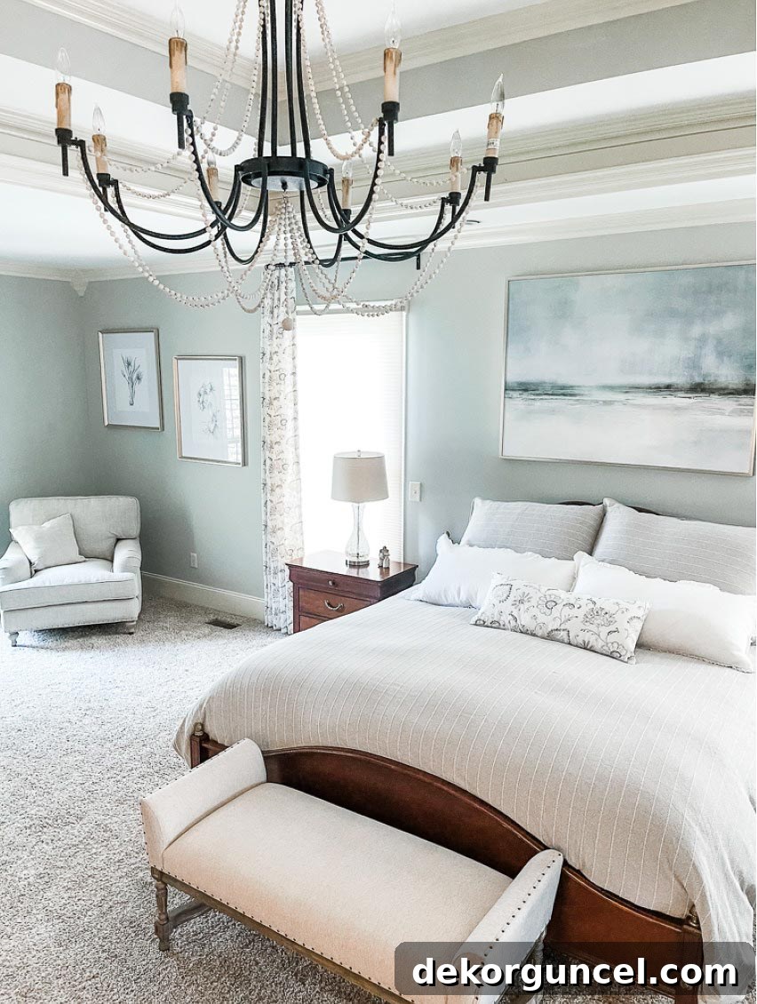
Whether you see it as blue-green or green-blue, its soothing quality is undeniable. Beach Glass is ideal for creating a spa-like bathroom, a peaceful nursery, or any room where you want to foster a sense of escape and tranquility. Its subtle nature allows it to serve as a beautiful backdrop for a wide range of furniture styles and accent colors. To explore Jennifer’s other stunning design projects and gather more inspiration, visit her Instagram account Jennifer Decorates here.
8. Sherwin Williams Krypton (SW6247) LRV: 52
Sherwin Williams describes Krypton as a light, atmospheric blue, delicately infused with a subtle slate gray undertone. This particular blend creates a sophisticated and airy hue that feels both fresh and grounded. Krypton is not a loud color; instead, it offers a gentle presence that brings a sense of calm and spaciousness to any room. Its soft nature makes it highly adaptable, working beautifully in various lighting conditions and design styles.
Observe how absolutely stunning Krypton appears on this built-in wall of cabinetry. The color transforms functional storage into a captivating focal point, providing a soft contrast that allows decorative items to truly pop. It’s an elegant alternative to white or traditional wood, adding a touch of serene color without overwhelming the space.
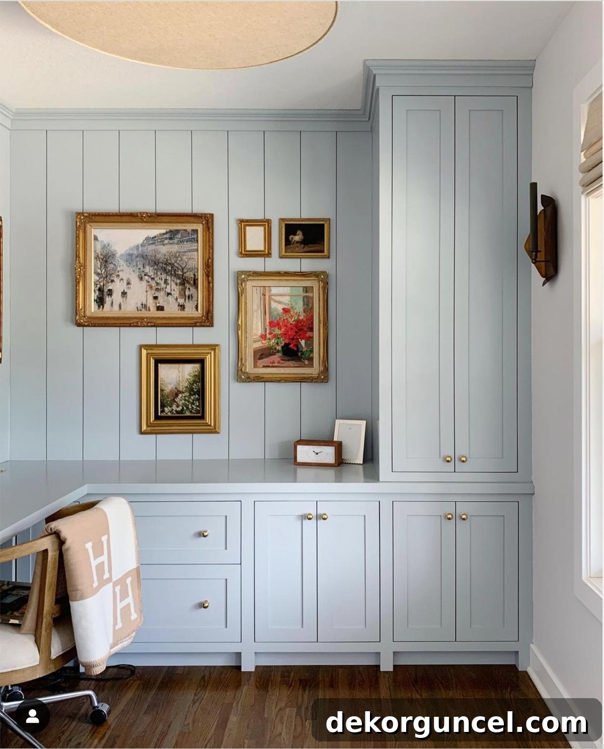
I am personally so enamored with this look that, as I plan to replace the shelving in our laundry room with custom cabinetry, Krypton has shot to the top of my list of possible paint colors for our new cabinets! Melissa of Oho Interiors truly has a remarkable knack for selecting beautiful and impactful paint colors for all her room designs. You can discover more of her inspiring work and impeccable taste by exploring Oho Interiors on Instagram here. Krypton is an excellent choice for creating a light and airy feel, ideal for bedrooms, bathrooms, or any space desiring a subtle yet distinct touch of blue.
9. Benjamin Moore Smoke (2122-40) LRV: 56.39
Benjamin Moore Smoke is one of those delightful discoveries that wasn’t initially on my radar for outstanding blue paint colors until several of you enthusiastically recommended it. After witnessing its transformative power in various applications, I am absolutely in love! Smoke is a beautifully subtle blue-gray, possessing a sophisticated muted quality that makes it incredibly versatile and calming. It’s not a bold statement blue, but rather a soft, ethereal hue that lends a serene and elegant ambiance to any space.
You can see Smoke in captivating action on the cabinetry in Jillian Harris’ incredible laundry room. Here, the color elevates a utilitarian space into a chic and inviting area, proving that even functional rooms deserve a touch of sophisticated design.
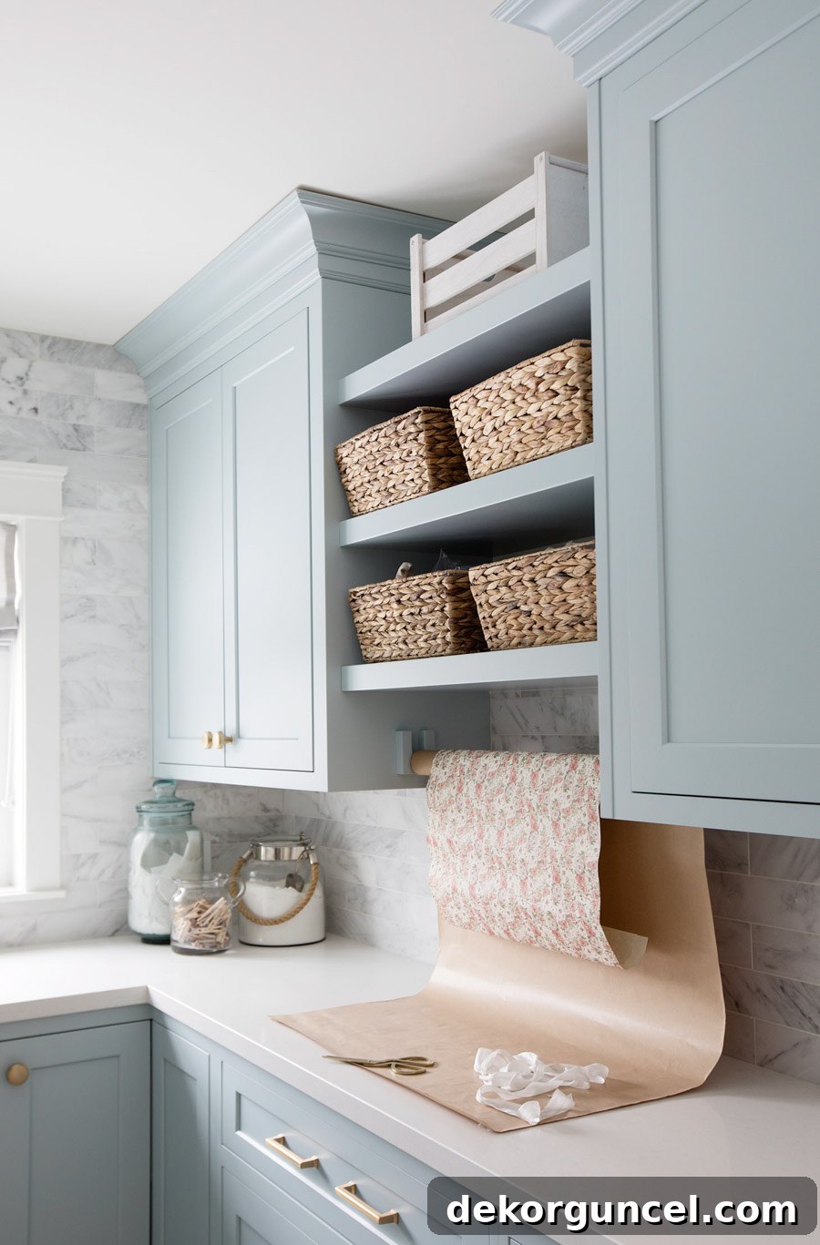
The soft, muted quality of Smoke allows it to pair wonderfully with crisp whites, natural wood tones, and metallic accents, creating a balanced and harmonious palette. It’s definitely a color I’m eager to try in my own home – perhaps on my daughters’ bathroom vanity to bring a touch of calming elegance? Its mid-range LRV makes it suitable for various room sizes and light levels, offering a welcoming glow. You can find more inspiring pictures and detailed insights into this beautiful laundry room on Jillian’s blog here.
10. Benjamin Moore Palladian Blue (HC-144) LRV: 60.4
Benjamin Moore Palladian Blue has long held a coveted spot on my personal “must-try-someday” list, particularly for front door colors. It’s a truly gorgeous soft greenish-blue, a beautifully ambiguous hue that often reads as more green than blue to the eye, despite its name. This delightful ambiguity is precisely what makes it so captivating and adaptable. With a higher LRV of 60.4, Palladian Blue is a lighter, airier option, perfect for bringing a fresh, spa-like quality to interiors or a welcoming vibrancy to exteriors.
Laura of Laura Murphy Interiors eloquently demonstrates its charm by painting the front door of her beautiful home with Palladian Blue, and I genuinely couldn’t love the result more. It instantly elevates the home’s curb appeal, offering a friendly and inviting pop of color that hints at the serene beauty within.
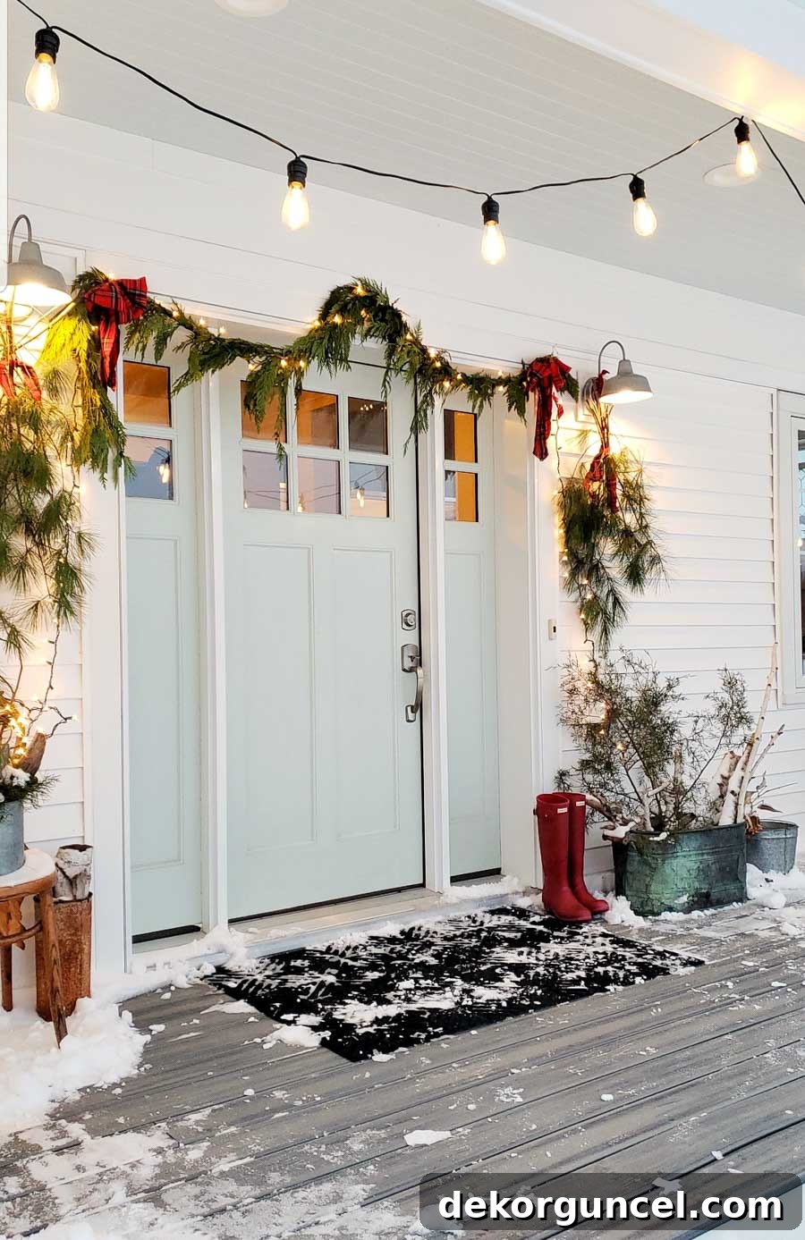
Palladian Blue is an exceptional choice for bathrooms, bedrooms, or any space where you desire a light, refreshing, and calming atmosphere. Its ability to subtly shift between blue and green depending on the light adds an intriguing layer to its appeal. To see more of Laura’s exquisite modern farmhouse, which is simply beautiful both inside and out, follow her on Instagram @meadowhaus_design here. This color is truly a breath of fresh air.
Ready for a fresh exterior? Give your entrance a boost! Find my detailed, step-by-step guide on how to paint a front door.
And with that, our comprehensive list of the top ten reader-favorite blue paint colors gracefully concludes! These hues, ranging from the deepest navies to the softest blue-greens, represent the most beloved choices from our vibrant community. Each color offers a unique way to infuse your home with tranquility, sophistication, and timeless style. But before we wrap up, I have one more cherished blue paint color to share with you—a personal favorite that, while not making the top ten, holds a special place in my heart and my home.
My Personal Favorite: Behr Blueprint (S470-5) LRV: 20
Behr Blueprint was famously named their color of the year for 2019, and it’s a shade that continues to captivate with its inviting warmth and versatility. This beautiful, balanced blue is the color I personally chose for an accent wall in my youngest daughter’s bedroom, and it has truly transformed her space into a vibrant yet calming haven.
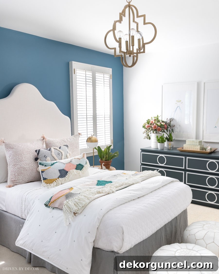
Room Sources: Gold quatrefoil pendant | DIY upholstered headboard | Moroccan leather poufs | White linen quilt | Other bedding no longer available
Blueprint is a fantastic medium-toned blue that carries a distinctly bright and optimistic feel without being overly saturated. With an LRV of 20, it provides a comforting depth while still reflecting ample light to keep the room feeling airy. It proved to be an incredibly harmonious choice, seamlessly blending and complementing all the other boho bedroom colors and textures I incorporated into the room’s design. It’s a wonderful choice for those seeking a welcoming blue that isn’t too dark or too light, offering a perfect balance for a wide array of spaces.
If you’ve found this guide inspiring and want to easily revisit these gorgeous blue paint colors for future reference, I encourage you to click the heart icon on the lower right corner of your screen, or simply Pin the image below to your favorite Pinterest board. This way, your perfect blue will always be just a click away when you’re ready to start your next painting project!
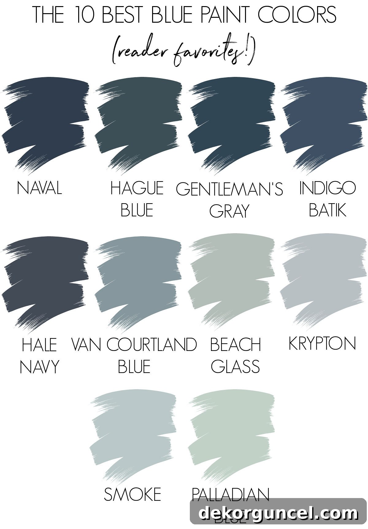
Do you have a personal favorite from this meticulously curated list of ten, or is your ultimate blue hue one that didn’t quite make our top selections? I would absolutely love to hear your thoughts and discover your tried-and-true recommendations in the comments below! Your insights are invaluable to this community of design lovers. And if you enjoyed this detailed post and are eager for more recommendations on other proven and beloved paint colors, be sure to explore my additional guides on:
The Best Greige Paint Colors for Any Home
Choosing the Best White Paint Colors: 8 Proven Favorites
A Complete Guide to My Home’s Paint Colors
With warmest regards and happy painting,
